VisualStudio2013 Theme
Inspired by the Visual Studio design, the VisualStudio2013 theme comes with three built-in color variations – Light, Dark and Blue.
Jump to the following topics to learn about the specifics of the theme's palette and features.
- Default Theme Colors
- Default Theme Brushes
- Changing Palette Colors
- Changing Theme Variation
- Changing Font Properties
- Changing Opacity
Default Theme Colors
Below you can find the differences between the three color variations. Each brush has relevant HEX value in the corresponding color variation.
| Color name | Light (default) | Dark | Blue | |||
|---|---|---|---|---|---|---|
| Colors, which are same in the three palettes | ||||||
| AccentMainColor | FF3399FF | FF3399FF | FF3399FF | |||
| AccentDarkColor | FF007ACC | FF007ACC | FF007ACC | |||
| SelectedColor | FFFFFFFF | FFFFFFFF | FFFFFFFF | |||
| ValidationColor | FFFF3333 | FFFF3333 | FFFF3333 | |||
| Color, which are different in the three palettes | ||||||
| AccentColor | FF007ACC | FF007ACC | FFE5C365 | |||
| MarkerColor | FF1E1E1E | FFF1F1F1 | FF1E1E1E | |||
| StrongColor | FF717171 | FF999999 | FF717171 | |||
| MainColor | FFFFFFFF | FF1E1E1E | FFFFFFFF | |||
| PrimaryColor | FFEEEEF2 | FF2D2D30 | FFE6EBF5 | |||
| AlternativeColor | FFF5F5F5 | FF252526 | FFF6F6F6 | |||
| MouseOverColor | FFC9DEF5 | FF3E3E40 | FFFDF4BF | |||
| BasicColor | FFCCCEDB | FF3F3F46 | FFCCCEDB | |||
| SemiBasicColor | 66CCCEDB | 663F3F46 | 66CCCEDB | |||
| HeaderColor | FF007ACC | FF007ACC | FF35496A | |||
| ComplementaryColor | FFDBDDE6 | FF434346 | FFDBDDE6 | |||
| ReadOnlyBackgroundColor | FFF5F5F5 | FF252526 | FFF6F6F6 | |||
| ReadOnlyBorderColor | FFCCCEDB | FF3F3F46 | FFCCCEDB | |||
| Additional color | ||||||
| DefaultForegroundColor | FF1E1E1E | FFF1F1F1 | FF1E1E1E |
Default Theme Brushes
Here you can find more details about each brush and where it is usually applied.
Common Brushes (same for all variations)
-
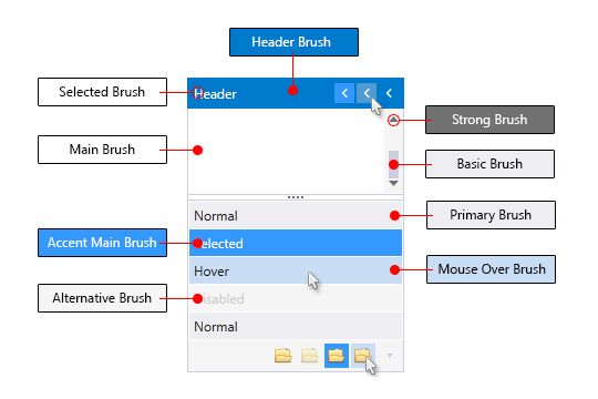
AccentMainBrush—Blue by default and it is the main accent brush for the theme -
AccentDarkBrush—Blue by default and it is the darker accent brush for the theme -
SelectedBrush—White by default and is the main color for text or paths which are over elements with accent background -
ValidatonBrush—Red by default and it is the brush used for validation where such is applicable in our controls
Foreground Brushes
-
MarkerBrush—the main brush used for text color, also path's fill in MouseOver state -
StrongBrush—paths' and ticks' fill in Normal state, also ReadOnly text
Background and Border Brushes
-
AccentBrush—another accent brush, usually used for the border of elements in their MouseOver, Active, Toggled or Focused state. -
MainBrush—used for background of controls with direct input such as TextBox, MaskedInput, Editable ComboBox, AutoCompleteBox, PasswordBox. Also used as main background of elements that has different content with unpredictable background (PrimaryBrush or AlternativeBrush). -
PrimaryBrush—used for background of most of the controls that have no direct input in their normal state. -
AlternativeBrush—used as alternative background of PrimaryBrush. Also used as background of Popups and DropDowns. -
MouseOverBrush—used for background of elements that are in MouseOver state. -
BasicBrush—widely used for border color of controls in their Normal state. -
SemiBasicBrush—the same brush as BasicBrush with 40% opacity, used for background of elements that are in MouseOver state.
Special State/Elements Brushes
-
HeaderBrush—used for the background of headers in controls such as Window, RibbonView, ScheduleView, Docking Pane, Docking ToolWindow, TileView. -
ComplementaryBrush—used for elements in Disabled state.
The only resource that is of type Color and does not have a respective SolidColorBrush is the * DefaultForegroundColor. It is currently used only in the ExpressionEditor.
The following screenshot shows the usage of some of the brushes:
Changing Palette Colors
The VisualStudio2013 theme provides dynamic change of the palette colors responsible for the brushes used in our controls. Their defaults are stated above. This mechanism is used to modify the color variation of the theme.
The general naming convention is: VisualStudio2013Palette.Palette.[name]Color is responsible for [name]Brush – e.g. VisualStudio2013Palette.Palette.AccentColor sets the color for telerik:VisualStudio2013Resource ResourceKey=AccentBrush
Changing the colors can be achieved in code behind.
Setting palette colors
VisualStudio2013Palette.Palette.AccentColor = Color.FromRgb(255, 0, 0);
Changing Theme Variation
There are three palettes of colors which can be easily set by choosing one of the three default color variations:
The next screenshot displays RadCalendar in the three color variations:
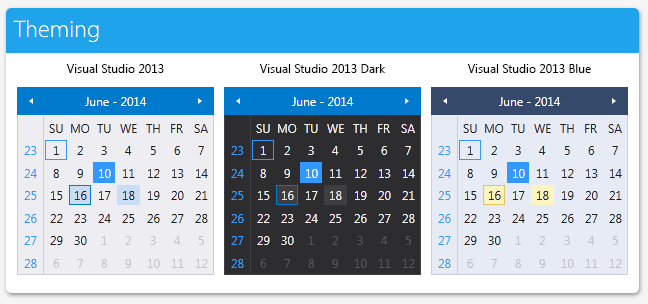
You can switch the three color palettes by calling the LoadPreset method as shown below:
//default color variation
VisualStudio2013Palette.LoadPreset(VisualStudio2013Palette.ColorVariation.Light);

//blue color variation
VisualStudio2013Palette.LoadPreset(VisualStudio2013Palette.ColorVariation.Blue);

//dark color variation
VisualStudio2013Palette.LoadPreset(VisualStudio2013Palette.ColorVariation.Dark);
The
Darkvariation of the theme is designed with a dark background in mind. It is recommended to use such a background in your application when choosing it.
Changing Font Properties
The FontSize and FontFamily properties of all components in the application can be dynamically changed for the VisualStudio2013 theme the same way as in all other Available Themes which support ThemePalette.
These properties are public so you can easily modify the theme resources at one single point. The most commonly used FontSize in the theme is named FontSize and its default value is 12. The bigger font sizes are used for headers and footers while smaller ones are used inside complex controls such as RadRibbonView, RadGauge, RadGanttView, etc. As for the FontFamily - there is only one FontFamily resource which is named FontFamily and it is set to Segoe UI.
Please note that for complex scenarios we strongly recommend setting font size only initially before the application is initialized. We recommend font sizes between 11px and 19px for the FontSize property.
All the available FontSizes and FontFamily as well as their default values:
VisualStudio2013Palette.Palette.FontSizeXXS = 9;
VisualStudio2013Palette.Palette.FontSizeXS = 10;
VisualStudio2013Palette.Palette.FontSizeS = 11;
VisualStudio2013Palette.Palette.FontSize = 12;
VisualStudio2013Palette.Palette.FontSizeL = 13;
VisualStudio2013Palette.Palette.FontSizeXL = 20;
VisualStudio2013Palette.Palette.FontSizeXXL = 22;
VisualStudio2013Palette.Palette.FontFamily = new FontFamily("Segoe UI");
-
VisualStudio2013Palette.Palette.FontSizeXXSis used only in:- HorizontalBulletGraphStyle and VerticalBullerGraphStyle in Telerik.Windows.Controls.DataVisualization
-
VisualStudio2013Palette.Palette.FontSizeXSis used in:- TimeBar's SelectionRangeStyle in Telerik.Windows.Controls.DataVisualization
- ExpressionEditor in Telerik.Windows.Controls.Expressions
- GridViewGroupPanel in Telerik.Windows.Controls.GridView
-
VisualStudio2013Palette.Palette.FontSizeSis used in:- TimeBar's ItemControlStyle in Telerik.Windows.Controls.DataVisualization
- GanttView's EventContainerStyle in Telerik.Windows.Controls.GanntView
- ScheduleView TimeRulerItems' styles in Telerik.Windows.Controls.ScheduleView
-
VisualStudio2013Palette.Palette.FontSizeLis used in:- TimeBar's GroupControlStyle in Telerik.Windows.Controls.DataVisualization
- Docking's Headers in Telerik.Windows.Controls.Docking
- ScheduleView TimeRulerGroupItems' styles in Telerik.Windows.Controls.ScheduleView
- TimeBar's GroupControlStyle in Telerik.Windows.Controls.DataVisualization
-
VisualStudio2013Palette.Palette.FontSizeXXLis used in:- ScheduleView warnings
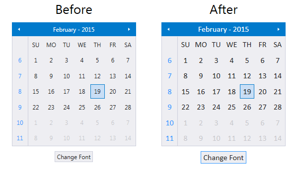
As the following example shows, you can change the default FontFamily from "Segoe UI" to "Calibri" and the FontSize from 12 to 16 on a click of a button:
<StackPanel>
    <StackPanel Orientation="Horizontal" HorizontalAlignment="Center">
        <telerik:RadCalendar x:Name="Calendar" Width="250" Height="250" Margin="4 10"/>
        <telerik:RadClock x:Name="Clock" Height="250" Margin="4 10" TimeInterval="0:0:1"/>
    </StackPanel>
    <telerik:RadButton x:Name="BtnChangeFontSize" VerticalAlignment="Center"
                       HorizontalAlignment="Center" Content="Change Font"
                       Click="OnButtonChangeFontSizeClick" />
</StackPanel>
private void OnButtonChangeFontSizeClick(object sender, RoutedEventArgs e)
{
   VisualStudio2013Palette.Palette.FontSize = 16;
   VisualStudio2013Palette.Palette.FontFamily = new FontFamily("Calibri");
}
Changing Opacity
Since the R2 2019 version, you can easily change the opacity of the disabled and read-only elements by using the DisabledOpacity and ReadOnlyOpacity properties of the VisualStudio2013Palette. The default values are 0.2 and 0.4 respectively.
Also, to control the background and border color in the read-only state, you can use the following brushes:
-
ReadOnlyBackgroundBrush—Used as a background of elements that are in a read-only state. -
ReadOnlyBorderBrush—Used in borders inside elements that are in a read-only state.
Changing the read-only and disabled opacity
VisualStudio2013Palette.Palette.ReadOnlyOpacity = 0.5;
VisualStudio2013Palette.Palette.DisabledOpacity = 0.5;
Merging Modified Palette Resources With StyleManager Theming Approach
When modifying fonts, colors, or other resources from the VisualStudio2013Palette and StyleManager is used as theming mechanism, the theme's ResourceDictionary needs to be merged in App.xaml file to apply the changes.
Merging the theme's ResourceDictionary in App.xaml
<Application.Resources>
    <ResourceDictionary>
        <ResourceDictionary.MergedDictionaries>
            <telerik:VisualStudio2013ResourceDictionary/>
        </ResourceDictionary.MergedDictionaries>
    </ResourceDictionary>
</Application.Resources>