Office2019 Theme
Inspired by the well-known Microsoft Office productivity suite and its latest version, the Office2019 theme is here to help re-creating and delivering that fresh and smooth look and feel to your WPF apps. Explore the Light, Gray and Dark built-in color variations of the Office2019 theme and get off to a flying start with your WPF applications.
With the R3 2021 release, we have expanded the built-in color variations with a brand-new one - the
HighContrast. In addition to it, we extended the theme palette with several brushes. Read more in the Default Theme Colors topic.
Jump to the following topics to learn about the specifics of the theme's palette and features.
- Default Theme Colors
- Default Theme Brushes
- Changing Palette Colors
- Changing Theme Variation
- Changing Font Properties
- Using Glyphs
- Using Theme Helper
- Setting White Color Variation
- Changing Opacity
Default Theme Colors
The Office2019 theme is designed to be easily modified via the exposed colors in the theme palette.
The default values of the brushes in the theme are listed below.
| Color name | Light | Gray | Dark | HighContrast | ||||
|---|---|---|---|---|---|---|---|---|
| AccentBackgroundColor | #106EBE | #106EBE | #106EBE | #1AEBFF | ||||
| AccentBorderColor | #106EBE | #106EBE | #106EBE | #1AEBFF | ||||
| AccentMouseOverBackgroundColor | #D4E8F8 | #D4E8F8 | #D4E8F8 | #FFFF00 | ||||
| AccentMouseOverBorderColor | #2F96ED | #2F96ED | #2F96ED | #1AEBFF | ||||
| AccentPressedBackgroundColor | #A1CDED | #A1CDED | #A1CDED | #1AEBFF | ||||
| AlternativeBackgroundColor | #F1F1F1 | #CBCBCB | #3C3C3C | #000000 | ||||
| BaseBackgroundColor | #DFDFDF | #767272 | #151515 | #000000 | ||||
| ButtonBackgroundColor | #E5E5E5 | #BFBFBF | #3D3D3D | #000000 | ||||
| CheckedForegroundColor | #FFFFFF | #FFFFFF | #FFFFFF | #000000 | ||||
| DisabledBackgroundColor | #F1F1F1 | #CBCBCB | #3F3E3C | #808080 | ||||
| DisabledBorderColor | #D6D6D6 | #BEBEBE | #4F4F4F | #FFFFFF | ||||
| HeaderBackgroundColor | #106EBE | #106EBE | #106EBE | #37006E | ||||
| HeaderForegroundColor | #FFFFFF | #FFFFFF | #FFFFFF | #FFFFFF | ||||
| HighlightedForegroundColor | #2F2F2F | #2F2F2F | #2F2F2F | #000000 | ||||
| IconColor | #606060 | #333333 | #A6A6A6 | #FFFFFF | ||||
| MainBackgroundColor | #FFFFFF | #E2E2E2 | #2F2F2F | #000000 | ||||
| MainBorderColor | #ACACAC | #A6A6A6 | #606060 | #FFFFFF | ||||
| MainForegroundColor | #000000 | #000000 | #F1F1F1 | #FFFFFF | ||||
| MouseOverBackgroundColor | #C8C7C4 | #ACACAC | #B3AFAD | #1AEBFF | ||||
| PressedBackgroundColor | #B3AFAD | #918E8D | #767676 | #1AEBFF | ||||
| ReadOnlyBackgroundColor | #FFFFFF | #E2E2E2 | #2F2F2F | #008000 | ||||
| ReadOnlyBorderColor | #ACACAC | #A6A6A6 | #606060 | #FFFFFF | ||||
| SecondaryBackgroundColor | #D6D5D5 | #B6B3B1 | #2B2B2B | #37006E | ||||
| SecondaryForegroundColor | #000000 | #FFFFFF | #F1F1F1 | #FFFFFF | ||||
| ValidationColor | #E43E00 | #E43E00 | #E43E00 | #EB0300 |
Additionally introduced brushes follow, which are available after the R3 2021.
| Color name | Light | Gray | Dark | HighContrast | ||||
|---|---|---|---|---|---|---|---|---|
| DisabledCheckedForegroundColor | #FFFFFF | #FFFFFF | #FFFFFF | #808080 | ||||
| DisabledForegroundColor | #000000 | #000000 | #F1F1F1 | #00FF00 | ||||
| DisabledIconColor | #606060 | #333333 | #A6A6A6 | #00FF00 | ||||
| IconWrapperColor | transparent | transparent | transparent | #000000 | ||||
| SelectedUnfocusedBackgroundColor | #E5E5E5 | #BFBFBF | #3D3D3D | #808080 | ||||
| TertiaryBackgroundColor | #F1F1F1 | #CBCBCB | #3C3C3C | #37006E |
More information about each color and the respective brush that is created from it follows in the next topic.
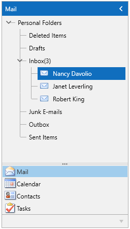
Theme colors represented in RadOutlookBar
Default Theme Brushes
Accent Brushes
-
AccentBackgroundBrush—Used for the background of the elements that should have accent - e.g. the background of the toggle button in its checked state. -
AccentBorderBrush—Used for the border color of the elements that should have accent - e.g. the border color of the toggle button in its checked state. -
AccentMouseOverBackgroundBrush—Used for the background of the accent elements in their mouse over state (e.g. all buttons except the ones in the RadRibbonView). -
AccentMouseOverBorderBrush—Used for the border color of the accent elements in their mouse over state (e.g. all buttons except the ones in the RadRibbonView). -
AccentPressedBackgroundBrush—Used for the background of the accent elements in their pressed state (e.g. all buttons except the ones in the RadRibbonView). Also used for the buttons, toggling dropdown menus (opened state).
Foreground Brushes
-
MainForegroundBrush—This is the default foreground of the theme. -
SecondaryForegroundBrush—Used for the foreground of the elements, placed over a background that would otherwise require reverting the default foreground - e.g. the BaseBackgroundBrush. It could be used as a default foreground to controls like the MS CheckBox, RadioButton, GroupBox in such scenarios. May also be considered for buttons with IsBackgroundVisible="False". -
HighlightedForegroundBrush—Used for the foreground of the elements when their parent is highlighted/hovered, pressed or selected/checked and hovered at once. -
CheckedForegroundBrush—Used for the foreground of the elements when their parent is in its selected/checked state. -
HeaderForegroundBrush—Used for the foreground of the header elements in a Window-based controls (e.g. RadWindow, RadTabbedWindow, FileDialogs, etc.). -
IconBrush—Used for the default foreground of the RadGlyph icons.
Base Brushes
-
BaseBackgroundBrush—This is the recommended background to be used as an application background with this theme. It is also used as a background of the RadRichTextBox, RadSpreadsheet and RadPdfViewer controls. -
MainBackgroundBrush—Used for the background the inputs and other editable elements such as RadAutocompleteBox, the content of their dropdowns/popup menus, and some child control elements like RadTaskBoard’s card, RadTileList’s tile, etc. -
MainBorderBrush—This is the default border color of all controls. -
SecondaryBackgroundBrush—Used for the background of non-editable, secondary elements - e.g. the RadCalculator's alternate buttons. Also used for the default background of the RadProgressBar's track and the RadSlider. -
AlternativeBackgroundBrush—Used for the background of the RadMenu, RadOutlookBar, RadSpreadsheet specific child-controls and the footer background of its dialogs, RadRibbonView's tabs background, RadGridView's panels background (GroupPanel, SearchPanel), alternation rows background, etc. -
ButtonBackgroundBrush—This is the default background of all buttons. -
HeaderBackgroundBrush—Used for the background of the header elements in a Window-based controls (e.g. RadWindow, RadTabbedWindow, FileDialogs, etc.). -
MouseOverBackgroundBrush—Used for the background of the non-accent elements in their mouse over state - e.g. the background of the RadRibbonView's buttons. -
PressedBackgroundBrush—Used for the background of the non-accent elements in their pressed state - e.g. the background of the RadRibbonView's buttons. -
TertiaryBackgroundBrush—Used for the background of the chat control's TextMessageControl and the gantt view control's SpecialSlots.
The
TertiaryBackgroundBrushis not available with versions prior to the R3 2021 release of the UI for WPF suite.
Special State Brushes
-
DisabledBackgroundBrush—Used for the background of the controls in their disabled state. -
DisabledBorderBrush—Used for the border color of the controls in their disabled state. -
DisabledCheckedForegroundBrush—Used for the foreground of the elements in their disabled and checked state (RadGlyph icons included). -
DisabledForegroundBrush—Used for the foreground of the elements in their disabled state. -
DisabledIconBrush—Used for the foreground of the RadGlyph icons in their disabled state. -
IconWrapperBrush—Used as a wrapper background for the images/icons when their color/foreground conflicts with the background of their parent in its mouse over state. This brush is introduced mainly for the HighContrast color variation. Its color is transparent in the other color variations. -
ReadOnlyBackgroundBrush—Used for the background of the controls in their read-only state. -
ReadOnlyBorderBrush—Used for the border color of the controls in their read-only state. -
SelectedUnfocusedBackgroundBrush—Used for the background of the elements in their selected and not focused state (e.g., the GridViewRow, TreeListViewRow and the TreeViewItem). -
ValidationBrush—Used for the background/border color of the controls to indicate the validation errors - for the foreground of the invalid control, or as a border for the error tooltip, border for invalid rows and cells.
The
DisabledCheckedForegroundBrush,DisabledForegroundBrush,DisabledIconBrush,IconWrapperBrushandSelectedUnfocusedBackgroundBrushare not available with versions prior to the R3 2021 release of the UI for WPF suite.
Control Specific Brushes
-
ComparativeMeasureBrush—Used in the BulletGraph control as a value of the ComparativeMeasureBrush property. -
QualityGoodBrush—Used in the BulletGraph control as a value of the QualityGoodBrush property. -
QualityPoorBrush—Used in the BulletGraph control as a value of the QualityPoorBrush property. -
QualitySatisfactoryBrush—Used in the BulletGraph control as a value of the QualitySatisfactoryBrush property. -
TimeBarSelectionBorderBrush—Used for border color of the SelectionThumbHandle and the SelectionRange elements in the TimeBar control. -
TimelineInstantItemBrush—Used for the background of the TimelineInstantItem (in the TimelineInstantItemControlStyle). -
TimelineItemBrush—Used for the background of the TimelineItem (in the TimelineItemControlStyle).
All of the above brushes are not available with versions prior to the R3 2021 release of the UI for WPF suite.
Other Properties
-
DisabledOpacity—Used for the controls in their disabled state. -
HeaderBorderThickness—Used for wrapping header elements with a border. Introduced mainly for the HighContrast color variation for which it has value 1. For all other color variations its default value is 0. Also used for the tab control's items in their mouse over state. -
ReadOnlyOpacity—Used for the controls in their read-only state. -
FocusThickness—Used for the thickness of the focus border of the buttons. It is of typeThicknessand its default value is 2, 2, 2, 2.
The
HeaderBorderThicknessis not available with versions prior to the R3 2021 release of the UI for WPF suite.
Changing Palette Colors
The Office2019 theme provides dynamic change of the palette colors responsible for the brushes used in our controls. Their defaults are stated above. This mechanism is used to modify the color variation of the theme.
The general naming convention is: Office2019Palette.Palette.[name]Color is responsible for [name]Brush – e.g. Office2019Palette.Palette.AccentBackgroundColor sets the color for telerik:Office2019Resource ResourceKey=AccentBackgroundBrush
Changing the colors can be achieved in code behind.
Setting palette colors
Office2019Palette.Palette.AccentBackgroundColor = Color.FromRgb(255, 0, 0);
Changing Theme Variation
The Office2019 theme comes with three color variations, inspired by the colors used in MS Office. The Light variation corresponds to Microsoft's Colorful Office theme, the Gray - to the Dark Gray Office2019 theme and the Dark - to the Black Office2019 theme. The following example demonstrates the ability to switch between the supported Light, Gray, Dark and HighContrast color palettes by calling the LoadPreset() method as shown below:
Changing the color variation of the theme
//default color variation
Office2019Palette.LoadPreset(Office2019Palette.ColorVariation.Light);

//Gray color variation
Office2019Palette.LoadPreset(Office2019Palette.ColorVariation.Gray);

//Dark color variation
Office2019Palette.LoadPreset(Office2019Palette.ColorVariation.Dark);

//HighContrast color variation
Office2019Palette.LoadPreset(Office2019Palette.ColorVariation.HighContrast);
All variations of the theme are designed with a specific background in mind and it is recommended to use such a background in your application when working with it - it is represented by the theme palette's
BaseBackgroundBrush.
Changing Font Properties
When using the Office2019 theme you can dynamically change the FontSize and FontFamily properties of all components in the application the same way as you do in all other Available Themes which support ThemePalette.
The FontSize and FontFamily properties are public and can be easily modified at a single point. The most commonly used font size in the theme is with value 12 and can be modified through the Office2019Palette.Palette.FontSize property in the same manner as in the other themes that support a theme palette.
The default font used in the theme is Segoe UI.
For complex scenarios it is strongly recommend to set the FontSize properties only before the application is initialized.
The following example shows the default font sizes and families.
Default FontSize
Office2019Palette.Palette.FontSize = 12;
Office2019Palette.Palette.FontSizeS = 13;
Office2019Palette.Palette.FontSizeM = 14;
Office2019Palette.Palette.FontSizeL = 16;
Changing the theme's FontSize and FontFamily
private void OnButtonChangeFontSizeClick(object sender, RoutedEventArgs e)
{
    Office2019Palette.Palette.FontSize = 18;
    Office2019Palette.Palette.FontFamily = new FontFamily("Calibri Italic");
}
Using Glyphs
The Office2019 theme also uses the Telerik Web UI font glyphs by default. The RadGlyph provides a lightweight, flexible and design-time-friendly implementation of our glyph font.
You can read more about the RadGlyph in the RadGlyph Overview article and about the range of the font glyphs in the Font Glyphs Overview article.
Using Theme Helper
The ThemeHelper class is used in the Office2019 theme. It exposes a set of attached properties and can be used to directly modify the appearance of a specific basic control without the need to alter its control template.
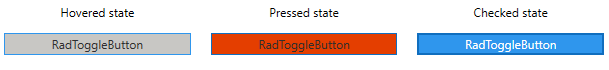
This example shows a RadToggleButton control with modified brushes for its different states through the ThemeHelper class:
Set RadToggleButton's visual appearance through the ThemeHelper class
<telerik:RadToggleButton Content="RadToggleButton"
                         Margin="10"
                         xmlns:helpers="clr-namespace:Telerik.Windows.Controls.Theming.Helpers;assembly=Telerik.Windows.Controls"
                         helpers:ThemeHelper.MouseOverBrush="{telerik:Office2019Resource ResourceKey=AccentMouseOverBrush}"
                         helpers:ThemeHelper.PressedBrush="{telerik:Office2019Resource ResourceKey=ValidationBrush}"
                         helpers:ThemeHelper.CheckedBrush="{telerik:Office2019Resource ResourceKey=AccentMainBrush}"/>
Setting White Color Variation
The theme has a few built-in color variations - Light, Gray and Dark. You can customize the Light variation and make it look like Microsoft's White Office Theme by changing several color properties of the theme palette.
To achieve this, first ensure that the Light variation is applied. This is the default one, so no explicit actions are required here. Then, set the following color properties:
Applying palette colors
Office2019Palette.Palette.ButtonBackgroundColor = (Color)ColorConverter.ConvertFromString("#FFFFFF");
Office2019Palette.Palette.BaseBackgroundColor = (Color)ColorConverter.ConvertFromString("#FFFFFF");
Office2019Palette.Palette.AlternativeBackgroundColor = (Color)ColorConverter.ConvertFromString("#FAFAFA");
Office2019Palette.Palette.SecondaryBackgroundColor = (Color)ColorConverter.ConvertFromString("#F1F1F1");
Changing Opacity
If you need to change the opacity of the disabled and read-only elements, you can easily do so by using the DisabledOpacity and ReadOnlyOpacity properties of the Office2019Palette. The default values are 0.3 and 0.6 respectively.
Changing the opacity
Office2019Palette.Palette.DisabledOpacity = 0.5;
Office2019Palette.Palette.ReadOnlyOpacity = 0.5;
Merging Modified Palette Resources With StyleManager Theming Approach
When modifying fonts, colors, or other resources from the Office2019Palette and StyleManager is used as theming mechanism, the theme's ResourceDictionary needs to be merged in App.xaml file to apply the changes.
Merging the theme's ResourceDictionary in App.xaml
<Application.Resources>
    <ResourceDictionary>
        <ResourceDictionary.MergedDictionaries>
            <telerik:Office2019ResourceDictionary/>
        </ResourceDictionary.MergedDictionaries>
    </ResourceDictionary>
</Application.Resources>