Fluent Theme
The Fluent theme comes with built-in elements that provide interaction feedback, with easy-to-customize colors and beautiful interpretation of the Fluent design system.
Jump to the following topics to learn about the specifics of the theme's palette and features.
- Default Theme Colors
- FluentPalette Properties
- Changing Palette Colors
- Changing Theme Variation
- Changing Font Properties
- Using Glyphs
- Changing Corner Radius
- Visual Helpers
- Fluent Control
- Changing ScrollBarsMode
- Changing Opacity
Default Theme Colors
The Fluent theme has two color variations, that are designed to be easily modified via the exposed colors in the theme palette.
The default values of the colors in the theme are listed below:
| Color name | Light | Dark | ||
|---|---|---|---|---|
| AccentColor | #FF0099BC | #FF0099BC | ||
| AccentMouseOverColor | #FF00BFE8 | #FF00BFE8 | ||
| AccentPressedColor | #FF0087A4 | #FF0087A4 | ||
| AccentFocusedColor | #FF15D7FF | #FF15D7FF | ||
| BasicColor | #33000000 | #4CFFFFFF | ||
| BasicSolidColor | #FFCCCCCC | #FF4C4C4C | ||
| IconColor | #CC000000 | #CCFFFFFF | ||
| MainColor | #19000000 | #33FFFFFF | ||
| MarkerColor | #FF000000 | #FFFFFFFF | ||
| MarkerMouseOverColor | #FF000000 | #FF000000 | ||
| ValidationColor | #FFE81123 | #FFE81123 | ||
| ComplementaryColor | #FFCCCCCC | #FF333333 | ||
| MouseOverColor | #33000000 | #4CFFFFFF | ||
| PressedColor | #4C000000 | #26FFFFFF | ||
| AlternativeColor | #FFF2F2F2 | #FF2B2B2B | ||
| MarkerInvertedColor | #FFFFFFFF | #FFFFFFFF | ||
| PrimaryColor | #66FFFFFF | #66FFFFFF | ||
| PrimaryBackgroundColor | #FFFFFFFF | #FF000000 | ||
| PrimaryMouseOverColor | #FFFFFFFF | #FFFFFFFF | ||
| ReadOnlyBackgroundColor | #00FFFFFF | #00FFFFFF | ||
| ReadOnlyBorderColor | #FFCDCDCD | #FF4C4C4C |
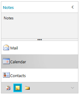
Theme colors represented in RadOutlookBar
FluentPalette Properties
Transparent Brushes
-
PrimaryBrush—Used in backgrounds of inputs. -
MouseOver—Used for an interaction of buttons. -
PressedBrush—Used for interaction of button-like controls. -
BasicBrush—Used in the majority of the normal state borders. -
BasicSolidBrush—Used for borders in the cases when several would overlap (in complex grid-structured controls) and is calculated automatically when theBasicBrushis changed by overlaying it on top of thePrimaryBackgroundBrush. -
MainBrush—Used for backgrounds of buttons, headers and footers. -
IconBrush—Used for glyph and path icons, which should be 80% of black/white and for the light/dark variation respectfully.
Opaque Brushes
-
PrimaryBackgroundBrush—Used when backgrounds need to be solid white/black -
AlternativeBrush—Used for backgrounds of popups, windows, listboxes etc and is slightly darker/lighter. -
ComplementaryBrush—Slightly darker/lighter than the alternative in case of collisions. -
AccentBrush—Used for coloring the primary accent elements. -
AccentMouseOverBrush—Variation of theAccentBrushthat is used for the hovered states of primary accent elements. -
AccentPressedBrush—Variation of theAccentBrushthat is used for the pressed states of primary accent elements. -
AccentFocusedBrush—Variation of theAccentBrushthat is used for the focused states of primary accent elements. -
MarkerBrush—Used for the majority of foregrounds which are black/white. -
MarkerInvertedBrush—Used for interactions states - white in both variations. -
MarkerMouseOverBrush—Used for mouse over and focused states of inputs which is black/black. -
ValidationBrush—A bright red brush that is used for the invalid elements, and validation tooltips. -
DisabledOpacity—Used for texts when they are disabled. Backgrounds are usuallyAlternativeBrushwhen disabled. -
InputOpacity—Used for texts in input controls (TextBox,RadMaskedInput, etc.) when they are in normal state. -
ReadOnlyOpacity—Used for texts in inputs when they are in a read-only state. -
FocusThickness—The default value is 2, 2, 2, 2. It is used for the thickness of the focus border as well as the thickness of the read only borders of inputs where applicable. -
FontFamily—The global font family used for the theme. By default it isSegoe UI.
Changing Palette Colors
The Fluent theme provides dynamic change of the palette colors responsible for the brushes used in the controls. Their defaults are stated above. This mechanism is used to modify the color variation of the theme.
The general naming convention is: FluentPalette.Palette.[name]Color is responsible for [name]Brush – e.g. FluentPalette.Palette.AccentColor sets the color for telerik:FluentResource ResourceKey=AccentBrush
Changing the colors can be achieved in code behind.
Setting palette colors
FluentPalette.Palette.AccentColor = Color.FromRgb(255, 0, 0);
Changing Theme Variation
You can switch between the color palettes by calling the LoadPreset method as shown below:
Changing the color variation of the theme
//default color variation
FluentPalette.LoadPreset(FluentPalette.ColorVariation.Light);

//dark color variation
FluentPalette.LoadPreset(FluentPalette.ColorVariation.Dark);
The
Darkvariation of the theme is designed with a dark background in mind and it is recommended to use such a background in your application when working with it.
Changing Font Properties
When using the Fluent theme you can dynamically change the FontSize and FontFamily properties of all components in the application.
The FontSize and FontFamily properties are public so you can easily modify the theme resources at a single point. The most commonly used font size in the theme is with value 12 and can be modified through the FluentPalette.Palette.FontSize property in the same manner as in the other themes that support a theme palette.
The default font used in the theme is Segoe UI.
For complex scenarios we strongly recommend setting the
FontSizeproperties only before the application is initialized.
Default FontSize and FontFamily
FluentPalette.Palette.FontSizeS = 10;
FluentPalette.Palette.FontSize = 12;
FluentPalette.Palette.FontSizeL = 13;
FluentPalette.Palette.FontSizeXL = 14;
FluentPalette.Palette.FontFamily = new FontFamily("Segoe UI");
Changing the theme's FontSize and FontFamily
private void OnButtonChangeFontSizeClick(object sender, RoutedEventArgs e)
{
    FluentPalette.Palette.FontSize = 13;
    FluentPalette.Palette.FontFamily = new FontFamily("Calibri Italic");
}

Using Glyphs
The Fluent theme also uses the Telerik Web UI font glyphs by default. With this theme we are introducting the RadGlyph which provides a lightweight, flexble and design-time-friendly implementation of out glyph font.
You can read more about the RadGlyph in the RadGlyph Overview article and about the range of the font glyphs in the Font Glyphs Overview article.
Changing Corner Radius
The Fluent Theme exposes an easy way to modify the corner radius of many elements in your application. You can directly use the corner radius property of the palette. By default the CornerRadius value is 0.
Changing the default corner radius
FluentPalette.Palette.CornerRadius = new CornerRadius(10);

Visual Helpers
Acrylic Effect
With the Fluent Theme we are introducting a ThemeEffectsHelper static class that is responsible for the iconic transparent and blurred effect that is associated with the design system. The ThemeEffectsHelper.IsAcrylic attached property can be applied to a Window, RadWindow, Popup and window-derivate controls to achieve this translucent effect. It is supported currently only under Windows 10. In any other operating system it would simply result in a transparent window/popup.
For the acrylic effect to properly apply, the control that it is used on needs to be transparent (i.e., the Window and Popup controls need to have their
AllowsTransparencyproperty set to True).
The acrylic effect is disabled for windows which have their
CornerRadiusproperty set.
ThemeEffectsHelper.IsAcrylicEnabledis used to turn off globally the setting of the effect and set opaque backgrounds in our controls. You can detect the version of the OS that the application is currently running and disable the effect for versions prior toWindows 10. For more information about achieving that you can review the following MSDN articles: Operating System Version and Targeting your application for Windows (if the application is not targeting Windows 10, the version number returned would be always 6.2)
Applying the
ThemeEffectsHelper.IsAcrylicto a control could result in unexpected visual issues.
Material Assist
The MaterialAssist static class comes from the Material theme and it is reused in the Fluent theme. It exposes a set of attached properties and can be used to directly modify the appearance of a specific basic control without the need to alter its control template. You can use the following dependency properties directly in XAML:
-
ShadowDepth—Enum property that indicates the depth of the shadow effect over the control. There are 5 values that can be selected. -
IsShadowDisabled—The property is used to control the visibility of the shadow effect.
Theme Helper
The ThemeHelper class is used in the Windows11 theme. It exposes a set of attached properties and can be used to directly modify the appearance of a specific basic control without the need to alter its control template.
Declare the namespace for the helpers
xmlns:mat="clr-namespace:Telerik.Windows.Controls.MaterialControls;assembly=Telerik.Windows.Controls"
xmlns:helpers="clr-namespace:Telerik.Windows.Controls.Theming.Helpers;assembly=Telerik.Windows.Controls"
Set RadToggleButton's visual appearance through the helpers
<telerik:RadToggleButton Content="RadButton"
                         Margin="10"
                         helpers:ThemeHelper.MouseOverBrush="{telerik:FluentResource ResourceKey=AccentMouseOverBrush}"
                         helpers:ThemeHelper.PressedBrush="{telerik:FluentResource ResourceKey=AccentPressedBrush}"
                         helpers:ThemeHelper.CheckedBrush="{telerik:FluentResource ResourceKey=ValidationBrush}"/>


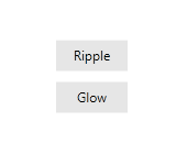
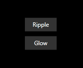
Fluent Control
The FluentControl is an element designed for the Fluent theme and used to display the interaction of the users with some of the controls. It is mainly used within the template of controls that suggest user actions such as the RadButton, RadToggleButton, etc. It adds "Ripple" and "Glow" effects and exposes several properties which you can use to modify the ripple/glow functionality and its appearance:
-
IsRippleEnabled—Indicates whether the ripple effect is enabled. -
IsRippleCentered—Controls the initial position from where the ripple effect starts. Setting the property to true will cause the effect to always start from the center of the control. Otherwise, the cursor position is respected. -
IsSmartClipped—Sets whether the ripple should be within the boundaries of the corner radius. -
RippleBrush—Sets the brush used for the ripple effect. The default is a RadialGradientBrush that is moved and transformed runtime. -
RippleOpacity—Sets the opacity of the ripple effect. -
BorderGradient—Sets the border gradient brush. This brush should be RadialGradientBrush and is cloned in code because it is modified runtime and should not be frozen. -
EffectMode—Sets the opacity of the ripple effect mode of the control - Ripple or Glow. The default effect is Ripple.
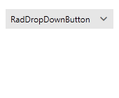
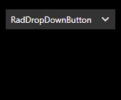
Ripple effect оn RadDropDownButton
The following code snippets show how you can integrate the FluentControl with a RadButton
RadButton's Style declaration
 <Style TargetType="telerik:RadButton" x:Key="custom">
    <Setter Property="Foreground" Value="{telerik:FluentResource ResourceKey=MarkerBrush}" />
    <Setter Property="Background" Value="{telerik:FluentResource ResourceKey=MainBrush}" />
    <Setter Property="BorderBrush" Value="{telerik:FluentResource ResourceKey=MainBrush}" />
    <Setter Property="BorderThickness" Value="1" />
    <Setter Property="Padding" Value="10 5" />
    <Setter Property="HorizontalAlignment" Value="Center" />
    <Setter Property="HorizontalContentAlignment" Value="Center" />
    <Setter Property="MinWidth" Value="64" />
    <Setter Property="Template">
        <Setter.Value>
            <ControlTemplate TargetType="telerik:RadButton">
                <Grid>
                    <Border Background="{TemplateBinding Background}" />
                    <mat:FluentControl EffectMode="{TemplateBinding Tag}"
                                       BorderThickness="{TemplateBinding BorderThickness}">
                        <ContentPresenter Focusable="False"
                                          HorizontalAlignment="{TemplateBinding HorizontalContentAlignment}"
                                          TextBlock.Foreground="{TemplateBinding Foreground}"
                                          Margin="{TemplateBinding Padding}"
                                          Content="{TemplateBinding Content}" />
                    </mat:FluentControl>
                </Grid>
                <ControlTemplate.Triggers>
                    <Trigger Property="IsMouseOver" Value="True">
                        <Setter Property="Background" Value="{telerik:FluentResource ResourceKey=MouseOverBrush}" />
                    </Trigger>
                    <Trigger Property="IsPressed" Value="True">
                        <Setter Property="Background" Value="{telerik:FluentResource ResourceKey=PressedBrush}" />
                    </Trigger>
                </ControlTemplate.Triggers>
            </ControlTemplate>
        </Setter.Value>
    </Setter>
</Style>
RadButton's instancing
 <StackPanel VerticalAlignment="Center">
    <telerik:RadButton VerticalAlignment="Center" Content="Ripple"
                       Tag="{x:Static mat:FluentControlEffectMode.Ripple}"
                       Style="{StaticResource custom}" />
    <telerik:RadButton VerticalAlignment="Center" Content="Glow" Margin="0 10 0 0"
                       Tag="{x:Static mat:FluentControlEffectMode.Glow}"
                       Style="{StaticResource custom}" />
</StackPanel>
Disabling the Ripple effect
 <!--If you are using the NoXaml binaries you should base the style on the default one for the theme like so
    <Style TargetType="mat:FluentControl" BasedOn="{StaticResource FluentControlStyle}" >
    -->

<Style TargetType="mat:FluentControl" >
    <Setter Property="IsRippleEnabled" Value="False" />
</Style>
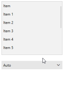
Changing ScrollBarsMode
By default, the scrollbars in the Fluent theme change their size depending on whether the mouse is currently over them. They are normally smaller in size to take less space and become wider when hovered. You have the option of setting the ScrollBarsMode property of the Fluent palette in order to control this behavior. It is of type ScrollViewerScrollBarsMode and can be set to one of the following values:
-
ScrollViewerScrollBarsMode.Auto—The ScrollBars appear as a narrow sliver and expand to normal size on MouseOver. This is the default value. -
ScrollViewerScrollBarsMode.Compact—The ScrollBars appear always as a narrow sliver. -
ScrollViewerScrollBarsMode.Normal—The ScrollBars appear always with their normal size.
The
ScrollBarModeproperty and theScrollViewerScrollBarsModeenumeration of the FluentPalette, introduced with the 2019.1.121 version of our dlls, are obsolete and replaced by theScrollBarsModeproperty of the palette and theScrollViewerScrollBarsModeenum under theTelerik.Windows.Controls.Themingnamespace.
ScrollBar behavior in Auto, Compact and Normal ScrollBarsMode
Setting the ScrollBarsMode property of the palette to Compact
FluentPalette.Palette.ScrollBarsMode = Telerik.Windows.Controls.Theming.ScrollViewerScrollBarsMode.Compact;
Changing Opacity
If you need to change the opacity of the disabled and read-only elements, you can now easily do so by using the DisabledOpacity and ReadOnlyOpacity properties of the FluentPalette. The default values are 0.3 and 0.5 respectively.
Changing the opacity
FluentPalette.Palette.DisabledOpacity = 0.5;
FluentPalette.Palette.ReadOnlyOpacity = 0.4;
FluentPalette.Palette.DisabledOpacity = 0.5
FluentPalette.Palette.ReadOnlyOpacity = 0.4
Merging Modified Palette Resources With StyleManager Theming Approach
When modifying fonts, colors, or other resources from the FluentPalette and StyleManager is used as theming mechanism, the theme's ResourceDictionary needs to be merged in App.xaml file to apply the changes.
Merging the theme's ResourceDictionary in App.xaml
<Application.Resources>
    <ResourceDictionary>
        <ResourceDictionary.MergedDictionaries>
            <telerik:FluentResourceDictionary/>
        </ResourceDictionary.MergedDictionaries>
    </ResourceDictionary>
</Application.Resources>