Office2016Touch Theme
The Office2016Touch theme is a variation of the Office2016 theme, especially created to be suitable for touch interfaces and to provide larger and more easily accessible components. Part of the controls are simply larger, but some of them are redesigned for easier touch manipulation.
Jump to the following topics to learn about the specifics of the theme's palette and features.
- Differences From the Office2016 Theme
- Default Theme Colors
- Default Theme Brushes
- Changing Palette Colors
- Changing Font Properties
- Changing FocusThickness
- Changing Corner Radius
- Using Glyphs
- Changing Opacity
Differences From the Office2016 Theme
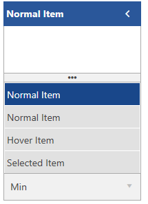
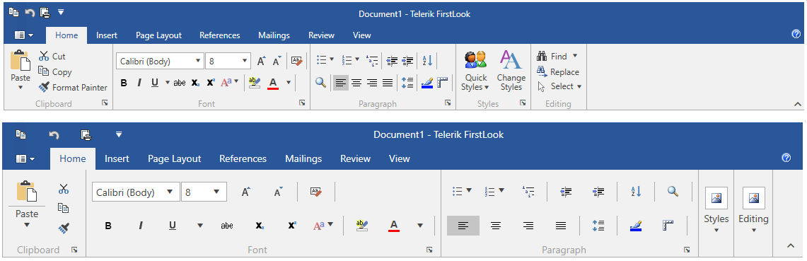
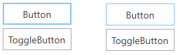
The Office2016Touch theme is, as the name suggests, very similar to the Office2016 theme but with larger controls and wider spaces for easier interaction. There are several controls that differ significantly and the following figures shows some of them.
RadNumericUpDown

RadOutlookBar
RadRibbonView
Default Theme Colors
Office2016Touch has one color variation, designed to be easily modified via the exposed colors in the theme palette. The default values of the brushes in the theme are the same as in the Office2016 theme.
| Color name | Hex code | |
|---|---|---|
| MainColor | #FFFFFFFF | |
| PrimaryColor | #FFE6E6E6 | |
| ComplementaryColor | #FFE1E1E1 | |
| AlternativeColor | #FFF1F1F1 | |
| BasicColor | #FFABABAB | |
| MarkerColor | #FF444444 | |
| MarkerInvertedColor | #FFF9F9F9 | |
| IconColor | #FF444444 | |
| ValidationColor | #FFE81123 | |
| AccentColor | #FF2A579A | |
| AccentMouseOverColor | #FF3E6DB6 | |
| AccentPressedColor | #FF19478A | |
| AccentFocusedColor | #FF88C3FF | |
| MouseOverColor | #FFC5C5C5 | |
| PressedColor | #FFAEAEAE | |
| SelectedColor | #FFEBEBEB | |
| ReadOnlyBackgroundColor | #FFFFFFFF | |
| ReadOnlyBorderColor | #FFABABAB |
Default Theme Brushes
The usage of the theme palette’s brushes is the same as in the Office2016 theme.
Changing Palette Colors
The Office2016Touch theme provides dynamic change of the palette colors responsible for the brushes used in our controls. Their defaults are stated above. This mechanism is used to modify the color variation of the theme.
The general naming convention is: Office2016TouchPalette.Palette.[name]Color is responsible for [name]Brush – e.g. Office2016TouchPalette.Palette.AccentColor sets the color for telerik:Offie2016TouchResource ResourceKey=AccentBrush
Changing the colors can be achieved in code behind.
Setting palette colors
Office2016TouchPalette.Palette.AccentColor = Color.FromRgb(255, 0, 0);
Changing Font Properties
When using the Office2016Touch theme you can dynamically change the FontSize and FontFamily properties of all components in the application the same way as you do in all other Available Themes which support ThemePalette.
The FontSize and FontFamily properties are public so you can easily modify the theme resources at a single point. The most commonly used font size in the theme is named FontSize and its default value is 12.
For complex scenarios we strongly recommend setting the
FontSizeproperty only initially before the application is initialized. Also, we recommend values between 11px and 19px for it.
Default FontSize and FontFamily
Office2016TouchPalette.Palette.FontSizeS = 12;
Office2016TouchPalette.Palette.FontSize = 14;
Office2016TouchPalette.Palette.FontSizeL = 16;
Office2016TouchPalette.Palette.FontFamily = new FontFamily("Segoe UI");
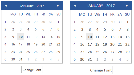
Example view definition
<StackPanel>
    <telerik:RadCalendar HorizontalAlignment="Center" />
    <telerik:RadButton Content="Change Font" Click="OnButtonChangeFontSizeClick" />
</StackPanel>
Changing the theme's FontSize and FontFamily
private void OnButtonChangeFontSizeClick(object sender, RoutedEventArgs e)
{
    Office2016TouchPalette.Palette.FontSize = 16;
    Office2016TouchPalette.Palette.FontFamily = new FontFamily("Calibri");
}
Changing FocusThickness
The Office2016Touch theme’s palette includes a FocusThickness property. It defines the thickness of the buttons’ focus border. As our design is inspired by the Microsoft Office, the focus border of the buttons is thicker than the one of the other controls and elements. By default the FocusThickness is set to 2, but it can be easily changed in a similar way as the other palette properties.
Changing the theme's FocusThickness
Office2016TouchPalette.Palette.FocusThickness = new Thickness(1);
Changing Corner Radius
The Office2016Touch theme exposes an easy way to modify the corner radius of many elements in your application. You can use corner radius properties of the palette. Their default value is 0.
Setting corner radius
Office2016TouchPalette.Palette.CornerRadius = new CornerRadius(0,0,0,0);
Office2016TouchPalette.Palette.CornerRadiusTop = new CornerRadius(0,0,0,0);
Office2016TouchPalette.Palette.CornerRadiusBottom = new CornerRadius(0,0,0,0);
Office2016TouchPalette.Palette.CornerRadiusLeft = new CornerRadius(0,0,0,0);
Office2016TouchPalette.Palette.CornerRadiusRight = new CornerRadius(0,0,0,0);
Changing the default corner radius
Office2016TouchPalette.Palette.CornerRadius = new CornerRadius(3);
Office2016TouchPalette.Palette.CornerRadiusBottom = new CornerRadius(0, 0, 3, 3);
Office2016TouchPalette.Palette.CornerRadiusLeft = new CornerRadius(3, 0, 0, 3);
Office2016TouchPalette.Palette.CornerRadiusRight = new CornerRadius(0, 3, 3, 0);
Office2016TouchPalette.Palette.CornerRadiusTop = new CornerRadius(3, 3, 0, 0);

Using Glyphs
The font glyphs that have been introduced with the Office2016 theme are built-in for the Office2016Touch theme as well. They provide a number of ready-to-use vector icons from the TelerikWebUI font. You can learn more about them and the usage from the Font Glyphs Overview article.
Changing Opacity
You can easily change the opacity of any disabled element by using the DisabledOpacity property of the Office2016TouchPalette. The default value of the property is 0.5.
Changing the disabled opacity
Office2016TouchPalette.Palette.DisabledOpacity = 0.3;

Merging Modified Palette Resources With StyleManager Theming Approach
When modifying fonts, colors, or other resources from the Office2016TouchPalette and StyleManager is used as theming mechanism, the theme's ResourceDictionary needs to be merged in App.xaml file to apply the changes.
Merging the theme's ResourceDictionary in App.xaml
<Application.Resources>
    <ResourceDictionary>
        <ResourceDictionary.MergedDictionaries>
            <telerik:Office2016TouchResourceDictionary/>
        </ResourceDictionary.MergedDictionaries>
    </ResourceDictionary>
</Application.Resources>