Crystal Theme
Inspired by MacOS, the Crystal theme delivers the renown Mac OS look and feel to your WPF apps. The team at Apple have been a trend setter with their clean UI and with the Crystal theme you will be able to bring that style to your own apps.
Jump to the following topics to learn about the specifics of the theme's palette and features.
- Default Theme Colors
- Default Theme Brushes
- Changing Palette Colors
- Changing Theme Variation
- Changing Font Properties
- Using Glyphs
- Changing Corner Radius
- Visual Helpers
- Window Buttons Alignment
- Changing ScrollBarsMode
- Changing Opacity
Default Theme Colors
The Crystal theme is designed to be easily modified via the exposed colors in the theme palette.
The default values of the colors in the theme are listed below. Please note that as the theme uses a number of gradients, most of the colors have a low and high value which indicates the colors at both stops of the gradient.
| Color name | Light | Dark | ||
|---|---|---|---|---|
| AccentHighColor | #FF56A9FD | #FF56A9FD | ||
| AccentLowColor | #FF087EFF | #FF087EFF | ||
| AccentMouseOverHighColor | #FF2590FB | #FF2590FB | ||
| AccentMouseOverLowColor | #FF0072EE | #FF0072EE | ||
| AccentPressedColor | #FF0060CF | #FF0060CF | ||
| AccentFocusedColor | #FF7CB7F9 | #FF7CB7F9 | ||
| AccentSelectedColor | #FF1C83FF | #FF1C83FF | ||
| BasicHighColor | #FFCCCCCC | #FF818181 | ||
| BasicLowColor | #FFA4A3A4 | #FF4F4F4F | ||
| AccentBasicHighColor | #FF2390FD | #FF2390FD | ||
| AccentBasicLowColor | #FF0052E6 | #FF0052E6 | ||
| IconColor | #FF505050 | #FFFFFFFF | ||
| MainHighColor | #FFFFFFFF | #FF686868 | ||
| MainLowColor | #FFF3F3F3 | #FF5F5F5F | ||
| MarkerColor | #FF020202 | #FFFFFFFF | ||
| ValidationColor | #FFD40012 | #FFD40012 | ||
| ComplementaryColor | #FFDEDEDE | #FF252525 | ||
| ComplementaryBasicHighColor | #FFADADAD | #FF646464 | ||
| ComplementaryBasicLowColor | #FF8D8D8D | #FF4D4D4D | ||
| MouseOverHighColor | #FFF3F3F3 | #FF898989 | ||
| MouseOverLowColor | #FFEEEEEE | #FF818181 | ||
| PressedHighColor | #FFDCDCDC | #FF5B5B5B | ||
| PressedLowColor | #FFCDCDCD | #FF4B4B4B | ||
| AlternativeColor | #FFEAEAEA | #FF3A3A3A | ||
| AlternativeBasicColor | #FFD3D3D3 | #FF4D4D4D | ||
| MarkerInvertedColor | #FFFFFFFF | #FFFFFFFF | ||
| PrimaryBackgroundColor | #FFFFFFFF | #FF2C2C2C | ||
| HeaderHighColor | #FFE8E6E6 | #FF5B5B5B | ||
| HeaderLowColor | #FFD4D0D0 | #FF494949 | ||
| ReadOnlyBackgroundColor | #FFFFFFFF | #FF2C2C2C | ||
| ReadOnlyBorderColor | #FFA4A3A4 | #FF4D4D4D |
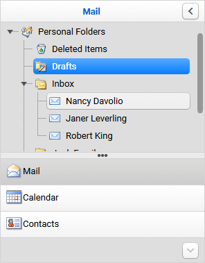
Theme colors represented in RadOutlookBar
Default Theme Brushes
Primary Brushes
-
PrimaryBackgroundBrush—Used in backgrounds of inputs. -
MainBrush—Used for backgrounds of buttons. -
AlternativeBrush—Used for backgrounds of popups, windows, listboxes etc. -
AlternativeBasicBrush—Used for borders in the cases when several would overlap (in complex grid-structured controls) and is calculated automatically when the BasicBrush is changed by overlaying it on top of the PrimaryBackgroundBrush -
BasicBrush—Used in the majority of the normal state borders. -
ComplementaryBrush—Slightly darker than the alternative in case of collisions. Used for background of footers as well. -
ComplementaryBasicBrush—Used for borders of windows. -
MarkerBrush—Used for the majority of foregrounds which are black. -
MarkerInvertedBrush—Used for interactions states - white in both variations. -
IconBrush—Used for glyph and path icons, which should be 80% of black. -
AccentBrush—Used for backgrounds of radio, repeat, split, toggle buttons, as well as picker control buttons – DatePicker, DateTimePicker, CalculatorPicker, etc. -
AccentBasicBrush—Used for border of the above-mentioned controls, that have AccentBrush for their background.
Interaction State Brushes
-
AccentFocusedBrush—Variation of the AccentBrush that is used for the focused states of primary accent elements.
-
AccentMouseOverBrush—Variation of the AccentBrush that is used for the hovered states of primary accent elements. -
AccentSelectedBrush—Variation of the AccentBrush that is used for the selected states of primary accent elements. -
AccentPressedBrush—Variation of the AccentBrush that is used for the pressed states of primary accent elements. -
MouseOverBrush—Used in backgrounds for the hovered states of non-accent elements. -
PressedBrush—Used in backgrounds for the pressed states of non-accent elements.
Special Brushes
-
HeaderBrush—Used in backgrounds of header elements. -
ValidationBrush—A bright red brush used for indicating validation errors - for the underline of the invalid control and as a background for the error tooltip, background for invalid rows and cells as well as for clear buttons' mouse over states.
Other Properties
-
DisabledOpacity—Used for text when they are disabled. Backgrounds usually use theAlternativeBrushwhen disabled. -
InputOpacity—Used for text in masked input controls and watermark elements. -
ReadOnlyOpacity—Used for text in inputs when they are in aread-onlystate. -
FocusThickness—The default value is 2, 2, 2, 2. It is used for the thickness of the focus border.
Changing Palette Colors
The Crystal theme provides dynamic change of the palette colors responsible for the brushes used in the controls. Their defaults are stated above. This mechanism is used to modify the color variation of the theme.
The general naming convention is: CrystalPalette.Palette.[name]Color is responsible for [name]Brush – e.g. CrystalPalette.Palette.AccentPressedColor sets the color for telerik:CrystalResource ResourceKey=AccentPressedBrush.
The colors ending with Low- and High- Color set the respective gradient stop color of a LinearGradientBrush.
Changing the colors can be achieved in code behind.
Setting palette colors
CrystalPalette.Palette.AccentPressedColor = Color.FromRgb(255, 0, 0);
Changing Theme Variation
You can switch between the color palettes by calling the LoadPreset method as shown below:
Changing the color variation of the theme
//default color variation
CrystalPalette.LoadPreset(CrystalPalette.ColorVariation.Light);

//dark color variation
CrystalPalette.LoadPreset(CrystalPalette.ColorVariation.Dark);
The
Darkvariation of the theme is designed with a dark background in mind and it is recommended to use such a background in your application when working with it.
Changing Font Properties
When using the Crystal theme you can dynamically change the FontSize and FontFamily properties of all components in the application.
The FontSize and FontFamily properties are public so you can easily modify the theme resources at a single point. The most commonly used font size in the theme is with value 13 and can be modified through the CrystalPalette.Palette.FontSize property in the same manner as in the other themes that support a theme palette.
The default font used in the theme is Roboto.
For complex scenarios we strongly recommend setting the FontSize properties only before the application is initialized.
Default FontSize
CrystalPalette.Palette.FontSizeXS = 11;
CrystalPalette.Palette.FontSizeS = 12;
CrystalPalette.Palette.FontSize = 13;
CrystalPalette.Palette.FontSizeL = 14;
CrystalPalette.Palette.FontSizeXL = 15;
Changing the theme's FontSize and FontFamily
private void OnButtonChangeFontSizeClick(object sender, RoutedEventArgs e)
{
    CrystalPalette.Palette.FontSize = 16;
    CrystalPalette.Palette.FontFamily = new FontFamily("Calibri Italic");
}
Using Glyphs
The Crystal theme also uses the Telerik Web UI font glyphs by default. The RadGlyph provides a lightweight, flexble and design-time-friendly implementation of our glyph font.
You can read more about the RadGlyph in the RadGlyph Overview article and about the range of the font glyphs in the Font Glyphs Overview article.
Changing Corner Radius
The Crystal theme exposes an easy way to modify the corner radius of many elements in your application. You can directly use the corner radius property of the palette. By default the CornerRadius value is 5.
Changing the default corner radius
CrystalPalette.Palette.CornerRadius = new CornerRadius(0);
Visual Helpers
Using Theme Helper
The ThemeHelper class is used in the Windows11 theme. It exposes a set of attached properties and can be used to directly modify the appearance of a specific basic control without the need to alter its control template.
Using Material Assist
The MaterialAssist static class comes from the Material theme and it is reused in the Crystal theme. It exposes a set of attached properties and can be used to directly modify the appearance of a specific basic control without the need to alter its control template. You can use the following dependency properties directly in XAML:
-
ShadowDepth—Enum property that indicates the depth of the shadow effect over the control. There are 5 values that can be selected. -
IsShadowDisabled—The property is used to control the visibility of the shadow effect.
Declare the namespace for the helper components
xmlns:mat="clr-namespace:Telerik.Windows.Controls.MaterialControls;assembly=Telerik.Windows.Controls"
xmlns:helpers="clr-namespace:Telerik.Windows.Controls.Theming.Helpers;assembly=Telerik.Windows.Controls"
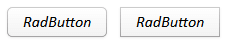
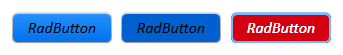
Set RadToggleButton's visual appearance through the visual helpers
  <telerik:RadToggleButton Content="RadButton"
                           Margin="10"
                           helpers:ThemeHelper.MouseOverBrush="{telerik:CrystalResource ResourceKey=AccentMouseOverBrush}"
                           helpers:ThemeHelper.PressedBrush="{telerik:CrystalResource ResourceKey=AccentPressedBrush}"
                           helpers:ThemeHelper.CheckedBrush="{telerik:CrystalResource ResourceKey=ValidationBrush}"/>
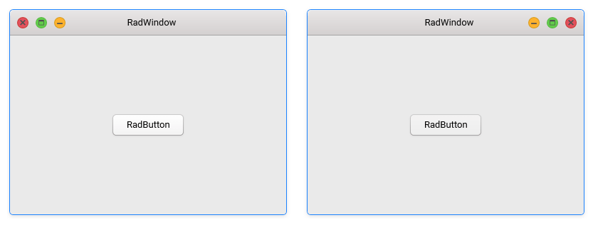
Window Buttons Alignment
In accordance to the MacOS design, by default the minimize, maximize, restore and close buttons of the RadWindow controls are displayed on the left of the window's title in the Crystal theme. This can be easily modified via the WindowButtonsAlignment property of the Crystal palette.
Changing the WindowButtonsAlignment
CrystalPalette.Palette.WindowButtonsAlignment = ButtonsAlignment.Right;
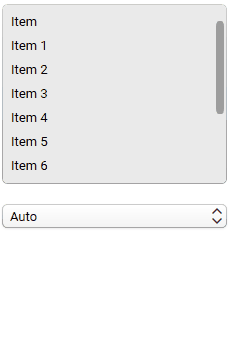
Changing ScrollBarsMode
By default, the scrollbars in the Crystal theme change their size depending on whether the mouse is currently over them. They are normally smaller in size to take less space and become wider when hovered. You have the option of setting the ScrollBarsMode property of the CrystalPalette in order to control this behavior. It is of type ScrollViewerScrollBarsMode and can be set to one of the following values:
-
ScrollViewerScrollBarsMode.Auto—The ScrollBars appear as a narrow sliver and expand to normal size on MouseOver. This is the default value. -
ScrollViewerScrollBarsMode.Compact—The ScrollBars appear always as a narrow sliver. -
ScrollViewerScrollBarsMode.Normal—The ScrollBars appear always with their normal size.
The
ScrollViewerScrollBarsModeenumeration of the CrystalPalette can be found under theTelerik.Windows.Controls.Themingnamespace.
ScrollBar behavior in Auto, Compact and Normal ScrollBarsMode
Setting the ScrollBarsMode property of the palette to Compact
CrystalPalette.Palette.ScrollBarsMode = Telerik.Windows.Controls.Theming.ScrollViewerScrollBarsMode.Compact;
Changing Opacity
If you need to change the opacity of the disabled and read-only elements, you can now easily do so by using the DisabledOpacity and ReadOnlyOpacity properties of the CrystalPalette. The default values are 0.35 and 0.55 respectively.
Changing the opacity
CrystalPalette.Palette.DisabledOpacity = 0.5;
CrystalPalette.Palette.ReadOnlyOpacity = 0.5;
CrystalPalette.Palette.DisabledOpacity = 0.5
CrystalPalette.Palette.ReadOnlyOpacity = 0.5
Merging Modified Palette Resources With StyleManager Theming Approach
When modifying fonts, colors, or other resources from the CrystalPalette and StyleManager is used as theming mechanism, the theme's ResourceDictionary needs to be merged in App.xaml file to apply the changes.
Merging the theme's ResourceDictionary in App.xaml
<Application.Resources>
    <ResourceDictionary>
        <ResourceDictionary.MergedDictionaries>
            <telerik:CrystalResourceDictionary/>
        </ResourceDictionary.MergedDictionaries>
    </ResourceDictionary>
</Application.Resources>