Add a Close Button to a RadTileViewItem
This article demonstrates how to add a close button next to the tile state change (minimize/maximize) button of the RadTileViewItems. The Command property of the close button will be bound to an ICommand that removes the item from the RadTileView's ItemsSource.
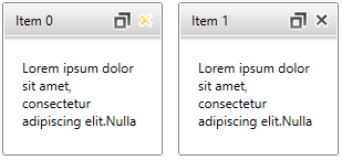
You can see the final result on the picture bellow:
Define the RadTileView in XAML and create the view model
The RadTileView in this scenario will be data bound to a collection of business objects.
- C#
- VB.NET
public class DataItem
{
    public string Header { get; set; }
    public string Content { get; set; }
}
Public Class DataItem
Public Property Header() As String
Get
Return m_Header
End Get
Set(value As String)
m_Header = Value
End Set
End Property
Private m_Header As String
Public Property Content() As String
Get
Return m_Content
End Get
Set(value As String)
m_Content = Value
End Set
End Property
Private m_Content As String
End Class The collection passed to the RadTileView's ItemsSource can be wrapped in a View Model class
- C#
- VB.NET
public class MainViewModel
{
    public ObservableCollection<DataItem> Items { get; set; }

    public MainViewModel()
    {
        this.Items = new ObservableCollection<DataItem>();

        for (int i = 0; i < 2; i++)
        {
            var dataItem = new DataItem()
            {
                Header = "Item " + i,
                Content = "Lorem ipsum dolor sit amet, consectetur adipiscing elit."
            };

            this.Items.Add(dataItem);
        }
    }
}
Public Class MainViewModel
Public Property Items() As ObservableCollection(Of DataItem)
Get
Return m_Items
End Get
Set(value As ObservableCollection(Of DataItem))
m_Items = Value
End Set
End Property
Private m_Items As ObservableCollection(Of DataItem)
Public Sub New()
Me.Items = New ObservableCollection(Of DataItem)()
For i As Integer = 0 To 4
Dim dataItem = New DataItem() With { _
.Header = "Item " + i, _
.Content = "Lorem ipsum dolor sit amet, consectetur adipiscing elit." _
}
Me.Items.Add(dataItem)
Next
End Sub
End Class After creating the view models you can add the RadTileView definition in xaml.
- XAML
<telerik:RadTileView ItemsSource="{Binding Items}"
                     MinimizedRowHeight="150"
                     MinimizedColumnWidth="200"
                     HeaderStyle="{StaticResource TileViewItemHeaderStyle1}">
    <telerik:RadTileView.DataContext>
        <local:MainViewModel />
    </telerik:RadTileView.DataContext>
    <telerik:RadTileView.ItemTemplate>
        <DataTemplate>
            <TextBlock Text="{Binding Header}" HorizontalAlignment="Right"/>
        </DataTemplate>
    </telerik:RadTileView.ItemTemplate>
    <telerik:RadTileView.ContentTemplate>
        <DataTemplate>
            <TextBlock Margin="16" Text="{Binding Content}" TextWrapping="Wrap" />
        </DataTemplate>
    </telerik:RadTileView.ContentTemplate>
</telerik:RadTileView>
Extract and Edit the RadTileViewItem HeaderStyle
The RadTileViewItem’s header is represented by TileViewItemHeader control. To add close button you can extract the Style of the TileViewItemHeader and slightly modify its ControlTemplate. Basically, you can find the RadToggleButton that represents the Minimize/Maximize button and wrap it in a Grid (or another panel) along with the new close button.
You can see the Editing Control Templates help article that demonstrates how to extract the Style with the ControlTemplate of a control.
- XAML
................
<Border BorderBrush="White" BorderThickness="0,0,0,1" Background="{TemplateBinding Background}" CornerRadius="1" Padding="10,0,7,0">
<Grid MinHeight="28">
    <Border x:Name="GripBarElement" Background="Transparent">
        <ContentPresenter x:Name="HeaderElement" ContentTemplate="{TemplateBinding ContentTemplate}" Content="{TemplateBinding Content}" HorizontalAlignment="{TemplateBinding HorizontalContentAlignment}" Margin="0,0,10,0" VerticalAlignment="{TemplateBinding VerticalContentAlignment}"/>
    </Border>

    <Grid HorizontalAlignment="Right" VerticalAlignment="Center">
        <Grid.ColumnDefinitions>
            <ColumnDefinition />
            <ColumnDefinition />
        </Grid.ColumnDefinitions>

        <telerik:RadButton Margin="2 0 0 0" Command="local:TileViewCommandsExtension.Delete" Grid.Column="1" x:Name="CloseButton" InnerCornerRadius="0">
            <telerik:RadButton.Style>
                <Style TargetType="{x:Type telerik:RadButton}">
                    <Setter Property="VerticalAlignment" Value="Center"/>
                    <Setter Property="HorizontalAlignment" Value="Right"/>
                    <Setter Property="Width" Value="17"/>
                    <Setter Property="Height" Value="17"/>
                    <Setter Property="Template">
                        <Setter.Value>
                            <ControlTemplate TargetType="{x:Type telerik:RadButton}">
                                <Grid Background="Transparent" SnapsToDevicePixels="True">
                                    <VisualStateManager.VisualStateGroups>
                                        <VisualStateGroup x:Name="CommonStates">
                                            <VisualState x:Name="Disabled"/>
                                            <VisualState x:Name="Normal"/>
                                            <VisualState x:Name="MouseOver">
                                                <Storyboard>
                                                    <ObjectAnimationUsingKeyFrames Storyboard.TargetProperty="Stroke" Storyboard.TargetName="closeButtonPath">
                                                        <DiscreteObjectKeyFrame KeyTime="0">
                                                            <DiscreteObjectKeyFrame.Value>
                                                                <SolidColorBrush Color="White" />
                                                            </DiscreteObjectKeyFrame.Value>
                                                        </DiscreteObjectKeyFrame>
                                                    </ObjectAnimationUsingKeyFrames>
                                                    <ObjectAnimationUsingKeyFrames Storyboard.TargetProperty="Fill" Storyboard.TargetName="closeButtonPath">
                                                        <DiscreteObjectKeyFrame KeyTime="0">
                                                            <DiscreteObjectKeyFrame.Value>
                                                                <LinearGradientBrush EndPoint="0.5,1" StartPoint="0.5,0">
                                                                    <GradientStop Color="#FFFEEDB7" Offset="0"/>
                                                                    <GradientStop Color="#FFFACA6A" Offset="1"/>
                                                                    <GradientStop Color="#FFFFC94A" Offset="0.526"/>
                                                                    <GradientStop Color="#FFFEEDB7" Offset="0.509"/>
                                                                </LinearGradientBrush>

                                                            </DiscreteObjectKeyFrame.Value>
                                                        </DiscreteObjectKeyFrame>
                                                    </ObjectAnimationUsingKeyFrames>
                                                </Storyboard>
                                            </VisualState>
                                        </VisualStateGroup>
                                    </VisualStateManager.VisualStateGroups>

                                    <Grid x:Name="closeButtonContent">
                                        <Path x:Name="closeButtonPath" Stretch="Uniform"
                                              Stroke="White"
                                              StrokeThickness="1.5"
                                              VerticalAlignment="Center"
                                              Height="15" Width="15"
                                              Data="M41.191966,0.5 L71.431967,0.5 71.431967,41.207996 112.12394,42.350311 111.27536,72.578407 71.431967,71.459915 71.431967,111.319 41.191966,111.319 41.191966,70.611007 0.5,69.468688 1.3485718,39.240596 41.191966,40.359092 z">
                                            <Path.LayoutTransform>
                                                <TransformGroup>
                                                    <ScaleTransform ScaleX="-1"/>
                                                    <SkewTransform/>
                                                    <RotateTransform Angle="45.01"/>
                                                    <TranslateTransform/>
                                                </TransformGroup>
                                            </Path.LayoutTransform>

                                            <Path.Fill>
                                                <LinearGradientBrush EndPoint="0.5,1" StartPoint="0.5,0">
                                                    <GradientStop Color="#FF282828"/>
                                                    <GradientStop Color="#FF7C7C7C" Offset="1"/>
                                                </LinearGradientBrush>
                                            </Path.Fill>
                                        </Path>
                                    </Grid>
                                </Grid>
                            </ControlTemplate>
                        </Setter.Value>
                    </Setter>
                </Style>
            </telerik:RadButton.Style>
        </telerik:RadButton>

        <telerik:RadToggleButton x:Name="MaximizeToggleButton" Command="TileView:TileViewCommands.ToggleTileState" InnerCornerRadius="0">
            .................
        </telerik:RadToggleButton>
    </Grid>
</Grid>
</Border>
...........
The code snippet above doesn't contain the complete definition of the TileViewItemHeader.ControlTemplate, but only the part of it that is changed. You can see the complete template in our GitHub SDK repository.
Implement the Close button’s command
The final stage of this tutorial is to implement the Close button’s command. We will use a static class holding an RoutedUICommand and then we will implement its behavior by adding command binding for it. To do so, you can follow the next steps:
-
Create a static class that holds the command.
- C#
- VB.NET
    public static class TileViewCommandsExtension
    {
        static TileViewCommandsExtension()
        {
            TileViewCommandsExtension.Delete = new RoutedUICommand("Deletes a tile view item", "Delete", typeof(TileViewCommandsExtension));
        }

        public static RoutedUICommand Delete { get; private set; }
    }
Public NotInheritable Class TileViewCommandsExtension Private Sub New() End Sub Shared Sub New() TileViewCommandsExtension.Delete = New RoutedUICommand("Deletes a tile view item", "Delete", GetType(TileViewCommandsExtension)) End Sub Public Shared Property Delete() As RoutedUICommand Get Return m_Delete End Get Private Set(value As RoutedUICommand) m_Delete = Value End Set End Property Private Shared m_Delete As RoutedUICommand End Class -
Set the Command property of the close RadButton in the ControlTemplate of the TileViewItemHeader to the command.
- XAML
<telerik:RadButton Margin="2 0 0 0" Command="local:TileViewCommandsExtension.Delete" Grid.Column="1" x:Name="CloseButton" InnerCornerRadius="0"> -
Register command binding for the command in the static constructor of the UserControl where the RadTileView is used.
- C#
- VB.NET
    public partial class Example : UserControl
    {
        static Example()
        {
            var deleteBinding = new CommandBinding(TileViewCommandsExtension.Delete, OnDeleteCommandExecute, OnCanDeleteCommandExecute);
            CommandManager.RegisterClassCommandBinding(typeof(RadTileViewItem), deleteBinding);
        }

        private static void OnCanDeleteCommandExecute(object sender, CanExecuteRoutedEventArgs e)
        {
        }

        private static void OnDeleteCommandExecute(object sender, ExecutedRoutedEventArgs e)
        {
        }

        public Example()
        {
            InitializeComponent();
        }
    }
Partial Public Class Example Inherits UserControl Shared Sub New() Dim deleteBinding = New CommandBinding(TileViewCommandsExtension.Delete, AddressOf OnDeleteCommandExecute, AddressOf OnCanDeleteCommandExecute) CommandManager.RegisterClassCommandBinding(GetType(RadTileViewItem), deleteBinding) End Sub Private Shared Sub OnCanDeleteCommandExecute(sender As Object, e As CanExecuteRoutedEventArgs) End Sub Private Shared Sub OnDeleteCommandExecute(sender As Object, e As ExecutedRoutedEventArgs) End Sub Public Sub New() InitializeComponent() End Sub End Class -
Define behavior for the command by implementing the Execute and CanExecute event handlers.
- C#
- VB.NET
    public partial class Example : UserControl
    {
        static Example()
        {
            var deleteBinding = new CommandBinding(TileViewCommandsExtension.Delete, OnDeleteCommandExecute, OnCanDeleteCommandExecute);
            CommandManager.RegisterClassCommandBinding(typeof(RadTileViewItem), deleteBinding);
        }

        private static void OnCanDeleteCommandExecute(object sender, CanExecuteRoutedEventArgs e)
        {
            e.CanExecute = true;
        }

        private static void OnDeleteCommandExecute(object sender, ExecutedRoutedEventArgs e)
        {
            var tileViewItem = sender as RadTileViewItem;
            var tileView = tileViewItem.ParentTileView as RadTileView;
            if (tileViewItem == null || tileView == null) return;

            if (tileView.ItemsSource != null)
            {
                var dataItem = tileView.ItemContainerGenerator.ItemFromContainer(tileViewItem) as DataItem;

                // Note: This will change the DataContext's Items collection.
                var source = tileView.ItemsSource as IList;
                if (dataItem != null && source != null)
                    source.Remove(dataItem);
            }
            else
            {
                tileView.Items.Remove(tileViewItem);
            }
        }

        public Example()
        {
            InitializeComponent();
        }
    }
Partial Public Class Example Inherits UserControl Shared Sub New() Dim deleteBinding = New CommandBinding(TileViewCommandsExtension.Delete, AddressOf OnDeleteCommandExecute, AddressOf OnCanDeleteCommandExecute) CommandManager.RegisterClassCommandBinding(GetType(RadTileViewItem), deleteBinding) End Sub Private Shared Sub OnCanDeleteCommandExecute(sender As Object, e As CanExecuteRoutedEventArgs) e.CanExecute = True End Sub Private Shared Sub OnDeleteCommandExecute(sender As Object, e As ExecutedRoutedEventArgs) Dim tileViewItem = TryCast(sender, RadTileViewItem) Dim tileView = TryCast(tileViewItem.ParentTileView, RadTileView) If tileViewItem Is Nothing OrElse tileView Is Nothing Then Return End If If tileView.ItemsSource IsNot Nothing Then Dim dataItem = TryCast(tileView.ItemContainerGenerator.ItemFromContainer(tileViewItem), DataItem) ' Note: This will change the DataContext's Items collection. Dim source = TryCast(tileView.ItemsSource, IList) If dataItem IsNot Nothing AndAlso source IsNot Nothing Then source.Remove(dataItem) End If Else tileView.Items.Remove(tileViewItem) End If End Sub Public Sub New() InitializeComponent() End Sub End Class
Find a runnable project of the previous example in the WPF Samples GitHub repository.