Change the RadTileViewItem Header Background
This article will show you how to change the Background of the RadTileViewItems' Header corresponding to the state of the item in an MVVM scenario.
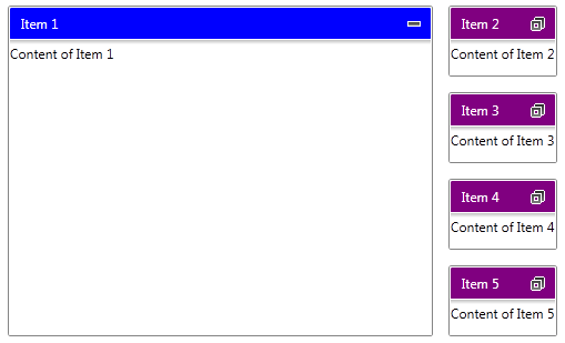
The final result should look like this:
The Header of the RadTileViewItem is designed as a separate ContentControl and you can apply a custom style to it. In order to do this you have to add the following namespace into your application:
xmlns:tileView="clr-namespace:Telerik.Windows.Controls.TileView;assembly=Telerik.Windows.Controls.Navigation"
Next, you can define a custom style targeting the TileViewItemHeader control and bind its Background property to a property defined in your business model like this:
<Style x:Key="TileViewItemHeaderStyle" TargetType="tileView:TileViewItemHeader">
    <Setter Property="Foreground" Value="White"/>
    <Setter Property="Background" Value="{Binding RelativeSource={RelativeSource AncestorType=telerik:RadTileViewItem}, Path=DataContext.HeaderColor, Mode=TwoWay}" />
</Style>
The Foreground is changed just to make the text in the header easy to read.
Also, in order to visualize your items you can create one more Style targeting the RadTileViewItem. In that style you can bind the Header property to a property defined in your business model. By doing so you will be able to set the text of the header. You can use the following code:
<Style x:Key="TileViewItemCustomStyle" TargetType="telerik:RadTileViewItem">
    <Setter Property="Header" Value="{Binding Header}" />
</Style>
In order to track the state of each RadTileViewItem you can define a property in your business model and bind it to the TileState property of the item. This can be done by adding one more Setter to the last Style and it will look like this:
<Style x:Key="TileViewItemCustomStyle" TargetType="telerik:RadTileViewItem">
    <Setter Property="TileState" Value="{Binding CurrentState, Mode=TwoWay}" />
    <Setter Property="Header" Value="{Binding Header}" />
</Style>
To finalize the XAML code you can define the following RadTileView control:
<telerik:RadTileView HeaderStyle="{StaticResource TileViewItemHeaderStyle}"
                     ItemContainerStyle="{StaticResource TileViewItemCustomStyle}"
                     ItemsSource="{Binding Items}" />
Next step is to set up your business model. First you can create an ItemViewModel class which derives from Telerik's ViewModelBase. This class can expose properties that will hold the text of the Header, the color of the Background and the CurrentState of the item. Furthermore, the item has to know which color to apply to its header in each state. This is why the constructor of the item can receive three colors - one for each state. Also, this class can expose a private method which changes the color of the header and it will be called whenever the state of the corresponding item is changed. Below is the implementation of that class.
public class ItemViewModel : ViewModelBase
{
    private readonly SolidColorBrush maximizedHeaderBackground;
    private readonly SolidColorBrush minimizedHeaderBackground;
    private readonly SolidColorBrush restoredHeaderBackground;
    private SolidColorBrush headerColor;
    private TileViewItemState currentState = TileViewItemState.Minimized;

    public ItemViewModel(SolidColorBrush maximizedHeaderBackground, SolidColorBrush restoredHeaderBackground, SolidColorBrush minimizedHeaderBackground)
    {
        this.maximizedHeaderBackground = maximizedHeaderBackground;
        this.restoredHeaderBackground = restoredHeaderBackground;
        this.minimizedHeaderBackground = minimizedHeaderBackground;

        this.SetColor();
    }

    public string Header { get; set; }

    public SolidColorBrush HeaderColor
    {
        get
        {
            return this.headerColor;
        }
        set
        {
            if (this.headerColor != value)
            {
                this.headerColor = value;
                this.OnPropertyChanged("HeaderColor");
            }
        }
    }

    public TileViewItemState CurrentState
    {
        get
        {
            return this.currentState;
        }
        set
        {
            if (this.currentState != value)
            {
                this.currentState = value;
                this.OnPropertyChanged("CurrentState");
                this.SetColor();
            }
        }
    }

    private void SetColor()
    {
        if (this.CurrentState == TileViewItemState.Maximized)
        {
            this.HeaderColor = this.maximizedHeaderBackground;
        }
        else if (this.CurrentState == TileViewItemState.Minimized)
        {
            this.HeaderColor = this.minimizedHeaderBackground;
        }
        else if (this.CurrentState == TileViewItemState.Restored)
        {
            this.HeaderColor = this.restoredHeaderBackground;
        }
    }
}
Public Class ItemViewModel
    Inherits ViewModelBase
    Private ReadOnly maximizedHeaderBackground As SolidColorBrush
    Private ReadOnly minimizedHeaderBackground As SolidColorBrush
    Private ReadOnly restoredHeaderBackground As SolidColorBrush
    Private m_headerColor As SolidColorBrush
    Private m_currentState As TileViewItemState = TileViewItemState.Minimized

    Public Sub New(maximizedHeaderBackground As SolidColorBrush, restoredHeaderBackground As SolidColorBrush, minimizedHeaderBackground As SolidColorBrush)
        Me.maximizedHeaderBackground = maximizedHeaderBackground
        Me.restoredHeaderBackground = restoredHeaderBackground
        Me.minimizedHeaderBackground = minimizedHeaderBackground

        Me.SetColor()
    End Sub

    Public Property Header() As String
        Get
            Return m_Header
        End Get
        Set(value As String)
            m_Header = Value
        End Set
    End Property
    Private m_Header As String

    Public Property HeaderColor() As SolidColorBrush
        Get
            Return Me.m_headerColor
        End Get
        Set(value As SolidColorBrush)
            If Me.m_headerColor <> value Then
                Me.m_headerColor = value
                Me.OnPropertyChanged("HeaderColor")
            End If
        End Set
    End Property

    Public Property CurrentState() As TileViewItemState
        Get
            Return Me.m_currentState
        End Get
        Set(value As TileViewItemState)
            If Me.m_currentState <> value Then
                Me.m_currentState = value
                Me.OnPropertyChanged("CurrentState")
                Me.SetColor()
            End If
        End Set
    End Property

    Private Sub SetColor()
        If Me.CurrentState = TileViewItemState.Maximized Then
            Me.HeaderColor = Me.maximizedHeaderBackground
        ElseIf Me.CurrentState = TileViewItemState.Minimized Then
            Me.HeaderColor = Me.minimizedHeaderBackground
        ElseIf Me.CurrentState = TileViewItemState.Restored Then
            Me.HeaderColor = Me.restoredHeaderBackground
        End If
    End Sub
End Class
After your ItemViewModel is ready, you can define a collection of items. Create a MainViewModel class which exposes one property of type ObservableCollection
public class MainViewModel
{
    public MainViewModel()
    {
        this.Items = new ObservableCollection<ItemViewModel>();
        this.GenerateItems();
    }

    public ObservableCollection<ItemViewModel> Items { get; set; }

    private void GenerateItems()
    {
        var blue = new SolidColorBrush(Colors.Blue);
        var green = new SolidColorBrush(Colors.Green);
        var purple = new SolidColorBrush(Colors.Purple);

        this.Items.Add(new ItemViewModel(blue, green, purple)
        {
            Header = "Item 1",
            CurrentState = TileViewItemState.Maximized,
        });
        this.Items.Add(new ItemViewModel(blue, green, purple)
        {
            Header = "Item 2",
        });
        this.Items.Add(new ItemViewModel(blue, green, purple)
        {
            Header = "Item 3",
        });
        this.Items.Add(new ItemViewModel(blue, green, purple)
        {
            Header = "Item 4",
        });
        this.Items.Add(new ItemViewModel(blue, green, purple)
        {
            Header = "Item 5",
        });
    }
}
Public Class MainViewModel
    Public Sub New()
        Me.Items = New ObservableCollection(Of ItemViewModel)()
        Me.GenerateItems()
    End Sub

    Public Property Items() As ObservableCollection(Of ItemViewModel)
        Get
            Return m_Items
        End Get
        Set(value As ObservableCollection(Of ItemViewModel))
            m_Items = Value
        End Set
    End Property
    Private m_Items As ObservableCollection(Of ItemViewModel)

    Private Sub GenerateItems()
        Dim blue = New SolidColorBrush(Colors.Blue)
        Dim green = New SolidColorBrush(Colors.Green)
        Dim purple = New SolidColorBrush(Colors.Purple)

        Me.Items.Add(New ItemViewModel(blue, green, purple) With {
            .Header = "Item 1",
            .CurrentState = TileViewItemState.Maximized
        })
        Me.Items.Add(New ItemViewModel(blue, green, purple) With {
            .Header = "Item 2"
        })
        Me.Items.Add(New ItemViewModel(blue, green, purple) With {
            .Header = "Item 3"
        })
        Me.Items.Add(New ItemViewModel(blue, green, purple) With {
            .Header = "Item 4"
        })
        Me.Items.Add(New ItemViewModel(blue, green, purple) With {
            .Header = "Item 5"
        })
    End Sub
End Class
Finally, you can set the MainViewModel as DataContext of your application. This can be done just after the InitializeComponent() method like this:
this.DataContext = new MainViewModel();
Me.DataContext = New MainViewModel()