Visual Structure
This section defines terms and concepts used in the scope of RadTileView you have to get familiar with prior to continue reading this help.
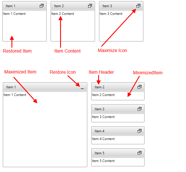
Below you can see a snapshot and explanation of the main visual elements of the RadTileView control.

RadTileView is an ItemsControl. It is populated with RadTileViewItems. RadTileViewItem is a HeaderedContentControl. Each TileViewItem can be any of the three possible states:
- Maximized
- Minimized
- Restored
RadTileView supports different placement for the minimized area. The minimize area can be placed in the Top, Left, Bottom, or Right side of the TileView. Read more info on the minimize area here.
The developer can also modify the number of rows and columns in which the TileView items are rendered. Read more info here.
When all items are restored they can be dragged and to change their position with a customizable animation.