How to Add Close and Create Buttons to the Tab Headers using MVVM approach
Since R2 2019 the RadTabItem supports built-in close and pin buttons. Read more about this in the Pin and Close article.
The goal of this tutorial is to create a RadTabControl with closable tab items using an MVVM approach.
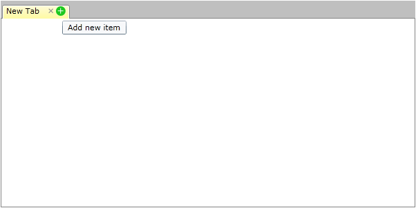
It demonstrates how to close and create new items using close and add buttons placed in the tab header as shown on the snapshot bellow:
For the purpose of this example, you will need to create an empty WPF application project and open it in Visual Studio.
The first step is to add references to the assemblies Telerik.Windows.Controls and Telerik.Windows.Controls.Navigation.
Then we need to define our ViewModels. We can start by creating a class to describe the RadTabItems - TabViewModel exposing a Header property. As we're taking an MVVM approach to implement the Add and Close buttons functionality, we'll also have to set up Add and Close commands in the TabViewModel.
Example 1: Create ViewModels
public class MainViewModel
{
    public MainViewModel()
    {
        this.Tabs = new ObservableCollection<TabViewModel>();
        this.AddItem(null);
    }

    public ObservableCollection<TabViewModel> Tabs
    {
        get;
        private set;
    }

    public void AddItem(TabViewModel sender)
    {
        TabViewModel newTabItem = new TabViewModel(this);
        newTabItem.Header = "New Tab";
        newTabItem.IsSelected = true;
        if (sender != null)
        {
            int insertIndex = this.Tabs.IndexOf(sender) + 1;
            this.Tabs.Insert(insertIndex, newTabItem);
        }
        else
        {
            this.Tabs.Add(newTabItem);
        }
    }

    public void RemoveItem(TabViewModel tabItem)
    {
        this.Tabs.Remove(tabItem);
        tabItem.Dispose();
    }
}
Public Class MainViewModel
    Public Sub New()
        Me.Tabs = New ObservableCollection(Of TabViewModel)()
        Me.AddItem(Nothing)
    End Sub

    Public Property Tabs() As ObservableCollection(Of TabViewModel)
        Get
            Return _tabs
        End Get
        Private Set(value As ObservableCollection(Of TabViewModel))
            _tabs = Value
        End Set
    End Property
    Private _tabs As ObservableCollection(Of TabViewModel)


    Public Sub AddItem(sender As TabViewModel)
        Dim newTabItem As New TabViewModel(Me)
        newTabItem.Header = "New Tab"
        newTabItem.IsSelected = True
        If sender IsNot Nothing Then
            Dim insertIndex As Integer = Me.Tabs.IndexOf(sender) + 1
            Me.Tabs.Insert(insertIndex, newTabItem)
        Else
            Me.Tabs.Add(newTabItem)
        End If
    End Sub

    Public Sub RemoveItem(tabItem As TabViewModel)
        Me.Tabs.Remove(tabItem)
        tabItem.Dispose()
    End Sub
End Class
- After that we can go ahead and create a MainViewModel to define the collection of TabViewModel items which we will use to populate the RadTabControl.ItemsSource. Please note that as the add/close logic will change the RadTabControl.ItemsSource collection, it's best to implement the commands execution methods in this ViewModel as well:
Example 2: Creating TabViewModel
public class TabViewModel : INotifyPropertyChanged, IDisposable
{
    private bool isSelected;
    private readonly MainViewModel mainViewModel;

    public TabViewModel(MainViewModel mainViewModel)
    {
        this.mainViewModel = mainViewModel;
        this.mainViewModel.Tabs.CollectionChanged += this.Tabs_CollectionChanged;

        this.AddItemCommand = new DelegateCommand(
            delegate
            {
                this.mainViewModel.AddItem(this);
            },
            delegate
            {
                return this.mainViewModel.Tabs.Count < 5;
            });

        this.RemoveItemCommand = new DelegateCommand(
            delegate
            {
                this.mainViewModel.RemoveItem(this);
            },
            delegate
            {
                return this.mainViewModel.Tabs.Count > 1;
            });
    }

    public void Dispose()
    {
        this.mainViewModel.Tabs.CollectionChanged -= this.Tabs_CollectionChanged;
    }

    void Tabs_CollectionChanged(object sender, System.Collections.Specialized.NotifyCollectionChangedEventArgs e)
    {
        this.AddItemCommand.InvalidateCanExecute();
        this.RemoveItemCommand.InvalidateCanExecute();
    }

    public string Header
    {
        get;
        set;
    }

    public bool IsSelected
    {
        get
        {
            return this.isSelected;
        }
        set
        {
            if (this.isSelected != value)
            {
                this.isSelected = value;
                this.OnPropertyChanged("IsSelected");
            }
        }
    }

    public DelegateCommand AddItemCommand { get; set; }
    public DelegateCommand RemoveItemCommand { get; set; }

    #region INotifyPropertyChanged
    public event PropertyChangedEventHandler PropertyChanged;

    private void OnPropertyChanged(string propertyName)
    {
        if (this.PropertyChanged != null)
        {
            this.PropertyChanged(this, new PropertyChangedEventArgs(propertyName));
        }
    }
}
Public Class TabViewModel
    Implements INotifyPropertyChanged
    Implements IDisposable
    Private _isSelected As Boolean
    Private ReadOnly mainViewModel As MainViewModel

    Public Sub New(mainViewModel As MainViewModel)
        Me.mainViewModel = mainViewModel
        Me.mainViewModel.Tabs.CollectionChanged += Me.Tabs_CollectionChanged

        Me.AddItemCommand = New DelegateCommand(Function() Do
        Me.mainViewModel.AddItem(Me)
        End Function, Function() Me.mainViewModel.Tabs.Count < 5)

        Me.RemoveItemCommand = New DelegateCommand(Function() Do
            Me.mainViewModel.RemoveItem(Me)
        End Function, Function() Me.mainViewModel.Tabs.Count > 1)
    End Sub

    Public Sub Dispose()
        Me.mainViewModel.Tabs.CollectionChanged -= Me.Tabs_CollectionChanged
    End Sub

    Private Sub Tabs_CollectionChanged(sender As Object, e As System.Collections.Specialized.NotifyCollectionChangedEventArgs)
        Me.AddItemCommand.InvalidateCanExecute()
        Me.RemoveItemCommand.InvalidateCanExecute()
    End Sub

    Public Property Header() As String
        Get
            Return _header
        End Get
        Set(value As String)
            _header = Value
        End Set
    End Property
    Private _header As String

    Public Property IsSelected() As Boolean
        Get
            Return Me._isSelected
        End Get
        Set(value As Boolean)
            If Me._isSelected <> value Then
                Me._isSelected = value
                Me.OnPropertyChanged("IsSelected")
            End If
        End Set
    End Property

    Public Property AddItemCommand() As DelegateCommand
        Get
            Return _addItemCommand
        End Get
        Set(value As DelegateCommand)
            _addItemCommand = Value
        End Set
    End Property
    Private _addItemCommand As DelegateCommand
    Public Property RemoveItemCommand() As DelegateCommand
        Get
            Return _removeItemCommand
        End Get
        Set(value As DelegateCommand)
            _removeItemCommand = Value
        End Set
    End Property
    Private _removeItemCommand As DelegateCommand

    Public Event PropertyChanged As PropertyChangedEventHandler

    Private Sub OnPropertyChanged(propertyName As String)
        RaiseEvent PropertyChanged(Me, New PropertyChangedEventArgs(propertyName))
    End Sub
End Class
Now that our ViewModels are all in place, we can proceed with the definition of our view. In order to take full advantage of the implemented commands we have to bind the Add/Close Buttons Command properties to the appropriate DelegateCommands definitions.
Here is how the Resources section of our view looks like:
Example 3: Binding buttons Command property
  <Style x:Key="CloseButton"
         TargetType="{x:Type Button}">
    <Setter Property="Template">
      <Setter.Value>
        <ControlTemplate TargetType="Button">
          <ControlTemplate.Triggers>
            <Trigger Property="IsMouseOver"
                     Value="True">
              <Trigger.EnterActions>
                <BeginStoryboard x:Name="MouseOverBeginStoryboard">
                  <Storyboard>
                    <ObjectAnimationUsingKeyFrames Storyboard.TargetName="FocusEllipse"
                                                   Storyboard.TargetProperty="(UIElement.Visibility)">
                      <DiscreteObjectKeyFrame KeyTime="0">
                        <DiscreteObjectKeyFrame.Value>
                          <Visibility>Visible</Visibility>
                        </DiscreteObjectKeyFrame.Value>
                      </DiscreteObjectKeyFrame>
                    </ObjectAnimationUsingKeyFrames>
                    <ColorAnimation Duration="0"
                                    Storyboard.TargetName="FocusEllipse"
                                    Storyboard.TargetProperty="(Shape.Fill).(SolidColorBrush.Color)"
                                    To="LightGray" />
                  </Storyboard>
                </BeginStoryboard>
              </Trigger.EnterActions>
              <Trigger.ExitActions>
                <StopStoryboard BeginStoryboardName="MouseOverBeginStoryboard" />
              </Trigger.ExitActions>
            </Trigger>
            <Trigger Property="IsPressed"
                     Value="True">
              <Trigger.EnterActions>
                <BeginStoryboard x:Name="IsPressedBeginStoryboard">
                  <Storyboard>
                    <ObjectAnimationUsingKeyFrames Storyboard.TargetName="FocusEllipse"
                                                   Storyboard.TargetProperty="(UIElement.Visibility)">
                      <DiscreteObjectKeyFrame KeyTime="0">
                        <DiscreteObjectKeyFrame.Value>
                          <Visibility>Visible</Visibility>
                        </DiscreteObjectKeyFrame.Value>
                      </DiscreteObjectKeyFrame>
                    </ObjectAnimationUsingKeyFrames>
                    <ColorAnimation Duration="0"
                                    Storyboard.TargetName="FocusEllipse"
                                    Storyboard.TargetProperty="(Shape.Fill).(SolidColorBrush.Color)"
                                    To="DarkGray" />
                  </Storyboard>
                </BeginStoryboard>
              </Trigger.EnterActions>
              <Trigger.ExitActions>
                <StopStoryboard BeginStoryboardName="IsPressedBeginStoryboard" />
              </Trigger.ExitActions>
            </Trigger>
          </ControlTemplate.Triggers>
          <Grid Width="14"
                Height="14"
                Background="Transparent">
            <Ellipse x:Name="FocusEllipse"
                     Fill="#FFF13535"
                     Visibility="Collapsed" />
            <ContentPresenter x:Name="ContentPresenter"
                              HorizontalAlignment="Center"
                              VerticalAlignment="Center"
                              Content="{TemplateBinding Content}" />
          </Grid>
        </ControlTemplate>
      </Setter.Value>
    </Setter>
  </Style>
  <DataTemplate x:Key="TabItemTemplate">
    <StackPanel VerticalAlignment="Center"
                Orientation="Horizontal">
      <TextBlock Text="{Binding Header}" />
      <Button Margin="10,0,0,0"
              Command="{Binding RemoveItemCommand}"
              Style="{StaticResource CloseButton}"
              ToolTipService.ToolTip="Remove item">
        <Button.Content>
          <Path Data="M0,0 L6,6 M6, 0 L0,6"
                SnapsToDevicePixels="True"
                Stroke="Black"
                StrokeThickness="1" />
        </Button.Content>
      </Button>
      <Button Command="{Binding AddItemCommand}"
              Style="{StaticResource CloseButton}"
              ToolTipService.ToolTip="Add new item">
        <Button.Content>
          <Path Data="M4,0 L4,8 M0, 4 L8,4"
                SnapsToDevicePixels="True"
                Stroke="Black"
                StrokeThickness="1" />
        </Button.Content>
      </Button>
    </StackPanel>
  </DataTemplate>
  <DataTemplate x:Key="ContentTemplate">
    <Grid />
  </DataTemplate>

  <Style TargetType="telerik:RadTabItem">
    <Setter Property="IsSelected"
            Value="{Binding IsSelected, Mode=TwoWay}" />
  </Style>
- And here is the RadTabControl definition:
Example 4: Defining RadTabControl
<telerik:RadTabControl x:Name="tabControl"
                     Width="600"
                     Height="300"
                     ContentTemplate="{StaticResource ContentTemplate}"
                     ItemTemplate="{StaticResource TabItemTemplate}"
                     ItemsSource="{Binding Tabs}"
                     OverflowMode="Wrap" />
Please note that in the above sample we have defined custom styles for the Button controls which you can remove or modify accordignly to your requirements.