How to Add Close Button to the Tab Headers
Since R2 2019 the RadTabItem supports built-in close and pin buttons. Read more about this in the Pin and Close article.
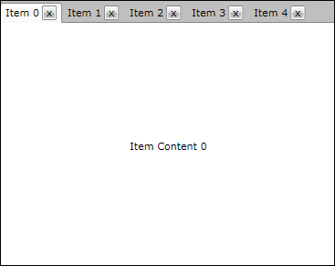
The goal of this tutorial is to create a tab control with closable tab items. The tab items can be closed using close button placed in the tab header as shown on the snapshot bellow.
For the purpose of this example, you will need to create an empty WPF Application project and open it in Visual Studio.
If you copy and paste the source code directly from this XAML examples, don't forget to change xmlns:example alias to import the namespace used in your project.
The first step is to add references to the assemblies Telerik.Windows.Controls and Telerik.Windows.Controls.Navigation.
In order to create closable tab control, we are going to make use of the routed events mechanism. That is why you will create a helper class named RoutedEventHelper. It will contain the declarations of both the close tab routed event and the attached property for enabling the routed event for the close button. Here is how this class looks like:
As you can see, you have declared a new routed event called CloseTabEvent of type Telerik.Windows.RoutedEvent. For its creation you have used the static method DeclareRoutedEvent from the class Telerik.Windows.EventManager. This routed event will be raised when the close button of the tab control is clicked by the user.
Another thing that is worth mentioning is the declaration of the attached property EnableRoutedClickProperty. Using this property you can enable the raise of the close routed event for certain button control. See how this property is set from XAML in the next step.
- Change the XAML of MainPage.xaml to:
In the beginning of the XAML you have imported two namespaces - example and telerik. The example namespace imports all types from the current test project like RoutedEventHelper. The second namespace is telerik and it imports all telerik navigation controls like RadTabControl from the assembly Telerik.Windows.Controls.Navigation.
Later in the UserControl.Resources section you declare a custom item container style, which defines the header and the content templates of the tab items. The header template contains a grid control with the close button on the right side and a content control located on the left side. The routing events for the close button are enabled using your new attached property EnableRoutedClick which is set to True.
The last step of this example scenario is to open MainPage.xaml.cs and to:
Bind the tab control to an observable collection containing items of the custom type TabItemModel
Register the RadTabItem class handler for the routed event CloseTabEvent.