Styling the GroupHeaders
It is a common scenario to use resources in RadScheduleView and group the appointments according to the resource they are assigned to. This article discusses how you can customize the GroupHeaders. It also explains the use of RadScheduleView's GroupHeaderStyleSelector property in order to apply separate styles to the GroupHeaders.
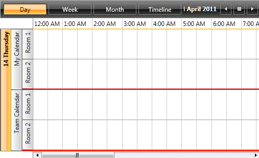
For the purposes of this article, we will use the following RadScheduleView grouped by Date, "Calendar" and "Room" resources.
Example 1: RadScheduleView grouped by Date, "Calendar" and "Room"
<telerik:RadScheduleView x:Name="scheduleView" AppointmentsSource="{Binding Appointments}" >
    <telerik:RadScheduleView.ResourceTypesSource>
        <telerik:ResourceTypeCollection>
            <telerik:ResourceType Name="Calendar">
                <telerik:Resource ResourceName="MyCalendar" DisplayName="My Calendar"  />
                <telerik:Resource ResourceName="TeamCalendar" DisplayName="Team Calendar"  />
            </telerik:ResourceType>
            <telerik:ResourceType Name="Room">
                <telerik:Resource ResourceName="Room1" DisplayName="Room 1" />
                <telerik:Resource ResourceName="Room2" DisplayName="Room 2" />
            </telerik:ResourceType>
        </telerik:ResourceTypeCollection>
    </telerik:RadScheduleView.ResourceTypesSource>
    <telerik:RadScheduleView.GroupDescriptionsSource>
        <telerik:GroupDescriptionCollection>
            <telerik:DateGroupDescription />
            <telerik:ResourceGroupDescription ResourceType="Calendar" />
            <telerik:ResourceGroupDescription ResourceType="Room" />
        </telerik:GroupDescriptionCollection>
    </telerik:RadScheduleView.GroupDescriptionsSource>
    <telerik:RadScheduleView.ViewDefinitions>
        <telerik:DayViewDefinition />
        <telerik:WeekViewDefinition />
        <telerik:MonthViewDefinition />
        <telerik:TimelineViewDefinition />
    </telerik:RadScheduleView.ViewDefinitions>
</telerik:RadScheduleView>
The GroupHeaderStyleSelector
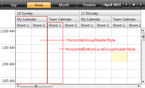
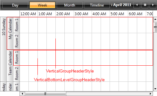
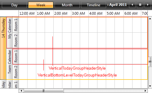
Any change on the appearance of a GroupHeader depends on the GroupHeaderStyleSelector class and its containing styles. The selector is oriented, meaning it contains orientation-dependent styles – horizontal and vertical.
The GroupHeaderStyleSelector contains the following styles:
- HorizontalGroupHeaderStyle and HorizontalBottomLevelGroupHeaderStyle
- HorizontalTodayGroupHeaderStyle and HorizontalBottomLevelTodayGroupHeaderStyle

- VerticalGroupHeaderStyle and VerticalBottomLevelGroupHeaderStyle
- VerticalTodayGroupHeaderStyle and VerticalBottomLevelTodayGroupHeaderStyle
- MonthViewWeekGroupStyle and MonthViewBottomLevelWeekGroupStyle
You can choose one of the following approaches to obtain the source code of GroupHeaderStyleSelector:
Extract GroupHeaderStyleSelector from installation folder
In the UI for WPF installation folder on your computer, go to the Themes.Implicit folder and select the theme that you use in your application. Drill down to find the Telerik.Windows.Controls.ScheduleView.xaml file in that directory. From this resource dictionary you can extract the GroupHeaderStyleSelector and any needed resources that it uses.
Generate GroupHeaderStyleSelector from RadScheduleView template
You can also generate the RadScheduleView template in Microsoft Blend by right-clicking on the control (either in the Design view or in the Objects and Timeline pane) and selecting Edit Template -> Edit a Copy. You should then search for the GroupHeaderStyleSelector and copy the style together with all needed resources that it uses.
The extracted style will have the following content:
Example 2: The default RadScheduleView style
<telerikScheduleView:OrientedGroupHeaderStyleSelector x:Key="GroupHeaderStyleSelector"
        HorizontalStyle="{StaticResource HorizontalGroupHeaderStyle}"
        HorizontalTodayStyle="{StaticResource HorizontalTodayGroupHeaderStyle}"
        HorizontalBottomLevelStyle="{StaticResource HorizontalBottomLevelGroupHeaderStyle}"
        HorizontalTodayBottomLevelStyle="{StaticResource HorizontalBottomLevelTodayGroupHeaderStyle}"
        VerticalStyle="{StaticResource VerticalGroupHeaderStyle}"
        VerticalTodayStyle="{StaticResource VerticalTodayGroupHeaderStyle}"
        VerticalBottomLevelStyle="{StaticResource VerticalBottomLevelGroupHeaderStyle}"
        VerticalTodayBottomLevelStyle="{StaticResource VerticalBottomLevelTodayGroupHeaderStyle}"
        MonthViewWeekGroupStyle="{StaticResource MonthViewWeekGroupStyle}"
        MonthViewBottomLevelWeekGroupStyle="{StaticResource MonthViewBottomLevelWeekGroupStyle}"/>
You can now modify the styleselector and set it through RadScheduleView's GroupHeaderStyleSelector property as demonstrated in Example 3.
Example 3: Setting RadScheduleView's GroupHeaderStyleSelector
<telerik:RadScheduleView x:Name="scheduleView" AppointmentsSource="{Binding Appointments}" GroupHeaderStyleSelector="{StaticResource GroupHeaderStyleSelector}">
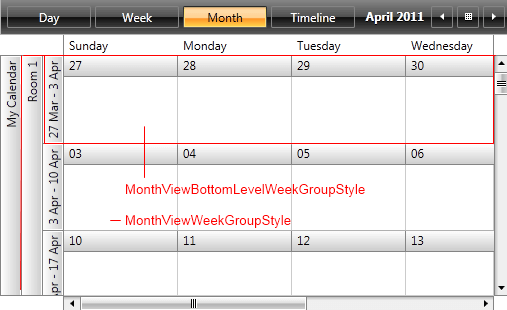
Let's modify the HorizontalBottomLevelStyle and observe the result.
Example 4: The modified HorizontalBottomLevelGroupHeaderStyle
<Style x:Key="HorizontalBottomLevelGroupHeaderStyle" TargetType="telerik:GroupHeader" BasedOn="{StaticResource GroupHeaderBaseStyle}">
    <Setter Property="Margin" Value="0 0 -1 0" />
    <Setter Property="Padding" Value="0 0 5 0" />
    <Setter Property="Canvas.ZIndex" Value="-2" />
    <Setter Property="Foreground" Value="Red"/>
    <Setter Property="FontStyle" Value="Italic"/>
</Style>
Figure 1: RadScheduleView with the modified HorizontalBottomLevelGroupHeaderStyle
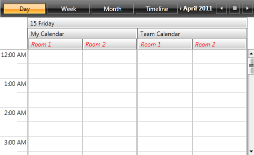
Create a custom GroupHeaderStyleSelector
In order to set different styles for the different resource GroupHeaders, you should create a custom class which inherits from the OrientedGroupHeaderStyleSelector class and overrides its SelectStyle method. You also need to define Style properties for Date and "Calendar" resource headers and return the corresponding Style.
Example 5: The custom OrientedGroupHeaderStyleSelector
public class CustomGroupHeaderStyleSelector : OrientedGroupHeaderStyleSelector
{
    public Style CalendarStyle { get; set; }

    public Style DateStyle { get; set; }

    public override Style SelectStyle(object item, DependencyObject container, ViewDefinitionBase activeViewDeifinition)
    {
        var groupHeader = container as GroupHeader;
        if (groupHeader != null)
        {
            var groupKey = groupHeader.GroupKey as Resource;
            if (groupKey != null && groupKey.ResourceType == "Calendar")
            {
                return this.CalendarStyle;
            }
            else if (groupHeader.GroupKey is DateTime)
            {
                return this.DateStyle;
            }
        }

        return base.SelectStyle(item, container, activeViewDeifinition);
    }
}
Public Class CustomGroupHeaderStyleSelector
    Inherits OrientedGroupHeaderStyleSelector

    Public Property CalendarStyle() As Style
        Get
            Return m_CalendarStyle
        End Get
        Set(value As Style)
            m_CalendarStyle = value
        End Set
    End Property
    Private m_CalendarStyle As Style

    Public Property DateStyle() As Style
        Get
            Return m_DateStyle
        End Get
        Set(value As Style)
            m_DateStyle = value
        End Set
    End Property
    Private m_DateStyle As Style

    Public Overrides Function SelectStyle(item As Object, container As DependencyObject, activeViewDeifinition As ViewDefinitionBase) As Style
        Dim groupHeader = TryCast(container, GroupHeader)
        If groupHeader IsNot Nothing Then
            Dim groupKey = TryCast(groupHeader.GroupKey, Resource)
            If groupKey IsNot Nothing AndAlso groupKey.ResourceType = "Calendar" Then
                Return Me.CalendarStyle
            ElseIf TypeOf groupHeader.GroupKey Is DateTime Then
                Return Me.DateStyle
            End If
        End If
        Return MyBase.SelectStyle(item, container, activeViewDeifinition)
    End Function
End Class
You then need to define the styles in XAML as demonstrated in Example 6.
Example 6: Defining the styles in XAML
<local:CustomGroupHeaderStyleSelector x:Key="CustomGroupHeaderStyleSelector">
     <local:CustomGroupHeaderStyleSelector.CalendarStyle>
          <Style TargetType="telerik:GroupHeader">
              <Setter Property="BorderThickness" Value="0, 0, 0, 2" />
              <Setter Property="BorderBrush" Value="Red" />
          </Style>
      </local:CustomGroupHeaderStyleSelector.CalendarStyle>
      <local:CustomGroupHeaderStyleSelector.DateStyle>
          <Style TargetType="telerik:GroupHeader">
               <Setter Property="FontWeight" Value="Bold" />
          </Style>
      </local:CustomGroupHeaderStyleSelector.DateStyle>
</local:CustomGroupHeaderStyleSelector>
And finally set the GroupHeaderStyleSelector property of the RadScheduleView:
Example 7: Setting RadScheduleView's GroupHeaderStyleSelector
<telerik:RadScheduleView x:Name="scheduleView" AppointmentsSource="{Binding Appointments}" GroupHeaderStyleSelector="{StaticResource CustomGroupHeaderStyleSelector}">
Figure 2: RadScheduleView with the custom GroupHeaderStyleSelector