Customizing the MouseOver and SelectionHighlight
The RadScheduleView makes it possible to customize the mouseover and selection highlights of the slots in the control. The next examples will demonstrate how to do that by setting the MouseOverHighlightStyle and SelectionHighlightStyle properties of the RadScheduleView.
The following examples use implicit styles. Before proceeding with them, you should read about Implicit Styles.
Customizing the MouseOverHighlightStyle
In order to customize the MouseOverHighlightStyle using implicit styles you can follow these steps:
Add references to the NoXaml binaries that the RadScheduleView requires.
-
Merge the necessary ResourceDictionaries in the App.xaml file (the Office 2016 theme is used in this example):
Example 1: Merge the necessary ResourceDictionaries
<ResourceDictionary> <ResourceDictionary.MergedDictionaries> <ResourceDictionary Source="/Telerik.Windows.Themes.Office2016;component/Themes/System.Windows.xaml"/> <ResourceDictionary Source="/Telerik.Windows.Themes.Office2016;component/Themes/Telerik.Windows.Controls.xaml"/> <ResourceDictionary Source="/Telerik.Windows.Themes.Office2016;component/Themes/Telerik.Windows.Controls.Input.xaml"/> <ResourceDictionary Source="/Telerik.Windows.Themes.Office2016;component/Themes/Telerik.Windows.Controls.Navigation.xaml"/> <ResourceDictionary Source="/Telerik.Windows.Themes.Office2016;component/Themes/Telerik.Windows.Controls.ScheduleView.xaml"/> </ResourceDictionary.MergedDictionaries> </ResourceDictionary> -
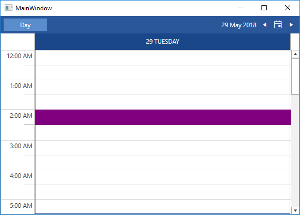
Create a Style that targets HighlightItem, base it on the MouseOverHighlightStyle StaticResource and set the Background property:
Example 2: Define the custom style
<Style x:Key="MyMouseOverHighlightStyle" TargetType="telerik:HighlightItem" BasedOn="{StaticResource MouseOverHighlightStyle}"> <Setter Property="Background" Value="Purple"/> </Style> -
Next we will need to set the newly created Style to the MouseOverHighlightStyle property of the RadScheduleView:
Example 3: Set the MouseOverHighlightStyle property
    <telerik:RadScheduleView AppointmentsSource="{Binding Appointments}"
                        MouseOverHighlightStyle="{StaticResource MyMouseOverHighlightStyle}">
        <telerik:RadScheduleView.ViewDefinitions>
            <telerik:DayViewDefinition/>
        </telerik:RadScheduleView.ViewDefinitions>
    </telerik:RadScheduleView>
Figure 1: Result from Example 3 after hovering over a slot in the Office 2016 theme
Customizing the SelectionHighlightStyle
In order to customize the SelectionHighlightStyle using implicit styles you can do step 1 and step 2 from the previous example and then:
-
Create a Style that targets the HighlightItem, base it on the SelectionHighlightStyle StaticResource and set the Background property:
Example 4: Define the custom style
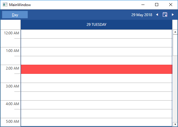
<Style x:Key="MySelectionHighlightStyle" TargetType="telerik:HighlightItem" BasedOn="{StaticResource SelectionHighlightStyle}"> <Setter Property="Background" Value="Red"/> </Style> -
Next we will need to set the newly created Style to the SelectionHighlightStyle of the RadScheduleView:
Example 5: Set the custom style
    <telerik:RadScheduleView AppointmentsSource="{Binding Appointments}"
                        SelectionHighlightStyle="{StaticResource MySelectionHighlightStyle}">
        <telerik:RadScheduleView.ViewDefinitions>
            <telerik:DayViewDefinition/>
        </telerik:RadScheduleView.ViewDefinitions>
    </telerik:RadScheduleView>
Figure 2: Result from Example 5 after selecting a slot in the Office 2016 theme__