Set GroupHeaders Width
GroupHeaders represent the date and resource (when RadScheduleView is grouped) headers. They can be horizontal or vertical depending on the active ViewDefinition and its Orientation.
For detailed information about the different GroupHeaders, see the Styling the GroupHeaders topic.
It is a common scenario to apply a specific width to the GroupHeaders. Generally, the width of the headers depend on the following three things:
The count of the intersecting appointments in each group. When there are more appointments, the width of the group is increased.
The desired width of the GroupHeader control itself. It can be changed by either setting a custom GroupHeaderStyle or a GroupHeaderTemplate.
RadScheduleView will disregard the set width if you have a group with many appointments, even if GroupHeaders have a fixed width. The effect of this can be minimized by setting the MinAppointmentWidth property of the ScheduleView to a smaller value.
- Whether the groups are stretched or not. This feature is switched on and off by setting the StretchGroupHeaders property of the ViewDefinitions. If it is switched on and there is extra space left, it is distributed among the groups.
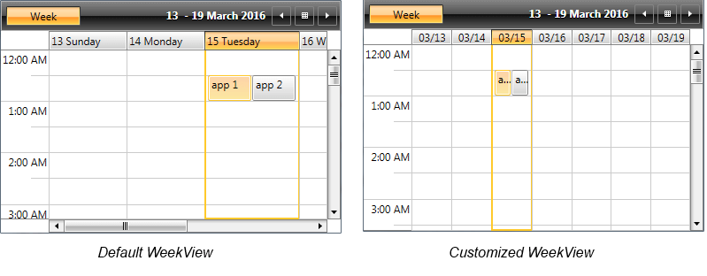
Example 1 will show you how you could decrease the GroupHeaders width by customizing the GroupHeaderTemplateSelector and setting a shorter date format in the WeekViewDefinition of RadScheduleView.
First, we will generate the default GroupHeaderContentTemplateSelector and will set Width to the ContentPresenters in both the HorizontalTemplate and VerticalTemplate (which template is used depends on the active ViewDefinition Orientation) as shown in Example 1.
Example 1: Modified GroupHeaderContentTemplateSelector
<telerik:GroupHeaderTemplateSelector x:Key="GroupHeaderContentTemplateSelector">
    <telerik:GroupHeaderTemplateSelector.HorizontalTemplate>
        <DataTemplate>
            <ContentPresenter Content="{Binding FormattedName}" Height="16" Margin="2" Width="30" />
        </DataTemplate>
    </telerik:GroupHeaderTemplateSelector.HorizontalTemplate>
    <telerik:GroupHeaderTemplateSelector.VerticalTemplate>
        <DataTemplate>
            <telerik:LayoutTransformControl VerticalAlignment="Top">
                <telerik:LayoutTransformControl.LayoutTransform>
                    <RotateTransform Angle="-90" />
                </telerik:LayoutTransformControl.LayoutTransform>
                <ContentPresenter Content="{Binding FormattedName}" Margin="2" Width="30" Height="16"  />
            </telerik:LayoutTransformControl>
        </DataTemplate>
    </telerik:GroupHeaderTemplateSelector.VerticalTemplate>
</telerik:GroupHeaderTemplateSelector>
Additionally, we will change the format of the dates inside the GroupHeaders as explained in the Formatting topic and will set the MinAppointmentWidth property of the ScheduleView to a smaller value.
Example 2: Apply GroupHeaderContentTemplateSelector
<telerik:RadScheduleView AppointmentsSource="{Binding Appointments}"
        GroupHeaderContentTemplateSelector="{StaticResource GroupHeaderContentTemplateSelector}"
        MinAppointmentWidth="10">
    <telerik:RadScheduleView.ViewDefinitions>
            <telerik:WeekViewDefinition  GroupHeaderDateStringFormat="{}{0:MM/dd}" />
    </telerik:RadScheduleView.ViewDefinitions>
</telerik:RadScheduleView>
Figure 1: Default and customized WeekViewDefinitions
