Custom Content
ContentTemplate and CompactContentTemplate
Each RadOfficeNavigationBarItem supports setting complex structures of elements to its ContentTemplate and CompactContentTemplate properties. These structures will represent the values set to its Content and CompactContent properties.
The CompactContent, CompactContentTemplate, and CompactContentTemplateSelector properties will be used when the
IsInCompactModeproperty is set to True. To learn more about this items display mode, check the View Modes article.
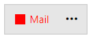
Example complex ContentTemplate
<telerik:RadOfficeNavigationBarItem Content="Mail">
    <telerik:RadOfficeNavigationBarItem.ContentTemplate>
        <DataTemplate>
            <StackPanel Orientation="Horizontal">
                <Border Width="12" Height="12" Background="Red"/>
                <TextBlock Text="{Binding}" Foreground="Red" Margin="5 0 0 0"/>
            </StackPanel>
        </DataTemplate>
    </telerik:RadOfficeNavigationBarItem.ContentTemplate>
</telerik:RadOfficeNavigationBarItem>
Example complex CompactContentTemplate
<telerik:RadOfficeNavigationBar IsInCompactMode="True">
<telerik:RadOfficeNavigationBarItem CompactContent="">
<telerik:RadOfficeNavigationBarItem.CompactContentTemplate>
<DataTemplate>
<telerik:RadGlyph Glyph="{Binding}" Foreground="Red"/>
</DataTemplate>
</telerik:RadOfficeNavigationBarItem.CompactContentTemplate>
</telerik:RadOfficeNavigationBarItem>
</telerik:RadOfficeNavigationBar>

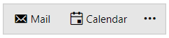
ContentTemplateSelector and CompactContentTemplateSelector
The ContentTemplateSelector and CompactContentTemplateSelector allow you to apply different data templates based on custom logic.
For the purpose of the following example, the ContentTemplateSelector property of the RadOfficeNavigationBarItem will be used.
The example utilizes the RadGlyph element. To learn more about it, check the RadGlyph article.
Define a sample model class that will hold the name and the glyph as string of each item.
Define a model
public class ItemModel
{
    public string Name { get; set; }
    public string GlyphString { get; set; }
}
Public Class ItemModel
    Public Property Name As String
    Public Property GlyphString As String
End Class
After that, create a view model that will contain a collection of ItemModels instances. This collection will be bound to the ItemsSource property of the RadOfficeNavigationBar control.
Define a view model
public class ItemsViewModel
{
    public ItemsViewModel()
    {
        this.ItemModels = new ObservableCollection<ItemModel>
        {
            new ItemModel() { Name = "Mail", GlyphString = "xe809" },
            new ItemModel() { Name = "Calendar", GlyphString = "No glyph" },
        };
    }

    public ObservableCollection<ItemModel> ItemModels { get; set; }
}
Public Class ItemsViewModel
Public Sub New()
ItemModels = New ObservableCollection(Of ItemModel) From {
  New ItemModel() With {
      .Name = "Mail",
        .GlyphString = "xe809"
    },
    New ItemModel() With {
      .Name = "Calendar",
        .GlyphString = "No glyph"
    }
}
End Sub

Public Property ItemModels As ObservableCollection(Of ItemModel)
End Class
Next, we can define a custom DataTemplateSelector class and override its SelectTemplate method. In it, we will check if the GlyphString property equals "No glyph" and return different DataTemplate depending on this check.
Define a custom DataTemplateSelector
public class GlyphContentTemplateSelector : DataTemplateSelector
{
    public DataTemplate GlyphDataTemplate { get; set; }
    public DataTemplate DefaultDataTemplate { get; set; }

    public override DataTemplate SelectTemplate(object item, DependencyObject container)
    {
        ItemModel itemModel = (ItemModel)item;

        if (itemModel.GlyphString == "No glyph")
        {
            return this.DefaultDataTemplate;
        }

        return this.GlyphDataTemplate;
    }
}
Public Class GlyphContentTemplateSelector
    Inherits DataTemplateSelector
    Public Property GlyphDataTemplate As DataTemplate
    Public Property DefaultDataTemplate As DataTemplate

    Public Overrides Function SelectTemplate(ByVal item As Object, ByVal container As DependencyObject) As DataTemplate
        Dim itemModel As ItemModel = CType(item, ItemModel)

        If itemModel.GlyphString Is "No glyph" Then
            Return DefaultDataTemplate
        End If

        Return GlyphDataTemplate
    End Function
End Class
Create an instance of the custom DataTemplateSelector class in XAML and set it to each RadOfficeNavigationBarItem element.
Instantiate the custom DataTemplateSelector in XAML
<Application.Resources>
    <telerik:StringToGlyphConverter x:Key="StringToGlyphConverter"/>

    <local:GlyphContentTemplateSelector x:Key="GlyphContentTemplateSelector">
        <local:GlyphContentTemplateSelector.DefaultDataTemplate>
            <DataTemplate>
                <StackPanel Orientation="Horizontal">
                    <telerik:RadGlyph Glyph="{StaticResource GlyphCalendar}" Margin="0 0 3 0"/>
                    <TextBlock Text="{Binding Name}"/>
                </StackPanel>
            </DataTemplate>
        </local:GlyphContentTemplateSelector.DefaultDataTemplate>
        <local:GlyphContentTemplateSelector.GlyphDataTemplate>
            <DataTemplate>
                <StackPanel Orientation="Horizontal">
                    <telerik:RadGlyph Glyph="{Binding GlyphString, Converter={StaticResource StringToGlyphConverter}}" Margin="0 0 3 0"/>
                    <TextBlock Text="{Binding Name}"/>
                </StackPanel>
            </DataTemplate>
        </local:GlyphContentTemplateSelector.GlyphDataTemplate>
    </local:GlyphContentTemplateSelector>

    <Style x:Key="OfficeNavigationBarItemStyle" TargetType="telerik:RadOfficeNavigationBarItem" BasedOn="{StaticResource RadOfficeNavigationBarItemStyle}">
        <Setter Property="ContentTemplateSelector" Value="{StaticResource GlyphContentTemplateSelector}"/>
    </Style>
</Application.Resources>
ItemContainerStyle property of the RadOfficeNavigationBar control.
Set the custom Style to the ItemContainerStyle property
<Grid>
    <Grid.DataContext>
        <local:ItemsViewModel/>
    </Grid.DataContext>
    <telerik:RadOfficeNavigationBar ItemsSource="{Binding ItemModels}" ItemContainerStyle="{StaticResource OfficeNavigationBarItemStyle}"/>
</Grid>