Getting Started with WPF OfficeNavigationBar
This tutorial will walk you through the creation of a sample application that contains a RadOfficeNavigationBar control.
Adding Telerik Assemblies Using NuGet
To use RadOfficeNavigationBar when working with NuGet packages, install the Telerik.Windows.Controls.Navigation.for.Wpf.Xaml package. The package name may vary slightly based on the Telerik dlls set - Xaml or NoXaml
Read more about NuGet installation in the Installing UI for WPF from NuGet Package article.
With the 2025 Q1 release, the Telerik UI for WPF has a new licensing mechanism. You can learn more about it here.
Adding Assembly References Manually
If you are not using NuGet packages, you can add a reference to the following assemblies:
- Telerik.Licensing.Runtime
- Telerik.Windows.Controls
- Telerik.Windows.Controls.Navigation
Defining the RadOfficeNavigationBar
You can add RadOfficeNavigationBar manually in XAML as demonstrated in the following example:
Adding RadOfficeNavigationBar in XAML
<telerik:RadOfficeNavigationBar/>

Adding Items
The RadOfficeNavigationBar control works with RadOfficeNavigationBarItem elements that are added to the Items collection of the control. These elements can be added both in XAML and in code.
Adding RadOfficeNavigationBarItems in XAML
<telerik:RadOfficeNavigationBar>
    <telerik:RadOfficeNavigationBar.Items>
        <telerik:RadOfficeNavigationBarItem Content="Item 1"/>
        <telerik:RadOfficeNavigationBarItem Content="Item 2"/>
        <telerik:RadOfficeNavigationBarItem Content="Item 3"/>
    </telerik:RadOfficeNavigationBar.Items>
</telerik:RadOfficeNavigationBar>
Adding RadOfficeNavigationBarItems in code
RadOfficeNavigationBar radOfficeNavigationBar = new RadOfficeNavigationBar();

radOfficeNavigationBar.Items.Add(new RadOfficeNavigationBarItem() { Content = "Item 1" });
radOfficeNavigationBar.Items.Add(new RadOfficeNavigationBarItem() { Content = "Item 2" });
radOfficeNavigationBar.Items.Add(new RadOfficeNavigationBarItem() { Content = "Item 3" });
Dim radOfficeNavigationBar As RadOfficeNavigationBar = New RadOfficeNavigationBar()

radOfficeNavigationBar.Items.Add(New RadOfficeNavigationBarItem() With {
    .Content = "Item 1"
})
radOfficeNavigationBar.Items.Add(New RadOfficeNavigationBarItem() With {
    .Content = "Item 2"
})
radOfficeNavigationBar.Items.Add(New RadOfficeNavigationBarItem() With {
    .Content = "Item 3"
})
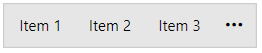
RadOfficeNavigationBar with several RadOfficeNavigationBarItems defined in its Items collection
The Content property of the RadOfficeNavigationBarItem element is of type object and it can contain values of any type. You can customize how the object is going to be visualized by creating a custom DataTemplate for the ContentTemplate property.
Data Binding
RadOfficeNavigationBar allows you to data bind it to a collection of business objects. To do so, bind the collection to the ItemsSource property of the control.
The following example will demonstrate a simple data binding scenario.
Simple business class
public class ItemModel
{
    public string Name { get; set; }
}
Public Class ItemModel
    Public Property Name As String
End Class
Next, you can create a view model that will contain a collection of ItemModel objects.
View model containing ObservableCollection of ItemModel objects
public class ItemsViewModel
{
    public ItemsViewModel()
    {
        this.ItemModels = new ObservableCollection<ItemModel>
        {
            new ItemModel() { Name = "Mail" },
            new ItemModel() { Name = "Calendar" },
            new ItemModel() { Name = "People" }
        };
    }

    public ObservableCollection<ItemModel> ItemModels { get; set; }
}
Public Class ItemsViewModel

Public Sub New()
ItemModels = New ObservableCollection(Of ItemModel) From {
  New ItemModel() With {
      .Name = "Mail"
    },
    New ItemModel() With {
      .Name = "Calendar"
    },
    New ItemModel() With {
      .Name = "People"
    }
}
End Sub

Public Property ItemModels As ObservableCollection(Of ItemModel)
End Class
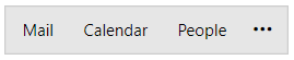
Now that you have prepared the needed sample data, it is time to bind it to the RadOfficeNavigationBar. To do so, set its ItemsSource property to the collection of ItemModel objects. Additionally, you can set DisplayMemberPath property to mark which property of the business object will be used as its visual representation inside RadOfficeNavigationBar.
Binding the collection to the ItemsSource property
<Grid>
    <Grid.DataContext>
        <local:ItemsViewModel/>
    </Grid.DataContext>
    <telerik:RadOfficeNavigationBar ItemsSource="{Binding ItemModels}" DisplayMemberPath="Name"/>
</Grid>
Setting a Theme
The controls from our suite support different themes. You can see how to apply a theme different than the default one in the Setting a Theme help article.
Changing the theme using implicit styles will affect all controls that have styles defined in the merged resource dictionaries. This is applicable only for the controls in the scope in which the resources are merged.
Choose between the themes and add reference to the corresponding theme assembly (ex: Telerik.Windows.Themes.Windows8.dll). You can see the different themes applied in the Theming examples from our WPF Controls Examples application.
-
Merge the ResourceDictionaries with the namespace required for the controls that you are using from the theme assembly. For the RadOfficeNavigationBar, you will need to merge the following resources:
- Telerik.Windows.Controls
- Telerik.Windows.Controls.Navigation
The following example demonstrates how to merge the ResourceDictionaries so that they are applied globally for the entire application.
Merge the ResourceDictionaries
<Application.Resources>
    <ResourceDictionary>
        <ResourceDictionary.MergedDictionaries>
            <ResourceDictionary Source="/Telerik.Windows.Themes.Windows8;component/Themes/System.Windows.xaml"/>
            <ResourceDictionary Source="/Telerik.Windows.Themes.Windows8;component/Themes/Telerik.Windows.Controls.xaml"/>
            <ResourceDictionary Source="/Telerik.Windows.Themes.Windows8;component/Themes/Telerik.Windows.Controls.Navigation.xaml"/>
        </ResourceDictionary.MergedDictionaries>
    </ResourceDictionary>
</Application.Resources>
Alternatively, you can use the theme of the control via theStyleManager.
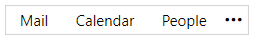
The following image shows a RadOfficeNavigationBar with the Windows8 theme applied.
RadOfficeNavigationBar with the Windows8 theme
Telerik UI for WPF Learning Resources
- Telerik UI for WPF OfficeNavigationBar Component
- Getting Started with Telerik UI for WPF Components
- Telerik UI for WPF Installation
- Telerik UI for WPF and WinForms Integration
- Telerik UI for WPF Visual Studio Templates
- Setting a Theme with Telerik UI for WPF
- Telerik UI for WPF Virtual Classroom (Training Courses for Registered Users)
- Telerik UI for WPF License Agreement