Styling the Pane Header
The PaneHeader element displays the title of the selected pane in the given RadPaneGroup (for RadPaneGroups outside the DocumentHost), a menu and two buttons. For some more information, read the Visual Structure article.
Targeting the PaneHeader Element
In order to style all PaneHeader elements in a RadDocking, you should create a style targeting PaneHeader.
Example 1: Creating an implicit style targeting PaneHeader
<Application.Resources>
    <!-- If you are using the NoXaml binaries, you will have to base the style on the default one for the theme like so:
    <Style TargetType="telerik:PaneHeader" BasedOn="{StaticResource PaneHeaderStyle}">-->

    <Style TargetType="telerik:PaneHeader">
        <Setter Property="Background" Value="Red" />
    </Style>
</Application.Resources>

<Grid>
    <telerik:RadDocking>
        <telerik:RadDocking.DocumentHost>
            <telerik:RadSplitContainer>
                <telerik:RadPaneGroup>
                    <telerik:RadPane Header="Pane 1" />
                    <telerik:RadPane Header="Test 2"/>
                    <telerik:RadPane Header="Test 3" />
                    <telerik:RadPane Header="Test 4" />
                </telerik:RadPaneGroup>
            </telerik:RadSplitContainer>
        </telerik:RadDocking.DocumentHost>
        <telerik:RadSplitContainer >
            <telerik:RadPaneGroup >
                <telerik:RadPane Header="Pane 1" />
                <telerik:RadPane Header="Test 2"/>
                <telerik:RadPane Header="Test 3" />
                <telerik:RadPane Header="Test 4" />
            </telerik:RadPaneGroup>
        </telerik:RadSplitContainer>
        <telerik:RadSplitContainer InitialPosition="DockedRight" >
            <telerik:RadPaneGroup  >
                <telerik:RadPane Header="Pane 1" />
                <telerik:RadPane Header="Test 2"/>
                <telerik:RadPane Header="Test 3" />
                <telerik:RadPane Header="Test 4" />
            </telerik:RadPaneGroup>
        </telerik:RadSplitContainer>
    </telerik:RadDocking>
</Grid>
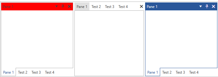
Figure 1: PaneHeader with Red Background in the Office2016 theme

You will notice that in Figure 1 the PaneHeader in the left group is red, however the PaneHeader in the right group is blue. This is due to the fact that the right pane is active. Inside the ControlTemplate of the PaneHeader there are triggers/visual states, which set the Background when a pane becomes active and that value takes precedence over the value from the implicit style. In order to change this behavior, you can extract and modify the ControlTemplate of the PaneHeader for the theme(s) that you are using. For more information on how to do that read, the Editing Control Templates article.