Radio Button
The RadRadioButton control inherits from the native RadioButton control and implements the ICommandSource interface. Because of the inheritance it has all of the features of the standard RadioButton control. The ICommandSource implementation allows you to attach commands to the button, that will be executed when the RadRadioButton is clicked.
You can see how to use an ICommand with a button in the Commands topic.
Figure 1: Radio button

Defining RadButton
You can instantiate your RadRadioButton in both XAML and code.
Example 1: Defining a button in XAML
<telerik:RadRadioButton Content="Radio Item" />
Example 2: Defining a button in code
RadRadioButton radRadioButton = new RadRadioButton() { Content = "Radio Item" };
Dim radRadioButton As New RadRadioButton() With { _
    .Content = "Radio Item" _
}
Button Checked Events
The button provides a set of events that are fired when you click on it.
- Checked: This event is fired when the button is checked.
- Unchecked: This event is fired when the button is unchecked.
- Activate: This event is fired when the button is checked or unchecked.
As any other button the RadRadioButton exposes a Click event as well.
The check state of the button can be manually controlled via its IsChecked property.
Here is an example of handling the Checked event of a button.
Example 3: Subscribing to the Checked event
<telerik:RadRadioButton Content="Radio Item" Checked="RadRadioButton_Checked"/>
Example 4: Defining a Checked event handler
private void RadRadioButton_Checked(object sender, RoutedEventArgs e)
{
    //implement your logic here
}
Private Sub RadRadioButton_Checked(sender As Object, e As RoutedEventArgs)
    'implement your logic here '
End Sub
Grouping RadRadioButtons
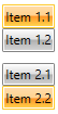
By grouping the RadRadioButtons the user will be allowed to check only one button in the group. In order to group several RadRadioButtons you can place them in the same layout panel (see Example 5).
Example 5: Grouping radio buttons
<StackPanel>
    <telerik:RadRadioButton Content="Item 1.1" />
    <telerik:RadRadioButton Content="Item 1.2" />
</StackPanel>
<StackPanel>
    <telerik:RadRadioButton Content="Item 2.1" />
    <telerik:RadRadioButton Content="Item 2.2" />
</StackPanel>
The above code creates two groups of RadRadioButtons.
Figure 2: Grouped radio buttons
Customizing the RadRadioButton
-
IsBackgroundVisible - this property is of type bool and it controls the visibility of the background and the border of the RadRadioButton control when in normal state.
Figure 2: Radio button with hidden background

-
CornerRadius: This property controls the corner radius of the button.
Figure 3: Radio button with its CornerRadius set to 15
