Popup Animation
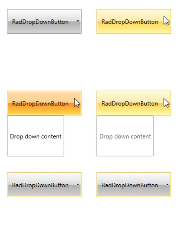
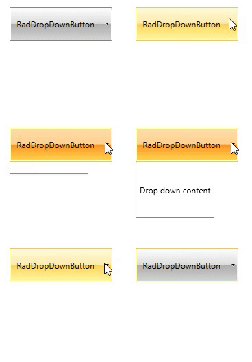
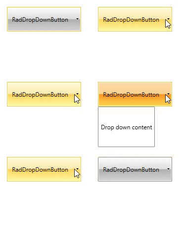
RadDropDownButton and RadSplitButton support popup animations. The animation is triggered when the drop down content of the button opens.
By default the animation is not enabled.
To enable the animation you can set the PopupAnimation property of the button.
Example 1: Setting PopupAnimation
-
Fade: The popup control gradually appears, or fades out, depending on its current state (open or not).

-
Slide: The popup control slides down starting from the bottom border of the button. If the screen doesn't have enough space for the popup, the sliding behaves differently according to the position of the popup.

-
Scroll: The popup control scrolls from the lower left corner of the button. If the screen doesn't have enought space for the popup, the scrolling behaves differently according to the position of the popup.

-
None: The popup control appears without animation. This is the default value of the property.
