Hyperlink Button
RadHyperlinkButton provides the RadButton functionality extending it with Hyperlink capabilities.

Setting the Content, Uri and the Target
The most common properties for utilizing the control are its NavigateUri and Content properties. The former one is intended to be used for navigating to the needed Uri when RadHyperlinkButton is clicked. The latter one sets the content that will be visualized by the control. Also, the location at which the link to be opened can be set through the TargetName string property.
Example 1: Setting the NavigateUri and Content
<telerik:RadHyperlinkButton NavigateUri="http://www.progress.com" Content="Hyperlink Button" TargetName="_blank"/>
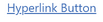
Figure 1: RadHyperlinkButton in Normal State

This example shows how a string can be set as a Content of RadHyperlinkButton. The Content can also be set to be an Image, for example. In such setup the link will be opened when the user clicks on the Image.
Visited and Hovered States
The default Foreground for the control when the link is visited can be altered via the VisitedForeground property. Also, RadHyperlinkButton provides information whether the link is visited or not through its IsVisited boolean property.
The figure above shows RadHyperlink in its Normal state. When hovered or clicked, the control will be underlined.
Figure 2: RadHyperlinkButton when Hovered or Clicked
The control will indicate when the link is visited by modifying the text Foreground.
Figure 3: RadHyperlinkButton when the Link is Visited