Getting Started with WPF Buttons
This tutorial will walk you through the creation of a sample application that contains Telerik buttons.
Adding Telerik Assemblies Using NuGet
To use RadButton when working with NuGet packages, install the Telerik.Windows.Controls.for.Wpf.Xaml package. The package name may vary slightly based on the Telerik dlls set - Xaml or NoXaml
Read more about NuGet installation in the Installing UI for WPF from NuGet Package article.
With the 2025 Q1 release, the Telerik UI for WPF has a new licensing mechanism. You can learn more about it here.
Adding Assembly References Manually
If you are not using NuGet packages, you can add a reference to the following assemblies:
- Telerik.Licensing.Runtime
- Telerik.Windows.Controls
You can find the required assemblies for each control from the suite in the Controls Dependencies help article.
RadButton
Here is an example of a RadButton that executes some logic when it is clicked.
Example 1: Defining a button in XAML
<telerik:RadButton x:Name="radButton"
                    HorizontalAlignment="Left"
                    VerticalAlignment="Top"
                    Click="radButton_Click"
                    Content="Click Me!" />
Example 2: Defining a Click event handler
private void radButton_Click(object sender, RoutedEventArgs e)
{
    //implement your logic here.
}
Private Sub radButton_Click(sender As Object, e As RoutedEventArgs)
    'implement your logic here. '
End Sub

RadPathButton
The greatest advantage of this control is that users can visualize a custom path geometry in the button. Also, the geometry can be positioned relatively to the Content of the button. Here is an example of a RadPathButton that executes some logic when it is clicked.
Example 3: Defining a path button in XAML
<telerik:RadPathButton x:Name="pathButton"
                   Width="100"
                   Height="30"
                   Margin="20"
                   Click="pathButton_Click"
                   ContentPlacement="Right"
                   Content="Click Me!"
                   PathGeometry="M3,7L9,7L9,4L13,8L9,12L9,9L3,9z" />
Example 4: Defining a Click event handler
private void pathButton_Click(object sender, RoutedEventArgs e)
{
    //implement your logic here.
}
Private Sub pathButton_Click(sender As Object, e As RoutedEventArgs)
    'implement your logic here.'
End Sub

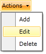
RadDropDownButton
Here is an example of a RadDropDownButton that contains a list of actions in its DropDown Content.
Example 5: Defining a drop down button
<telerik:RadDropDownButton HorizontalAlignment="Left"
                           VerticalAlignment="Top"
                           Content="Actions">
    <telerik:RadDropDownButton.DropDownContent>
        <telerik:RadContextMenu>
            <telerik:RadMenuItem Header="Add" />
            <telerik:RadMenuItem Header="Edit" />
            <telerik:RadMenuItem Header="Delete" />
        </telerik:RadContextMenu>
    </telerik:RadDropDownButton.DropDownContent>
</telerik:RadDropDownButton>
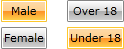
RadRadioButton
Here is an example of several RadRadioButtons placed in two groups.
Example 6: Defining a radio button
<StackPanel HorizontalAlignment="Left"
            VerticalAlignment="Top"
            Orientation="Horizontal">
    <StackPanel Margin="0,0,20,0">
        <telerik:RadRadioButton Margin="0,0,0,5" Content="Male" />
        <telerik:RadRadioButton Content="Female" />
    </StackPanel>
    <StackPanel>
        <telerik:RadRadioButton Margin="0,0,0,5" Content="Over 18" />
        <telerik:RadRadioButton Content="Under 18" />
    </StackPanel>
</StackPanel>
RadSplitButton
Here is an example of a RadSplitButton definition, where a ListBox control is used to display a list of items in the RadSplitButton DropDownContent. The Content of the RadSplitButton is bound to the SelectedItem of the ListBox.
Example 7: Defining a split button
<telerik:RadSplitButton HorizontalAlignment="Left"
                        VerticalAlignment="Top"
                        Content="{Binding Path=SelectedItem.Content, ElementName=FindActions}">
    <telerik:RadSplitButton.DropDownContent>
        <ListBox x:Name="FindActions" SelectionMode="Single">
            <ListBoxItem Content="Quick Find" IsSelected="True" />
            <ListBoxItem Content="Find in Files" />
            <ListBoxItem Content="Find Symbols" />
        </ListBox>
    </telerik:RadSplitButton.DropDownContent>
</telerik:RadSplitButton>

RadToggleButton
Here is an example of a RadToggleButton that toggles the "Monthly Newsletter" feature of a form.
Example 8: Defining a toggle button
<StackPanel HorizontalAlignment="Left"
            VerticalAlignment="Top"
            Orientation="Horizontal">
    <telerik:RadToggleButton Margin="0,0,10,0">
        <telerik:RadToggleButton.Content>
            <Image Source="/Silverlight.Help.RadButtons;component/Demos/Images/newsletter.png" Stretch="None" />
        </telerik:RadToggleButton.Content>
    </telerik:RadToggleButton>
    <TextBlock Text="Send a monthly newsletter" />
</StackPanel>

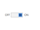
RadToggleSwitchButton
Here is an example of a RadToggleSwitchButton that switches between ON and OFF state.
Example 9: Defining a toggle switch button
<Grid>
    <telerik:RadToggleSwitchButton ContentPosition="Both" CheckedContent="ON" UncheckedContent="OFF" />
</Grid>
Setting a Theme
The controls from our suite support different themes. You can see how to apply a theme different than the default one in the Setting a Theme help article.
Changing the theme using implicit styles will affect all controls that have styles defined in the merged resource dictionaries. This is applicable only for the controls in the scope in which the resources are merged.
To change the theme, you can follow the steps below:
Choose between the themes and add reference to the corresponding theme assembly (ex: Telerik.Windows.Themes.Fluent.dll). You can see the different themes applied in the Theming examples from our WPF Controls Examples application.
-
Merge the ResourceDictionaries with the namespace required for the controls that you are using from the theme assembly. For the RadButton's, you will need to merge the following resources:
- Telerik.Windows.Controls
Example 10 demonstrates how to merge the ResourceDictionaries so that they are applied globally for the entire application.
Example 10: Merge the ResourceDictionaries
<Application.Resources>
    <ResourceDictionary>
        <ResourceDictionary.MergedDictionaries>
            <ResourceDictionary Source="/Telerik.Windows.Themes.Fluent;component/Themes/System.Windows.xaml"/>
            <ResourceDictionary Source="/Telerik.Windows.Themes.Fluent;component/Themes/Telerik.Windows.Controls.xaml"/>
        </ResourceDictionary.MergedDictionaries>
    </ResourceDictionary>
</Application.Resources>
Alternatively, you can use the theme of the control via the StyleManager.
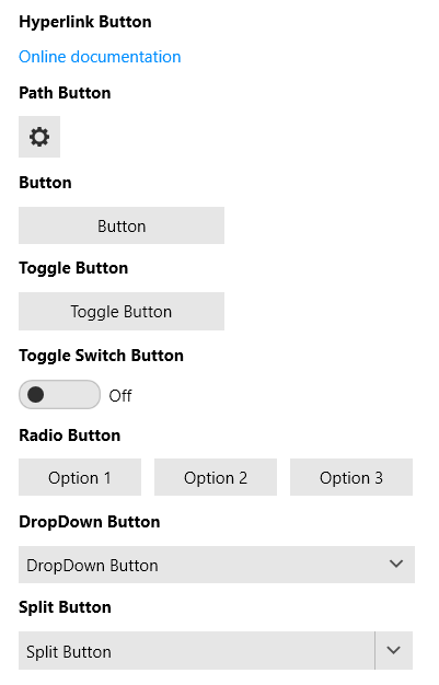
Figure 1 shows a RadButtons with the Fluent theme applied.
Figure 1: RadButtons with the Fluent theme
Telerik UI for WPF Learning Resources
- Telerik UI for WPF Buttons Component
- Getting Started with Telerik UI for WPF Components
- Telerik UI for WPF Installation
- Telerik UI for WPF and WinForms Integration
- Telerik UI for WPF Visual Studio Templates
- Setting a Theme with Telerik UI for WPF
- Telerik UI for WPF Virtual Classroom (Training Courses for Registered Users)
- Telerik UI for WPF License Agreement