Split Button
RadSplitButton is a UI combination of RadButton and RadDropDownButton.
A RadButton element represents the ButtonPart, while the RadDropDownButton represents the DropDownPart. See the different parts of RadSplitButton in the Visual Structure article.
RadSplitButton looks very similar to RadDropDownButton. The main difference is that RadSplitButton has two separate parts - a clickable button and a button that opens the drop down. On the other hand, RadDropDownButton combines those two actions into a single button.
The split button control implements the ICommandSource interface, which allows you to attach commands to the ButtonPart, that will be executed when the button is clicked. Read more about this in the Commands article.
Instantiating RadSplitButton
In order to use the RadSplitButton class, you will need to add а reference to
Telerik.Windows.Controls.dll.
You can instantiate RadSplitButton both in XAML and code.
Defining a button in XAML
<telerik:RadSplitButton Content="Click Me!" />
Defining a button in code
RadSplitButton radSplitButton = new RadSplitButton() { Content = "Click Me!" };
Dim radSplitButton As New RadSplitButton() With { _
    .Content = "Click Me!" _
}
RadSplitButton

Adding DropDown Content
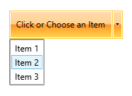
In order to add content to the drop-down area of RadSplitButton, use its DropDownContent property.
Adding ListBox as a drop down content
<telerik:RadSplitButton AutoOpenDelay="0:0:0.0" Content="Click or Choose an Item">
    <telerik:RadSplitButton.DropDownContent>
        <ListBox>
            <ListBoxItem Content="Item 1" />
            <ListBoxItem Content="Item 2" />
            <ListBoxItem Content="Item 3" />
        </ListBox>
    </telerik:RadSplitButton.DropDownContent>
</telerik:RadSplitButton>
Additionally, the control provides
DropDownContentTemplateandDropDownContentTemplateSelectorproperties, that can be used to customize the drop down content in a data binding scenario. Read more about data templates in the Data Templating Overview MSDN article.
RadSplitButton with dropdown content

Toggling the RadSplitButton
The ButtonPart of the split button can behave as a toggle button. To enable this, set the IsToggle property of RadSplitButton to True.
Enable toggle mode
<telerik:RadSplitButton IsToggle="True" />
RadSplitButton as a toggle button

Auto Opening
You can allow the RadSplitButton to automatically display its DropDownContent, when you mouse over the button. This behaviour is controlled via the AutoOpenDelay property of RadSplitButton. The property specifies the time, after which the drop down content is displayed.
To disable the auto-opening feature of the control, set the AutoOpenDelay to 0.
Setting the AutoOpenDelay property
<telerik:RadSplitButton AutoOpenDelay="0:0:0.5" />
Customizing the RadSplitButton
You can easily customize RadSplitButton by using the following properties:
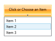
IsOpen—Specifies whether the DropDownContent of the button is opened.IsChecked—Specifies the checked state of the button when its ButtonPart behaves like a toggle button. To make this property work, theIsToggleproperty should be set totrue.CloseOnEscape—Specifies whether the drop-down should be closed when theEsckey gets pressed. The default value isTrue.ButtonPartStyle—Allows you to define aStylefor the ButtonPart of the RadSplitButton. TheTargetTypeexpected by the Style isRadButton.TogglePartStyle—Allows you to define aStylefor the ButtonPart of RadSplitButton when it is in toggle button mode. TheTargetTypeexpected by the Style isRadToggleButton.CornerRadius—Specifies the corner radius of RadSplitButton.ToggleCornerRadius—Specifies the corner radius of the ButtonPart, when it behaves like a toggle button.IsBackgroundVisible—Controls the visibility of the background and the border of the RadSplitButton control in normal state.IsButtonPartVisible—Specifies whether the ButtonPart is visible.DropDownButtonPosition—Specifies the position of the drop down arrow. The possible values areBottom,Left,Right(default),Top.DropDownIndicatorVisibility—Specifies whether the drop-down arrow should be visible. The default value isVisible.DropDownPlacement—Specifies where the drop down area should be placed -Absolute,Bottom,Center,Left,Right,Top.DropDownWidth—Specifies the width of the drop-down area.DropDownHeight—Specifies the height of the drop-down area.DropDownMaxHeight—Specifies the maximal height of the drop-down area.DropDownMaxWidth—Specifies the maximal width of the drop-down area.CloseOnPopupMouseLeftButtonUp—Specifies whether the drop-down area should be closed when the user clicks on theDropDownContentof the control. The closing of the drop-down is executed on theMouseLeftButtonUpevent of thePopupcontrol. The default value isFalse.
Customizing RadSplitButton
<telerik:RadSplitButton DropDownButtonPosition="Bottom"
                        Content="Click or Choose an Item"
                        DropDownWidth="{Binding ActualWidth, RelativeSource={RelativeSource Self}}">
    <telerik:RadSplitButton.DropDownContent>
        <ListBox>
            <ListBoxItem Content="Item 1" />
            <ListBoxItem Content="Item 2" />
            <ListBoxItem Content="Item 3" />
        </ListBox>
    </telerik:RadSplitButton.DropDownContent>
</telerik:RadSplitButton>
Customized RadSplitButton
