Selection
RadSegmentedControl control exposes few useful properties which can help you work with the items selection.
Setting the selected segment
The segment control has a SelectedIndex property which you can use to set the selected item.
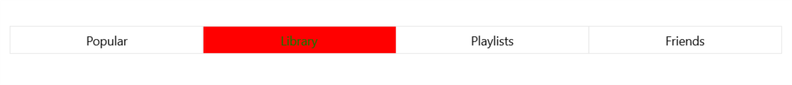
Setting Selection Colors
You can define custom colors for the text and the background of the selected segment. You can do that via the SelectedBackground and SelectedForegorund properties of Segment element. These properties can be set by creating custom style for the ItemContainerStyle property of the RadSegmentedControl targeting Segment element
Example 1: Defining a RadSegmentedControl
<input:RadSegmentedControl x:Name="segmentControl" VerticalAlignment="Center" Margin="20">
    <input:RadSegmentedControl.ItemContainerStyle>
        <Style TargetType="input:Segment">
            <Setter Property="SelectedBackground" Value="Red"/>
            <Setter Property="SelectedForeground" Value="Green"/>
        </Style>
    </input:RadSegmentedControl.ItemContainerStyle>
</input:RadSegmentedControl>
Selection changed
RadSegmentedControl exposes a SelectionChanged event which is fired when the selected item is updated.
- SelectionChanged: Occurs when the selected item is changed programatically or due to user interaction. The event arguments are of type SelectionChangedEventArgs.