Visual Structure
This help article will help you understand the main concepts used in the scope of the RadScheduler control.
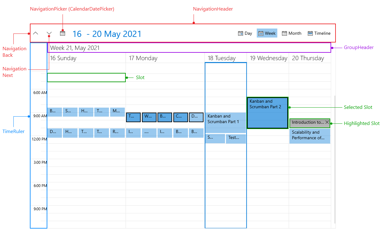
NavigationHeader: Used for switching the ViewDefinitions of the Scheduler as well as changing the current date. It can be easily hidden by setting the NavigationHeaderVisibility property of the Scheduler to "Collapsed".
TimeRuler: Represents the time axis of the Scheduler. The TimeRuler can be vertical or horizontal according to the active ViewDefinition orientation. Additionally, you could customize it by following the instructions in Configuring the TimeRuler ticks topic.
Appointment: Represents a single piece of data that is visualized in the Scheduler. For more details on the appointments, check the Populating with Data topics.
GroupHeader: Represent the date and the resources (when the Scheduler is grouped) headers. The group headers can be vertical or horizontal depending on the active ViewDefinition and its orientation.
Slot: Represent the timeslots of the control defined by the TimeRuler. Furthermore, RadScheduler provides the option to create Special and ReadOnly slots.
Selected Slot, Highlighted Slot: Represent the selected/hightlighted state of the Slot. The slot selection behavior can be customizing following the instructions in the SlotSelectionBehavior topic.
NavigationDefinition Selection: Used to navigate between the available ViewDefinitions in the Scheduler.
NavigationDateTimePicker: Opens a Calendar for easier changing of the CurrentDate of the Scheduler.
NavigationBack, NavigationNext : Decrease or increase the CurrentDate of the Scheduler according to the ViewDefinition LargeChangeInterval property. For more details check the ViewDefinitions Configuration topic.