Customizations
This article explains how the shape of the rating items can be customized.
Empty State
- EmptyIconContent: Gets or sets the content of the RadRatingItem icon when the item is not selected.
- EmptyIconStyle: Gets or sets the style of the RadRatingItem icon content when the item is not selected.
- EmptyIconContentTemplate: Gets or sets the content template of the RadRatingItem when the item is not selected.
Filled State
- FilledIconContent: Gets or sets the content of the RadRatingItem icon when the item is selected.
- FilledIconStyle: Gets or sets the style of the RadRatingItem icon content when the item is selected.
- FilledIconContentTemplate: Gets or sets the content template of the RadRatingItem when the item is selected.
Highlighted State
- HighlightedIconStyle: Gets or sets the style of the RadRatingItem icon content in highlighted state.
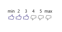
Example 1 demonstrate how you can use the above properties to further customize the RadRating control.
Example 1: Customize RadRating Control
<input:RadRating AutoGeneratedItemsCount="0" Grid.Row="1">
    <input:RadRatingItem Content="min" />
    <input:RadRatingItem Content="2" />
    <input:RadRatingItem Content="3"/>
    <input:RadRatingItem Content="4" />
    <input:RadRatingItem Content="5" />
    <input:RadRatingItem Content="max"/>

    <input:RadRating.EmptyIconContentTemplate>
        <DataTemplate>
            <SymbolIcon Symbol="Dislike" Foreground="Gray" Margin="3"/>
        </DataTemplate>
    </input:RadRating.EmptyIconContentTemplate>
    <input:RadRating.FilledIconContentTemplate>
        <DataTemplate>
            <SymbolIcon Symbol="Like" Margin="3"/>
        </DataTemplate>
    </input:RadRating.FilledIconContentTemplate>
    <input:RadRating.HighlightedIconStyle>
        <Style TargetType="ContentPresenter">
            <Setter Property="Foreground" Value="SlateBlue" />
        </Style>
    </input:RadRating.HighlightedIconStyle>
    <input:RadRating.FilledIconStyle>
        <Style TargetType="ContentPresenter">
            <Setter Property="Foreground" Value="DarkSlateBlue" />
        </Style>
    </input:RadRating.FilledIconStyle>
</input:RadRating>