Customize the RadialMenuItem Content
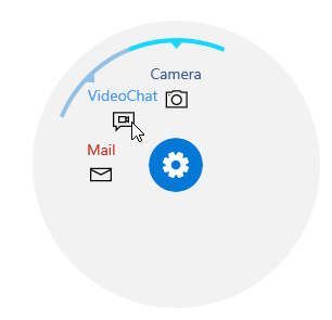
This example demonstrates how you can change the appearance of the RadialMenuItem content.
Here we will use an implicit Style that targets the RadialMenuItemControl type defined in the Telerik.UI.Xaml.Controls.Primitives.Menu namespace. We will set a Template that will have two ContentPresenter elements bound to the IconContent and Header properties of the RadialMenuItem element.
You can access the RadRadialMenu control and RadialMenuItemControl through alias pointing to the Telerik.UI.Xaml.Controls.Navigation and Telerik.UI.Xaml.Controls.Navigation.Menu namespaces: xmlns:navigation="using:Telerik.UI.Xaml.Controls.Navigation", xmlns:menu="using:Telerik.UI.Xaml.Controls.Navigation.Menu"
Example 1: Set Custom Template
<navigation:RadRadialMenu>
    <navigation:RadRadialMenu.Resources>
        <Style TargetType="menu:RadialMenuItemControl">
            <Setter Property="Template">
                <Setter.Value>
                    <ControlTemplate TargetType="menu:RadialMenuItemControl">
                        <StackPanel>
                            <ContentPresenter VerticalAlignment="Bottom" HorizontalAlignment="Center"
                                      FontSize="14" Content="{TemplateBinding Header}" >
                            </ContentPresenter>
                            <ContentPresenter VerticalAlignment="Bottom" HorizontalAlignment="Center"
                                      Width="30" Height="30"
                                      Content="{TemplateBinding IconContent}">
                            </ContentPresenter>
                        </StackPanel>
                    </ControlTemplate>
                </Setter.Value>
            </Setter>
        </Style>
    </navigation:RadRadialMenu.Resources>

    <navigation:RadialMenuItem>
        <navigation:RadialMenuItem.Header>
            <TextBlock Foreground="#3B5998">Camera</TextBlock>
        </navigation:RadialMenuItem.Header>
        <navigation:RadialMenuItem.IconContent>
            <SymbolIcon Symbol="Camera"/>
        </navigation:RadialMenuItem.IconContent>
    </navigation:RadialMenuItem>
    <navigation:RadialMenuItem>
        <navigation:RadialMenuItem.Header>
            <TextBlock Foreground="#4099FF">VideoChat</TextBlock>
        </navigation:RadialMenuItem.Header>
        <navigation:RadialMenuItem.IconContent>
            <SymbolIcon Symbol="VideoChat"/>
        </navigation:RadialMenuItem.IconContent>
    </navigation:RadialMenuItem>
    <navigation:RadialMenuItem>
        <navigation:RadialMenuItem.Header>
            <TextBlock Foreground="#C92C19">Mail</TextBlock>
        </navigation:RadialMenuItem.Header>
        <navigation:RadialMenuItem.IconContent>
            <SymbolIcon Symbol="Mail"/>
        </navigation:RadialMenuItem.IconContent>
    </navigation:RadialMenuItem>
</navigation:RadRadialMenu>