Alignment
You can control the alignment of the RadExpander control through the HorizontalAlignment and VerticalAlignment properties.
Moreover, if you need to further customize RadExpander's Content alignment you can take advantage of the HorizontalContentAlignment and VerticalContentAlignment properties.
And if you want to control the alignment of the header, you can use the HorizontalHeaderAlignment and VerticalHeaderAlignment properties.
By default all these properties are set to Stretch so that the RadExpander control takes up all the available space.
The alignment properties depend on the ExpandDirection of the control. Therefore before setting the alignment properties, you should carefully plan how you need to render the control depending on the available area as well as the ExpandDirection of the control.
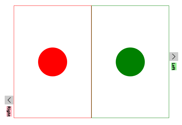
Example 1: Setting ExpandDirection property
<Grid>
    <Grid.RowDefinitions>
        <RowDefinition Height="*" />
        <RowDefinition Height="*" />
    </Grid.RowDefinitions>
    <Grid.ColumnDefinitions>
        <ColumnDefinition Width="*" />
        <ColumnDefinition Width="*" />
    </Grid.ColumnDefinitions>
    <telerik:RadExpander Grid.Row="0" Grid.Column="0" ExpandDirection="Down" Header="Down">
        <Border BorderBrush="Yellow" BorderThickness="1">
            <Ellipse Width="99" Height="99" Margin="5" Fill="Yellow" />
        </Border>
    </telerik:RadExpander>
    <telerik:RadExpander Grid.Row="0" Grid.Column="1" ExpandDirection="Up" Header="Up">
        <Border BorderBrush="Blue" BorderThickness="1">
            <Ellipse Width="99" Height="99" Margin="5" Fill="Blue" />
        </Border>
    </telerik:RadExpander>
    <telerik:RadExpander Grid.Row="1" Grid.Column="0" ExpandDirection="Right" Header="Right">
        <Border BorderBrush="Red" BorderThickness="1">
            <Ellipse Width="99" Height="99" Margin="5" Fill="Red" />
        </Border>
    </telerik:RadExpander>
    <telerik:RadExpander Grid.Row="1" Grid.Column="1" ExpandDirection="Left" Header="Left">
        <Border BorderBrush="Green" BorderThickness="1">
            <Ellipse Width="99" Height="99" Margin="5" Fill="Green" />
        </Border>
    </telerik:RadExpander>
</Grid>
Figure 1: RadExpander directions
HorizontalAlignment and VerticalAlignment properties
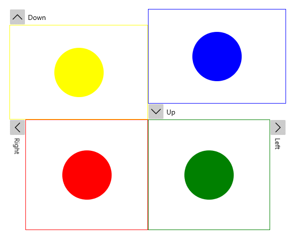
You can control the vertical and horizontal alignment of the control through the HorizontalAlignment and VerticalAlignment properties. By default both properties are set to Stretch.
However, if you want the control to take up only as much space as it needs, you can define the VerticalAlignment and HorizontalAlignment properties accordingly to the ExpandDirection of the control.
Example 2: Setting HorizontalAlignment and VerticalAlignment properties
<Grid>
    <Grid.RowDefinitions>
        <RowDefinition Height="*" />
        <RowDefinition Height="*" />
    </Grid.RowDefinitions>
    <Grid.ColumnDefinitions>
        <ColumnDefinition Width="*" />
        <ColumnDefinition Width="*" />
    </Grid.ColumnDefinitions>
    <telerik:RadExpander Grid.Row="0" Grid.Column="0" ExpandDirection="Down" Header="Down" VerticalAlignment="Top">
        <Border BorderBrush="Yellow" BorderThickness="1">
            <Ellipse Width="99" Height="99" Margin="5" Fill="Yellow" />
        </Border>
    </telerik:RadExpander>
    <telerik:RadExpander Grid.Row="0" Grid.Column="1" ExpandDirection="Up" Header="Up" VerticalAlignment="Bottom">
        <Border BorderBrush="Blue" BorderThickness="1">
            <Ellipse Width="99" Height="99" Margin="5" Fill="Blue" />
        </Border>
    </telerik:RadExpander>
    <telerik:RadExpander Grid.Row="1" Grid.Column="0" ExpandDirection="Right" Header="Right" HorizontalAlignment="Left">
        <Border BorderBrush="Red" BorderThickness="1">
            <Ellipse Width="99" Height="99" Margin="5" Fill="Red" />
        </Border>
    </telerik:RadExpander>
    <telerik:RadExpander Grid.Row="1" Grid.Column="1" ExpandDirection="Left" Header="Left" HorizontalAlignment="Right">
        <Border BorderBrush="Green" BorderThickness="1">
            <Ellipse Width="99" Height="99" Margin="5" Fill="Green" />
        </Border>
    </telerik:RadExpander>
</Grid>
Figure 2: HorizontalAlignment and VerticalAlignment properties visual appearance
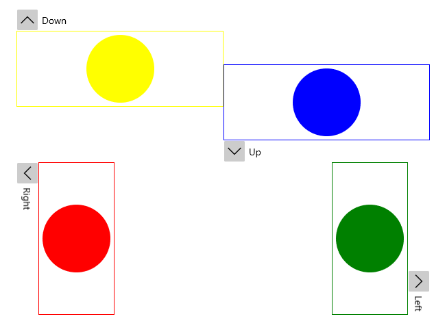
Please note that when the VerticalAlignment/HorizontalAlignment properties match the ExpandDirection, the Header will move aside as the content is expanded.
HorizontalContentAlignment and VerticalContentAlignment properties
Similarly, you can use the HorizontalContentAlignment and VerticalContentAlignment properties to control how the RadExpander's Content will be rendered.
HorizontalHeaderAlignment and VerticalHeaderAlignment properties
You can also control how to render the RadExpander's Header through the HorizontalHeaderAlignment and VerticalHeaderAlignment properties.
Example 4: Setting HorizontalHeaderAlignment property
<Grid>
    <Grid.ColumnDefinitions>
        <ColumnDefinition Width="" />
        <ColumnDefinition Width="" />
    </Grid.ColumnDefinitions>
    <telerik:RadExpander Grid.Column="0" ExpandDirection="Down" HorizontalHeaderAlignment="Center">
        <telerik:RadExpander.Header>
            <Border Background="LightYellow">
                <TextBlock Text="Down" FontWeight="Bold" />
            </Border>
        </telerik:RadExpander.Header>
        <Border BorderBrush="Yellow" BorderThickness="1">
            <Ellipse Width="99" Height="99" Margin="5" Fill="Yellow" />
        </Border>
    </telerik:RadExpander>
    <telerik:RadExpander Grid.Column="1" ExpandDirection="Up" HorizontalHeaderAlignment="Right">
        <telerik:RadExpander.Header>
            <Border Background="LightBlue">
                <TextBlock Text="Up" FontWeight="Bold" />
            </Border>
        </telerik:RadExpander.Header>
        <Border BorderBrush="Blue" BorderThickness="1">
            <StackPanel Orientation="Vertical">
                <Ellipse Width="99" Height="99" Margin="5" Fill="Blue" />
            </StackPanel>
        </Border>
    </telerik:RadExpander>
</Grid>
Figure 3: HorizontalHeaderAlignment with ExpandDirection set to Down and Up
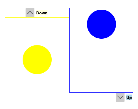
Figure 4: HorizontalHeaderAlignment with ExpandDirection set to Right and Left