Input Modes
This RadDateTimePicker fully replaces the functionality of the RadTimePicker and RadDatePicker controls. When you use a RadDateTimePicker control you might want to specify that you need to use the calendar or the clock independently.
This behavior can be controlled via the InputMode property. The default value gives you both the calendar and the clock views. There are three input modes that correspond to these scenarios:
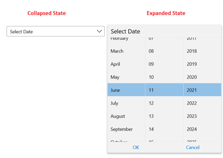
DatePicker: With this input mode your RadDateTimePicker control will show only the calendar view.
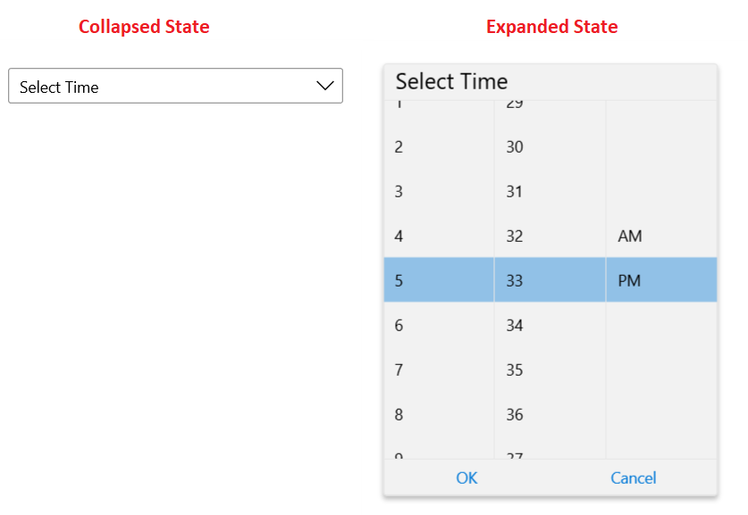
TimePicker: This input mode lets your RadDateTimePicker control show only the clock view.
DateTimePicker: This input mode is the default one and will visualize both the calendar and the clock views.
You can access the RadDateTimePicker control through an alias pointing to the Telerik.UI.Xaml.Controls.Input namespace: xmlns:input="using:Telerik.UI.Xaml.Controls.Input"
You can change the value of this property in XAML as shown in this snippet:
Example 1
<input:RadDateTimePicker InputMode="DatePicker"/>
Similarly if you decide to have only the time picker you can choose the TimePicker input mode:
Example 2
<input:RadDateTimePicker InputMode="TimePicker"/>