Radio Button
The RadRadioButton control is a checkable button that extends the native RadioButton component by providing an additional command target support and consistent theming with the other Telerik components.
By grouping the RadioButtons the user will be allowed to check only one button in the group. To group several RadioButtons, place them into the same layout panel (StackPanel, Grid, etc.) or set their GroupName to the same value.
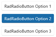
The following examples shows how to define several buttons and group them. The first example demonstrates how to use the automatic group when the buttons are placed into the same panel.
Grouping RadioButtons using StackPanel
<StackPanel>
    <telerikControls:RadRadioButton Content="RadRadioButton Option 1" />
    <telerikControls:RadRadioButton Content="RadRadioButton Option 2" Margin="0 10 0 0"/>
    <telerikControls:RadRadioButton Content="RadRadioButton Option 3" Margin="0 10 0 0"/>
</StackPanel>

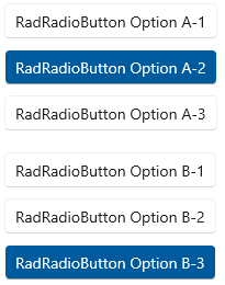
In the second example, the buttons are grouped with the GroupName property in order to create two sets of buttons in the same panel.
Grouping RadioButtons using the GroupName property
<StackPanel>
    <telerikControls:RadRadioButton GroupName="A" Content="RadRadioButton Option A-1" />
    <telerikControls:RadRadioButton GroupName="A" Content="RadRadioButton Option A-2" Margin="0 10 0 0"/>
    <telerikControls:RadRadioButton GroupName="A" Content="RadRadioButton Option A-3" Margin="0 10 0 0"/>
    <telerikControls:RadRadioButton GroupName="B" Content="RadRadioButton Option B-1" Margin="0 20 0 0"/>
    <telerikControls:RadRadioButton GroupName="B" Content="RadRadioButton Option B-2" Margin="0 10 0 0"/>
    <telerikControls:RadRadioButton GroupName="B" Content="RadRadioButton Option B-3" Margin="0 10 0 0"/>
</StackPanel>
