DropDown Button
The RadDropDownButton control is a toggle button that opens a drop down presenter on click and closes it on second click. The drop down content can be populated with any element, like a simple text, a list with items or any other complex UI.
The DropDownButton's content is populated using its Content property. The drop down part is added via the DropDownContent property. Additionally, the contents can be customized using the ContentTemplate, DropDownContentTemplate and the associated DataTemplateSelector properties.
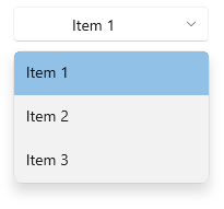
The following example shows how to define a button with a ListBox in its dropdown content and bind its 'Content' to the SelectedItem of the list.
Defining RadDropDownButton
<telerikControls:RadDropDownButton Content="{Binding ElementName=listBox, Path=SelectedItem.Content}"
                                   DropDownWidth="180">
    <telerikControls:RadDropDownButton.DropDownContent>
        <ListBox x:Name="listBox">
            <ListBoxItem Content="Item 1" />
            <ListBoxItem Content="Item 2" />
            <ListBoxItem Content="Item 3" />
        </ListBox>
    </telerikControls:RadDropDownButton.DropDownContent>
</telerikControls:RadDropDownButton>
The dropdown part of the DropDownButton can be opened or closed manually using the IsOpen property of RadDropDownButton.