Customizing Appearance
Parts of the buttons from the Buttons suite can be customized using properties from the public API.
To change the corner radius of a Button, set its CornerRadius property.
Changing the corner radius
<telerikControls:RadButton CornerRadius="20" Content="RadButton" />

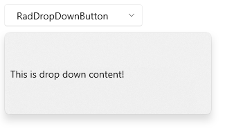
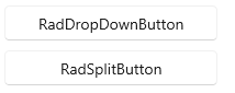
To hide the dropdown button part (the arrow) that opens the DropDownContent of the DropDownButton and SplitButton, set their DropDownIndicatorVisibility.
Hiding the dropdown button part
<telerikControls:RadDropDownButton Content="RadDropDownButton" DropDownIndicatorVisibility="Collapsed" />
<telerikControls:RadSplitButton Content="RadSplitButton" DropDownIndicatorVisibility="Collapsed" />
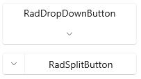
To change the position (right by default) of the dropdown button part, set the DropDownButtonPosition property of DropDownButton and SplitButton.
Setting the dropdown button position
<telerikControls:RadDropDownButton Content="RadDropDownButton" DropDownButtonPosition="Bottom" />
<telerikControls:RadSplitButton Content="RadSplitButton" DropDownButtonPosition="Left" />
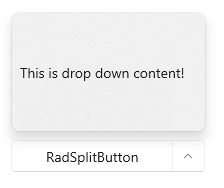
To change the placement of the DropDownContent, set the DropDownPlacement property of DropDownButton and SplitButton.
Setting the dropdown placement
<telerikControls:RadSplitButton DropDownPlacement="Top" Content="RadSplitButton" />
To change the size of the DropDownContent, you can set several properties of DropDownButton and SplitButton. The size of dropdown is determined by the DropDownWidth and DropDownHeight. Additionally, you can restrict the size with the DropDownMinHeight, DropDownMaxHeight, DropDownMinWidth and DropDownMaxWidth properties.
Setting the dropdown width and height
<telerikControls:RadDropDownButton Content="RadDropDownButton" DropDownWidth="300" DropDownHeight="120" />