Getting Started with WinForms CollapsiblePanel
This tutorial will help you to quickly get started using the control.
Adding Telerik Assemblies Using NuGet
To use RadCollapsiblePanel when working with NuGet packages, install the Telerik.UI.for.WinForms.AllControls package. The package target framework version may vary.
Read more about NuGet installation in the Install using NuGet Packages article.
With the 2025 Q1 release, the Telerik UI for WinForms has a new licensing mechanism. You can learn more about it here.
Adding Assembly References Manually
When dragging and dropping a control from the Visual Studio (VS) Toolbox onto the Form Designer, VS automatically adds the necessary assemblies. However, if you're adding the control programmatically, you'll need to manually reference the following assemblies:
- Telerik.Licensing.Runtime
- Telerik.WinControls
- Telerik.WinControls.UI
- TelerikCommon
The Telerik UI for WinForms assemblies can be install by using one of the available installation approaches.
Defining the RadCollapsiblePanel
RadCollapsiblePanel can host many controls in its controls container area, which then can be collapsed. This way you will be able to save space in your application as the control can use as much space as it needs for its header.
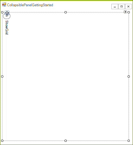
In this article you will learn the basics of how to use RadCollapsiblePanel. We will recreate a scenario where you have a RadGridView which you do not want to show at all times. This is how our Form will look like when we finish if RadCollapsiblePanel is collapsed.
Figure 1: Collapsed Panel
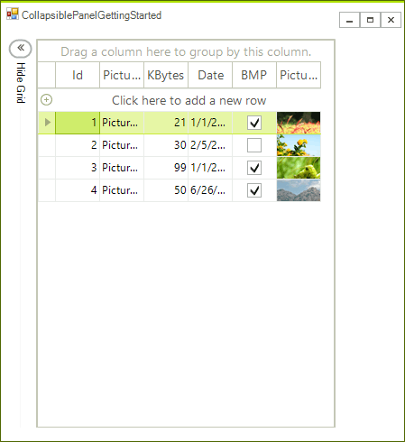
And this is how it will look if the panel is expanded.
Figure 2: Expanded Panel
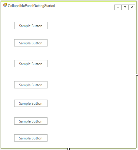
1. Create a RadForm and add a few controls (buttons in our case) on the left side of the form, but leave about 30 pixels to the form’s border. These controls will be visible only when RadCollapsiblePanel is collapsed.

2. Now drag a RadCollapsiblePanel control from the Toolbox of Visual Studio onto the form. Drag it to the top-left corner of the form and increase its height so it fits the height of the form. From the Property Window set the following properties
ExpandDirection: Right
Anchor: Top, Left, Botton
-
HeaderText: "ShowGrid"

3. Increase the panel's width to at least the half of the form. After this is ready drag a RadGridView to the controls container of the RadCollapsiblePanel instance you just created and set the following properties to the grid:
Dock: Fill
DataSource: This is optional, you can read how to bind RadGridView WinForms RadTemplates here

Handle Events
void radCollapsiblePanel1_Collapsed(object sender, EventArgs e)
{
    this.radCollapsiblePanel1.HeaderText = "Show Grid";
}
void radCollapsiblePanel1_Expanded(object sender, EventArgs e)
{
    this.radCollapsiblePanel1.HeaderText = "Hide Grid";
}
Private Sub radCollapsiblePanel1_Collapsed(sender As Object, e As EventArgs)
    Me.RadCollapsiblePanel1.HeaderText = "Show Grid"
End Sub
Private Sub radCollapsiblePanel1_Expanded(sender As Object, e As EventArgs)
    Me.RadCollapsiblePanel1.HeaderText = "Hide Grid"
End Sub
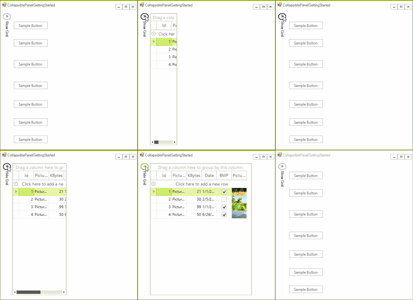
Our example is ready to be tested. You can start the application and observe the following:
Figure 3: End Result
See Also
Telerik UI for WinForms Learning Resources
- Getting Started with Telerik UI for WinForms Components
- Telerik UI for WinForms Setup
- Telerik UI for WinForms Application Modernization
- Telerik UI for WinForms Visual Studio Templates
- Deploy Telerik UI for WinForms Applications
- Telerik UI for WinForms Virtual Classroom(Training Courses for Registered Users)
- Telerik UI for WinForms License Agreement)

