Design Time
To start using RadCollapsiblePanel just drag it from the toolbox and drop it at the form.
Smart Tag
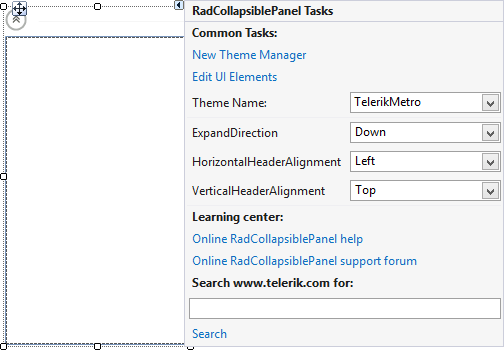
Select RadCollapsiblePanel and click the small arrow on the top right position in order to open the Smart Tag.
Figure 1: Smart Tag

-
Common Tasks
New Theme Manager: Adds a new RadThemeManager component to the form.
Edit UI elements: Opens a dialog that displays the Element Hierarchy Editor. This editor lets you browse all the elements in the control.
Theme Name: Specifies the theme set to the control.
-
RadCollapsiblePanel Actions
ExpandDirection: Indicates the direction of the expand animation..
HorizontalHeaderAlignment: Determines how the elements in the header to be aligned when it is in a horizontal position.
VerticalHeaderAlignment: Determines how the elements in the header to be aligned when it is in a vertical position.
Learning Center: Navigate to the Telerik help, code library projects or support forum.
Search: Search the Telerik website for a given string.
- Dock in Parent Container: Sets the control Dock property to Fill.
Setting the IsExpanded property in at design time expands or collapses the control without animations.