Structure
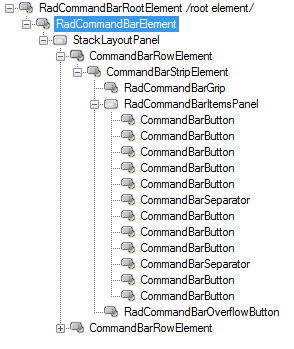
Figure 1: RadCommandBar's elements hierarchy

The Telerik RadCommandBar is built up of five levels of nested components:
-
RadCommandbar
-
RadCommandBarElement
-
CommandBarRowElement (Rows Collection)
-
CommandBarStripElement (Strips Collection)
RadCommandBarGripButton
Items ( arranged in ItemsLayout)
RadCommandBarOverflowButton
-
-
-
RadCommandBar
The RadCommandBarElement object represents the overall area of the form occupied by the Telerik RadCommandBar.
Figure 2: RadCommandBarElement

CommandBarRowElement
The CommandBarRowElement object represents a horizontal or vertical line within the RadCommandBarElement where individual strip elements are displayed.
Figure 3: CommandBarRowElement

CommandBarStripElement
The CommandBarStripElement object represents an individual toolstrip within a CommandBarRowElement. Descendants of the RadCommandBarBaseItem are arranged within a particular CommandBarStripElement.
Figure 4: CommandBarStripElement

RadCommandBarBaseItem descendants
You can add these item types to the CommandBarStripElement from the context menu or the RadElement Collection Editor:
| Name | Example | Description |
|---|---|---|
| CommandBarButton |  |
Displays a button containing text, an image, or both. Set the DrawText property to true to display the text of the button. Use the TextImageRelation property to control the layout of image and text: Overlay, ImageAboveText, TextAboveImage, ImageBeforeText, TextBeforeImage. |
| CommandBarToggleButton |  |
Displays a button that can toggle between "pressed" and "unpressed" states. The button element ToggleState property indicates the current condition of the button. |
| CommandBarTextBox |  |
Displays a text box that can accept user input. Use the Text property to get and set its content. |
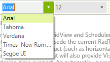
| CommandBarDropDownList |  |
Displays a dropdown list. Use the SelectedIndexChanged and SelectedValueChanged events to respond to user choices. |
| CommandBarLabel |  |
Displays static text on a strip element. Set the Text property to change the content. |
| CommandBarSeparatorItem |  |
Adds empty space between other elements on a strip element. |
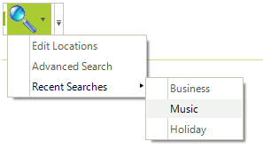
| CommandBarDropDownButton |  |
Displays a button with a drop-down arrow. Clicking the drop-down arrow displays a menu of choices. Use the Items property to populate the menu. Attach event handlers for individual element events in code to respond to user actions. |
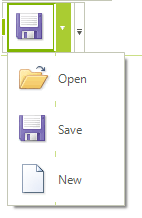
| CommandBarSplitButton |  |
Displays a button with a drop-down arrow. Clicking the drop-down arrow displays a menu of choices. Clicking the button has the same effect as clicking the default item from the menu. |
| CommandBarHostItem |  |
Item that can host any RadElement. Use the HostedItem property to get/set the element that you are hosting. Please check the example WinForms RadCommandBar here. |
| CommandBarMaskedEditBox |  |
Displays WinForms RadCommandBar RadMaskedEditBox. |
Figure 5: RadCommandBarBaseItem
