.NET MAUI Navigation Buttons Styling
The SlideView control exposes styling properties that allow you to customize the Navigation Buttons:
NavigateToPreviousItemButtonStyle(Style with target typetelerik:Radbutton)—Defines the custom style that will be applied to the button leading to the previous item.NavigateToNextItemButtonStyle(Style with target typetelerik:Radbutton)—Defines the custom style that will be applied to the button leading to the next item.
Example
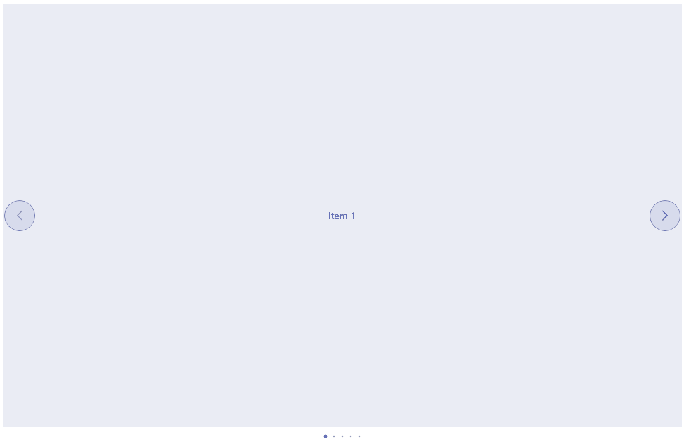
The following example demonstrates how to style the Navigation Buttons of the control.
<telerik:RadSlideView x:Name="slideView"
                      InteractionMode="Pan"
                      NavigationButtonsVisibility="Visible"
                      NavigateToNextItemButtonStyle="{StaticResource NavigateToNextButtonStyle}"
                      NavigateToPreviousItemButtonStyle="{StaticResource NavigateToPreviousButtonStyle}">
Add Style resources:
<Style x:Key="NavigateButtonBaseStyle" TargetType="telerik:RadButton">
<Setter Property="FontSize" Value="16" />
<Setter Property="TextColor" Value="#3341A1" />
<Setter Property="BackgroundColor" Value="#1A3341A1" />
<Setter Property="BorderColor" Value="#B33341A1" />
<Setter Property="BorderThickness" Value="1" />
<Setter Property="WidthRequest" Value="{OnPlatform Default=44, MacCatalyst=32}" />
<Setter Property="HeightRequest" Value="{OnPlatform Default=44, MacCatalyst=32}" />
<Setter Property="CornerRadius" Value="{OnPlatform Default=22, MacCatalyst=16}" />
</Style>
<Style x:Key="NavigateToNextButtonStyle" TargetType="telerik:RadButton" BasedOn="{StaticResource NavigateButtonBaseStyle}">
<Setter Property="Text" Value="" />
</Style>
<Style x:Key="NavigateToPreviousButtonStyle" TargetType="telerik:RadButton" BasedOn="{StaticResource NavigateButtonBaseStyle}">
<Setter Property="Text" Value="" />
</Style>
And the result below:
For a runnable example with the SlideView Navigation Buttons Styling scenario, see the SDKBrowser Demo Application and go to SlideView > Styling.