Selection in .NET MAUI SegmentedControl
The SegmentedControl exposes properties, which can help you work with the items selection.
Main Properties
-
SelectedIndex(int): Specifies the index of the first item in the current selection or -1 if the selection is empty. -
SelectedItem(object): Defines the first item in the current selection, or null if the selection is empty.
Events
The SegmentedControl exposes a SelectionChanged event, which is fired when the selected item is programmatically changed or updated due to user interaction.
The SelectionChanged event handler receives two parameters:
- The sender argument, which is of type
object, but can be cast to theRadSegmentedControltype. - A
ValueChangedEventArgs<int>object, which provides the old and new value of theSelectedIndex.
Style the currently selected item
You can define custom colors for the text and the background of the selected segment by using the SelectedSegmentBackgroundColor and SelectedSegmentTextColor properties of the SegmentedControl.
Example
The following example demonstrates how to use the selection feature of SegmentedControl.
1. Create a ViewModel with a SelectedItem property bound to the SelectedItem property of the SegmentedControl:
public class ViewModel : NotifyPropertyChangedBase
{
private string selectedItem;
public ViewModel()
{
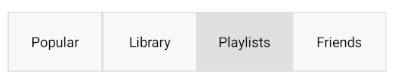
this.Categories = new ObservableCollection<string>() { "Popular", "Library", "Playlists", "Friends" };
this.SelectedItem = this.Categories[2];
}
public ObservableCollection<string> Categories { get; set; }
public string SelectedItem
{
get { return this.selectedItem; }
set { this.UpdateValue(ref this.selectedItem, value); }
}
}
2. Add the SegmentedControl definition in XAML:
<telerik:RadSegmentedControl x:Name="segmentControl"
                             ItemsSource="{Binding Categories}"
                             SelectedItem="{Binding SelectedItem, Mode=TwoWay}"
                             SelectionChanged="SelectionChanged"
                             HeightRequest="60"
                             VerticalOptions="Start" />
3. Set the BindingContext of the control:
this.segmentControl.BindingContext = new ViewModel();
4. Add the SegmentedControl SelectionChanged event:
private void SelectionChanged(object sender, ValueChangedEventArgs<int> e)
{
    this.selectionItemLabel.Text = $"The new selected item index is {e.NewValue}.";
}
The image below shows the end result on different platforms: