.NET MAUI SegmentedControl Styling
The SegmentedControl provides a set of properties for customizing the text and background colors of its segments.
The colors that are applied to the segments differ between the states of the control.
The SegmentedControl exposes the following properties:
-
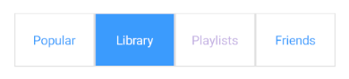
SegmentBackgroundColor—The background color applied to segments that are not selected. -
SegmentTextColor—The text color applied to the segments that are not selected. -
SelectedSegmentBackgroundColor—The background color applied to the selected segment. -
SelectedSegmentTextColor—The text color applied to the selected segment. -
DisabledSegmentTextColor—The text color applied to the disabled segments.
Example
The following example shows how to set the different segment colors.
<telerik:RadSegmentedControl x:Name="segmentControl"
                             Margin="10"
                             DisabledSegmentTextColor="#808660C5"
                             HeightRequest="60"
                             SegmentBackgroundColor="#FFFFFF"
                             SegmentTextColor="#3A9BFD"
                             SelectedSegmentBackgroundColor="#3A9BFD"
                             SelectedSegmentTextColor="#FFFFFF"
                             VerticalOptions="Start">
    <telerik:RadSegmentedControl.ItemsSource>
        <x:Array Type="{x:Type x:String}">
            <x:String>Popular</x:String>
            <x:String>Library</x:String>
            <x:String>Playlists</x:String>
            <x:String>Friends</x:String>
        </x:Array>
    </telerik:RadSegmentedControl.ItemsSource>
</telerik:RadSegmentedControl>
The following image shows the end result.