.NET MAUI Modal Popup
You can define whether the .NET MAUI Popup will be modal or not through the IsModal Boolean property. In both cases, the UI behind the popup gets inactive and cannot be used until the popup is closed. For non-modal popups, however, you can focus the content behind by clicking outside the popup, thus closing it.
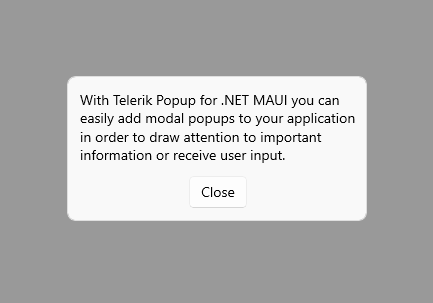
Here is an example of a modal popup attached to the ContentPage:
<telerik:RadPopup.Popup>
    <telerik:RadPopup x:Name="popup"
                      IsModal="True"
                      OutsideBackgroundColor="#66000000"
                      Placement="Center">
        <telerik:RadBorder BackgroundColor="#F9F9F9"
                           BorderColor="#DFDFDF"
                           BorderThickness="1"
                           CornerRadius="8"
                           WidthRequest="300">
            <VerticalStackLayout Padding="12"
                                 Spacing="12">
                <Label TextColor="Black"
                       Text="With Telerik Popup for .NET MAUI you can easily add modal popups to your application in order to draw attention to important information or receive user input."
                       LineBreakMode="WordWrap" />
                <telerik:RadTemplatedButton HorizontalOptions="Center"
                                            Content="Close"
                                            Clicked="ClosePopup" />
            </VerticalStackLayout>
        </telerik:RadBorder>
    </telerik:RadPopup>
</telerik:RadPopup.Popup>
And the next example shows the event handlers for opening/closing the popup:
private void ClosePopup(object sender, EventArgs e) => popup.IsOpen = false;

private void ShowPopup(object sender, EventArgs e) => popup.IsOpen = true;
Here is the result—the Popup applies the default outside background color for the content behind: