.NET MAUI ItemsControl Configuration
The ItemsControl enables you to define the collection of the rendered items and also to customize their appearance by using the item template.
Setting the Items Source
To set the items of the ItemsControl and populate them with data, use its ItemsSource property:
1. Use the following data item:
public class Experience
{
    public string Title { get; set; }
    public string Company { get; set; }
}
2. Create a ViewModel class and define a collection of Experience objects:
public class ViewModel
{
    public ViewModel()
    {
        this.Experiences = new ObservableCollection<Experience>()
        {
            new Experience() { Title = "JS Developer", Company = "@ Progress Software" },
            new Experience() { Title = "Technical Support Engineer", Company = "@ Progress Software" },
            new Experience() { Title = "Junior Technical Support Engineer", Company = "@ Progress Software" },
        };
    }

    public ObservableCollection<Experience> Experiences { get; set; }
}
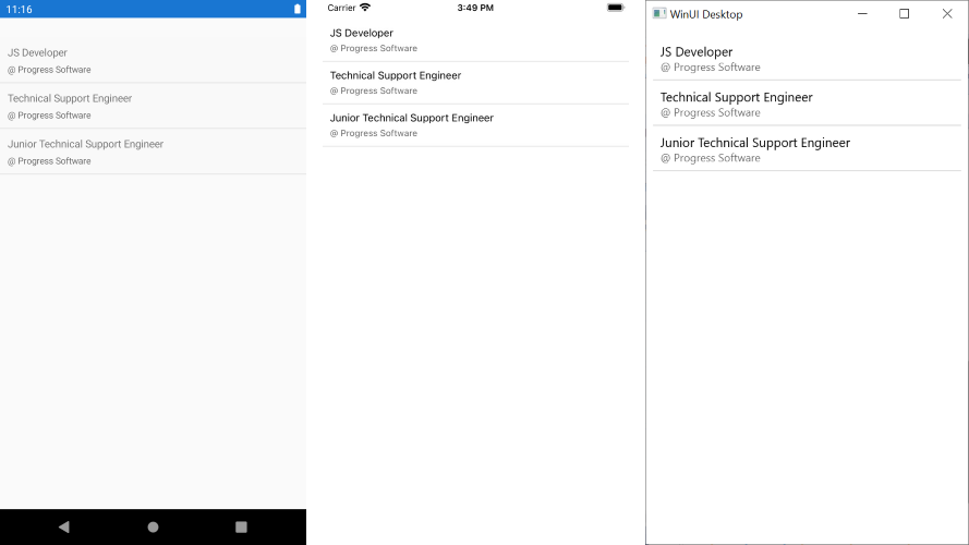
3. Add the ItemsControl definition with the ItemsSource and a sample ItemTemplate applied:
<telerik:RadItemsControl x:Name="itemsControl"
                                  ItemsSource="{Binding Experiences, Mode=TwoWay}">
    <telerik:RadItemsControl.BindingContext>
        <local:ViewModel />
    </telerik:RadItemsControl.BindingContext>
    <telerik:RadItemsControl.ItemTemplate>
        <DataTemplate>
            <StackLayout Margin="10"
                         Spacing="5"
                         Orientation="Horizontal">
                <Label Text="{Binding Title}"
                               FontSize="14"/>
                <Label Text="{Binding Company}"
                               TextColor="#99000000"
                               FontSize="12"/>
            </StackLayout>
        </DataTemplate>
    </telerik:RadItemsControl.ItemTemplate>
</telerik:RadItemsControl>
The following image shows the end result.
Customizing the Appearance
You can customize the visualization of the ItemsControl items and place various controls inside the control for more appealing designs by using the ItemTemplate property.
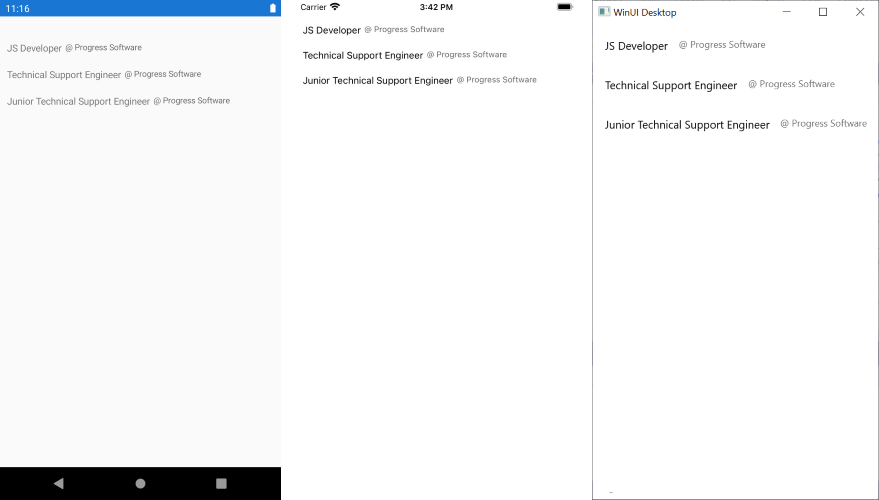
The following example demonstrates how to set the items template and uses the Experience objects together with the Telerik UI for .NET MAUI Border.
<telerikMauiControls:RadItemsControl x:Name="itemsControl"
                                ItemsSource="{Binding Experiences, Mode=TwoWay}">
    <telerikMauiControls:RadItemsControl.BindingContext>
        <local:ViewModel />
    </telerikMauiControls:RadItemsControl.BindingContext>
    <telerikMauiControls:RadItemsControl.ItemTemplate>
        <DataTemplate>
            <telerikMauiControls:RadBorder BorderColor="#DFDFDF"
                                           BorderThickness="0, 0, 0, 1">
                <StackLayout Margin="10"
                        Spacing="5">
                    <Label Text="{Binding Title}"
                            FontSize="14"/>
                    <Label Text="{Binding Company}"
                            TextColor="#99000000"
                            FontSize="12"/>
                </StackLayout>
            </telerikPrimitives:RadBorder>
        </DataTemplate>
    </telerikMauiControls:RadItemsControl.ItemTemplate>
</telerikMauiControls:RadItemsControl>
The following image shows the end result.