First Steps with ThemeBuilder
In this ThemeBuilder tutorial, you will learn how to make your first steps with the tool, and then you will discover its advanced features.
By using ThemeBuilder, you will create your custom UI components and build visual styles to make them match the design requirements of your project. The steps in this tutorial represent the standard workflow that you can follow when working with ThemeBuilder.
Most of the steps in this tutorial require an active free trial license or a ThemeBuilder subscription.
Prerequisites
To follow the steps in this tutorial, you need a Telerik account. If you don't have a Telerik account yet, register and start your free ThemeBuilder trial in a single step.
Don't worry if you do not have a ThemeBuilder subscription. You can start a free trial by following the instructions in this guide.
Creating a Blank Project
To start building your UI components and styles, you must create a blank ThemeBuilder project. ThemeBuilder is a cloud application and it automatically saves the changes in your project as you make them. You can even share your projects with colleagues and collaborate on projects.
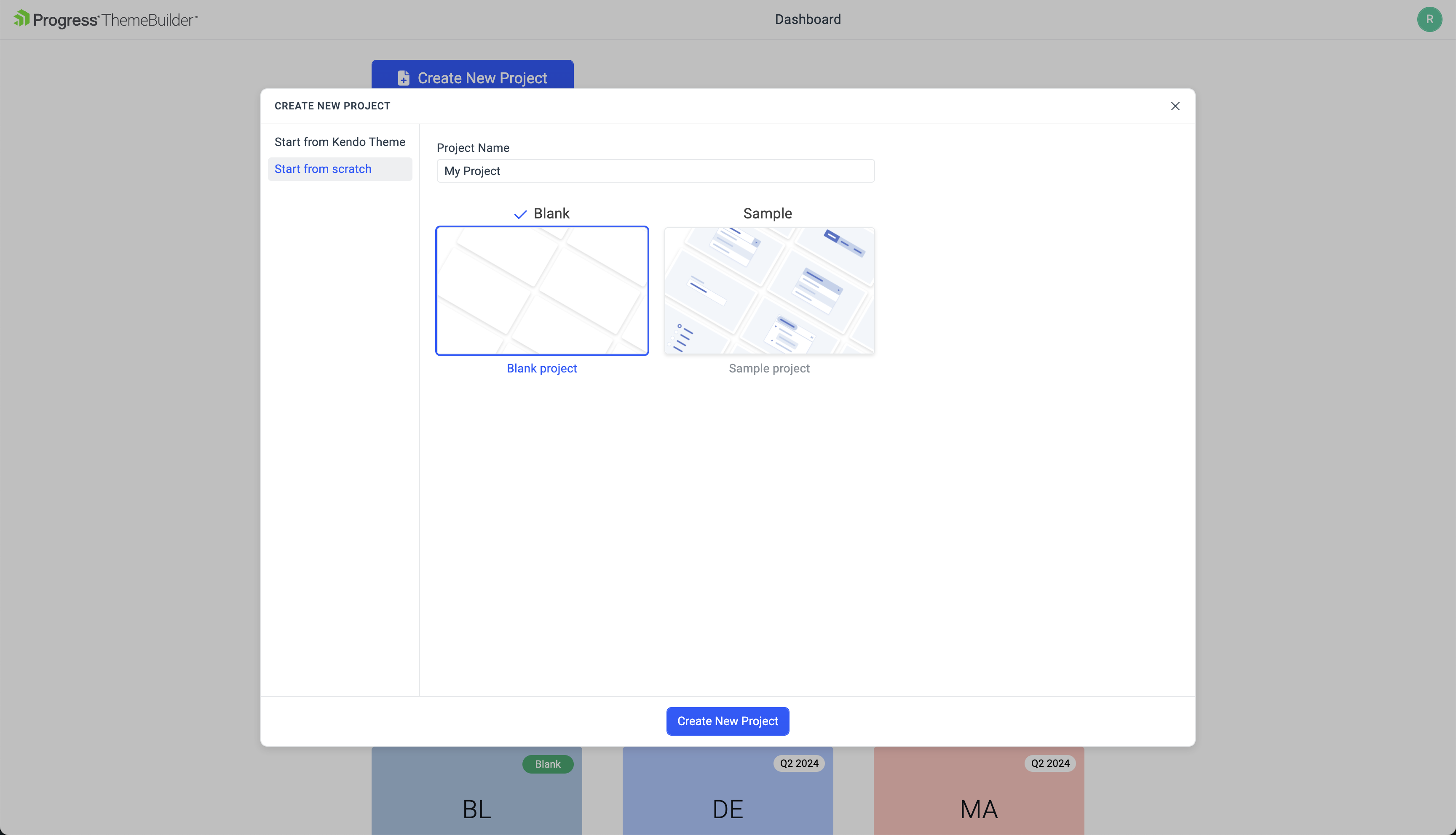
To create a new blank ThemeBuilder project:
Navigate to the ThemeBuilder app.
Enter the credentials for your Telerik account and log in.
Click the Create New Project button.
Choose the Start from scratch tab.
Enter My First Project as a name for your project and then select the Blank project type.
-
Finally, click Create New Project.
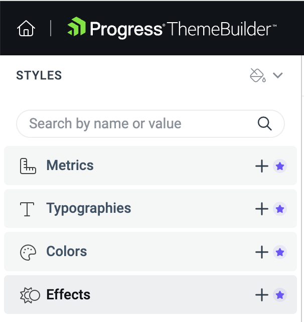
After creating the project, you will see the ThemeBuilder workspace:
The UI components, when added, are in the center of the screen. These are live components—any change to their styles is immediately rendered on the screen.
The variables are in the STYLES pane on the left-hand side of the screen. These variables let you reuse colors, metrics, and typographies, allowing you to scale any changes in your component styles.
(Optional) Activating Your Free Trial
This tutorial demonstrates various features that require the ThemeBuilder subscription or a free trial license. If you already have access to the paid features, continue to the Customizing Theme Variables section.
To activate your free trial:
-
Locate and click the Start Trial banner in the toolbar or one of the star icons in your ThemeBuilder project, for example:
-
Click the banner on the top of the ThemeBuilder screen.

-
Click the star icon near Typographies and Colors on the left of the screen.
-
In the new window that opens, click Start a Trial. Then accept the license agreement.
Creating Variables
Adding new variables gives you endless possibilities to style the UI components as you like or as required by the application design.
To create the custom variables for this tutorial:
Navigate to the STYLES pane and click the + button next to the Color section.
-
In the ADD COLOR editor:
2.1. Enter
Custom variablesas a category name and--button-borderas the name of the new variable.2.2. Enter
#DBE3EDas the value for the new variable.2.3. Click Create.
-
Repeat the steps above to add the following new variables:
New Variable Value Description --input-border#CED4DAThe border for the Inputs UI components --label-color#004284The color for the labels
The newly added variables appear under a new category in the Colors section of the STYLES pane.
Adding Custom Typography
Adding custom typography allows you to change various font-related styles.
Select the + button next to Typography.
-
Enter
Custom typographiesas a category name and--text-typographyas a name for the new variable, then set the following properties:2.1. Select the
Verdanafont family.2.2. Set the font weight to
400.2.3. Set the font size to
14px.2.4. Set the line height to
24px.
Creating Custom UI Components
Custom components in ThemeBuilder allow you to enrich your set of available UI components. They are based on pure HTML and can be styled using the out-of-the-box features and capabilities of ThemeBuilder.
To create custom UI component for this tutorial:
Click the + Add Component button.
Enter
My Formin the Name field as a name andFormsin the Category field, and then select Add Component.Enable the advanced mode by clicking the Advanced Edit tab on the top of the screen.
Click My Form to open the component for editing.
-
Click </> Add HTML to open the HTML editor and paste the following code:
<div class="my-form">
    <input class="my-input" type="text" />
    <button class="my-button">Click Me</button>
</div>
Select Save & Close from the dropdown button in the top right corner.
Select the My Form frame on the screen to access the properties of the component.
Using Advanced Customization
Next, you will change the default styles of the previously created UI components to meet our requirements.
Editing the Button Properties
-
Change the typography of the button component part:
1.1. In the COMPONENT PARTS pane on the right, select the button part.
The COMPONENT PARTS pane represents the DOM tree and informs you about the structure of the component.
2.3. In the PROPERTIES pane on the right, locate the Text property.
2.4. From the dropdown menu, select
--text-typography—the custom typography that you added in the previous part of this tutorial. -
Change the border of the button component part:
3.1. In the PROPERTIES pane, locate the Border property.
3.2. Enter
2as a value for the border width.3.3. To change the border color, select
--button-borderfrom the border color dropdown list on the right. You added this color earlier in this tutorial.
Editing the Input Properties
Next, you will customize the style of the input component part:
In the COMPONENT PARTS pane on the right, select input part.
-
In the PROPERTIES pane on the right, locate the Border property:
2.1. Enter
2px as a value for the border width.2.2. To change the border color, select
--input-borderfrom the border color dropdown list on the right. You added this color earlier in this tutorial.
(Optional) Add Kendo UI Theme
If you're building complex applications, it's easier to use an existing UI library to speed up the development process. If that is the case, you can easily include the Telerik and Kendo UI components library in your project.
Once you add the Kendo UI theme to a project, you cannot remove it later.
To add Kendo UI theme to your project:
Open the project menu by clicking on the drop down button next to the project name.
Click on the Add Kendo UI option
In the Add Kendo UI dialog, choose the Bootstrap theme. Bootstrap is one of the five themes that you can add to your project.
Click on the Add Kendo UI button to add the Bootstrap theme to your project.
For a Getting Started tutorial with the Telerik and Kendo UI components, see First Steps with ThemeBuilder using Telerik and Kendo UI.
Exporting Your Theme
When you are done styling your custom UI components, you can export the theme that you created by clicking Export in the top right corner.
The exported file is a ZIP archive that contains:
An NPM package—You can use it in version control so that your styles are versioned.
A minified compiled CSS—You can directly reference these styles in your application.
SASS files—You can add them to the build of your project to style the components.
Custom components' HTML files—Use them as a reference in your application.
Next Steps
- First steps with ThemeBuilder using Telerik and Kendo UI
- Generating custom Kendo theme with AI
- Create new project in ThemeBuilder
- Exploring the Component Properties
- Using the Exported ThemeBuilder Package
- Keyboard Shortcuts in ThemeBuilder
- From Design to Development in 7 Steps With ThemeBuilder (Blog Post)