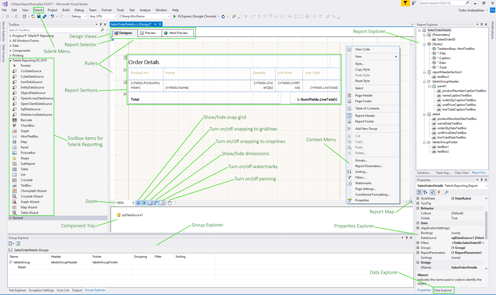
Structure of the Visual Studio Report Designer
After you have opened a report in the Telerik Visual Studio Report Designer, you may use the following elements it exposes:
Telerik Reporting Menu
The menu is accessible through the Extensions Menu --> Telerik --> Reporting for Visual Studio 2019 and later.
If you use Visual Studio versions up to 2017, you may find it in the Telerik Menu --> Reporting.
The menu lets you trigger the following functionalities:
Design Views Buttons
Use these buttons to switch between Design, Preview, and HTML view mode of the report.

Report Selector Button
Located in the upper left-hand of the report designer. Clicking this button makes the report active in the Properties window.

Rulers
They are on the top and left side of the designer and provide a point of reference to the report layout.
Report Sections
The high-level report design consists of report sections for the report header, report footer, page header, page footer, detail, group header, and group footer. Each section can be resized by dragging the sizing grips at the bottom/right of each section. Most sections except the detail can be deleted by selecting the section and hitting the delete key. To delete a group section, you have to delete the whole group from the Group Explorer.
Component Tray
Shows the DataSource components that are used in this report.

Context Menu
The Context Menu will conditionally display contents depending on the area that was right-clicked. In the figure below the menu is invoked in the area next to the report design surface.
Tooltip Buttons
All the buttons in the tooltip, placed at the lower left corner of the designer, are designed to ease you in your Report designing experience.

They toggle various options that help in aligning, snapping, and stretching the report items and also adjust different designer settings.
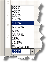
Zoom
The combo box enables you to easily specify the zoom percentage in which you see the design surface. You can do that by holding the Ctrl key and using the mouse wheel to zoom as well.
Show/Hide the Snap Grid
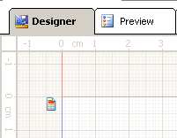
The button switches on or off the displayed snap grid. The snap grid provides a set of horizontal and vertical gridlines that — when you drag an object on the design surface — will snap or pull towards the closest vertical or horizontal gridlines. Objects can also snap to column and row dividers within a grid panel. Here is a workspace showing the snap grid turned on:
Turn On/Off Snapping to Gridlines
This option allows you to drag objects on the design surface and have them snap to the grid lines shown on the designer's surface. The snapping will be applied regardless of the visibility of the snap grid.
Turn On/Off Snapping to Snaplines
When this option is enabled, it allows you to drag objects on the design surface and snap them to the margins or alignment lines (red dashed line) of other objects within the same container element such as a layout panel, column, and row dividers in a grid panel. If a container has padding applied, it will be taken into account when snapping an object inside the container.
Show/Hide Dimensions
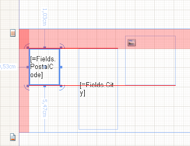
When enabled, the designer will show the distances from the currently selected object to the nearest elements.
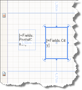
Show/Hide Watermarks
If enabled, the report watermarks will be shown in the designer. Note that the displayed watermarks are just for reference and their contents may not look the same as when rendered.
Turn On/Off Pan
This option allows you to switch between drag and pan mode in the designer. When enabled, the cursor is changed to a hand, and clicking and dragging on the designer surface will move the report contents. This tool is useful when working on higher zoom levels.
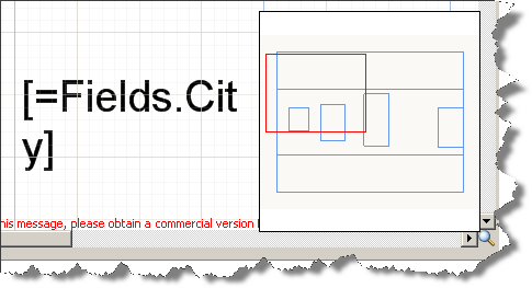
Show/Hide the Report MiniMap
In the lower-right corner of the design surface, click Show MiniMap. This element is especially useful when you have zoomed the report and want to focus on a specific element. To hide the map, click on the design surface to have it closed.
Change the Alignment of an Element
Alignment determines how an element resizes. For example, a left-aligned element stretches to the right as the parent layout container gets resized. To change the alignment of an element use the Layout toolbar and do one of the following:

- Select two report items and change their
HorizontalAlignmentby clicking Left, Center, Right, or Stretch. - Select two report items and change their
VerticalAlignmentby clicking Top, Center, Bottom, or Stretch. You can also change alignment by moving an element on the design surface.
The Visual Studio Report Designer features also Properties Explorer, Report Explorer, Group Explorer, and Data Explorer. The first one is displayed by default in the Visual Studio. The other three can be opened from the Telerik Menu.
If you are using Visual Studio 2022, ensure that the
Platform targetof yourReport Libraryproject is not set tox86, or you won't be able to preview your reports. This is because Visual Studio 2022 is a 64-bit application and, by design,.NETdoes not allow mixing 32-bit and 64-bit assemblies in the same process.