TabViewHeaderItem
The tab strip area of RadTabView contains a special toolbar panel that hosts all TabViewHeaderItem elements. Each individual TabViewItem has a Header property as well so you can set a specific TabViewHeaderItem for each tab.
Setting the Header's Position
You can use the HeaderPosition property of RadTabView to control the position of the header. The property allows you to place the header at the Top of the control where is by default or at the Bottom, under the content of the selected tab.
Default TabViewHeaderItem ControlTemplate
Here is the default Header ControlTemplate definition:
<ControlTemplate x:Key="HeaderControlTemplate" >
    <Grid BackgroundColor="Transparent">
        <BoxView IsVisible="{TemplateBinding IsSelected}"
                    BackgroundColor="{TemplateBinding SelectedColor}"
                    VerticalOptions="End"
                    HeightRequest="2" />
        <Label Text="{TemplateBinding Text}"
                Margin="0, 0, 0, 2"
                VerticalOptions="Center"
                HorizontalOptions="Center" />
    </Grid>
</ControlTemplate>
The TabView definition and how to control template is set to the TabView Header
<telerikPrimitives:RadTabView x:Name="tabView"
                              HeaderPosition="Top">
    <telerikPrimitives:RadTabView.Items>
        <telerikPrimitives:TabViewItem>
            <telerikPrimitives:TabViewItem.Header>
                <telerikPrimitives:TabViewHeaderItem Text="Tab 1"
                                                     ControlTemplate="{StaticResource HeaderControlTemplate}" />
            </telerikPrimitives:TabViewItem.Header>
        </telerikPrimitives:TabViewItem>
        <telerikPrimitives:TabViewItem HeaderText="Tab 2"/>
        <telerikPrimitives:TabViewItem HeaderText="Tab 3"/>
    </telerikPrimitives:RadTabView.Items>
</telerikPrimitives:RadTabView>
Customize the TabViewHeaderItem Control Template:
You can customize the appearance of each TabViewHeaderItem by replacing its default template with one of your choice. Below you can find a sample scenario where a custom control template is declared and set to the ControlTemplate property of the TabViewHeaderItem.
You can alter the control template of the TabViewHeaderItem in order to control the color of the selected item.
Example
<ContentView.Resources>
    <ResourceDictionary>
        <ControlTemplate x:Key="HeaderControlTemplate">
            <Grid BackgroundColor="Transparent">
                <BoxView IsVisible="{TemplateBinding IsSelected}"
                         BackgroundColor="Orange"
                         VerticalOptions="End"
                         HeightRequest="5"/>
                <StackLayout Orientation="Horizontal"
                             Margin="0, 0, 0, 8">
                    <Label Text="{TemplateBinding Text}"
                           FontSize="15"
                           TextColor="#9E4F2C"
                           VerticalOptions="Center"
                           HorizontalTextAlignment="Start"/>
                    <Label Text="Description"
                           TextColor="Blue"
                           IsVisible="{TemplateBinding IsSelected}"
                           VerticalTextAlignment="Center"
                           FontSize="12"/>
                </StackLayout>
            </Grid>
        </ControlTemplate>
    </ResourceDictionary>
</ContentView.Resources>
<telerikPrimitives:RadTabView x:Name="tabView"
                              HeaderPosition="Top">
    <telerikPrimitives:RadTabView.Items>
        <telerikPrimitives:TabViewItem>
            <telerikPrimitives:TabViewItem.Header>
                <telerikPrimitives:TabViewHeaderItem Text="Tab 1"
                                                     ControlTemplate="{StaticResource HeaderControlTemplate}" />
            </telerikPrimitives:TabViewItem.Header>
        </telerikPrimitives:TabViewItem>
        <telerikPrimitives:TabViewItem HeaderText="Tab 2"/>
        <telerikPrimitives:TabViewItem HeaderText="Tab 3"/>
    </telerikPrimitives:RadTabView.Items>
</telerikPrimitives:RadTabView>
Here is the result how the TabViewHeaderItem with custom Control Template looks:
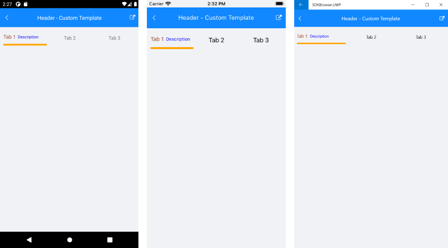
A sample HeaderItem Custom Template example can be found in the TabView/Features folder of the SDK Samples Browser application.
TabView Header
The RadTabView control exposes a Header(TelerikXamarinForms.Primitives.TabViewHeader) property which you can use to modify the header's appearance.
The TabViewHeader allows you to style and customize the OverflowButton. In addition you can decide whetehr scrolling inside the tabs will be allowed using the IsScrollanle bool property. When IsScrollable is True, OverflowButton won't be visualized, instead you can scroll through the tabs.
OverflowButton styling
Example how to set styling to OverflowButton
<telerikPrimitives:RadTabView x:Name="tabViewHeaderOverfowButton" HeaderPosition="Bottom">
    <telerikPrimitives:RadTabView.Header>
        <telerikPrimitives:TabViewHeader BackgroundColor="LightBlue"
                                         OverflowButtonContentPadding="3"
                                         OverflowButtonFontSize="20"
                                         OverflowButtonText="More items"
                                         OverflowButtonTextColor="Black"
                                         OverflowPopupBackgroundColor="LightBlue"/>
    </telerikPrimitives:RadTabView.Header>
</telerikPrimitives:RadTabView>
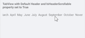
Scrolling Tabs
Here is how to set IsScrollable
<telerikPrimitives:RadTabView x:Name="tabViewHeader" HeaderPosition="Top">
    <telerikPrimitives:RadTabView.Header>
        <telerikPrimitives:TabViewHeader IsScrollable="True"/>
    </telerikPrimitives:RadTabView.Header>
</telerikPrimitives:RadTabView>
Here is how the scrolling is performed:
Adjust the width between the tab view headers
By default there is a spacing between the tab view headers. The behavior comes from the RadToolbar control which is used for the TabView headers.
In order to adjust the width between the tabview headers you will need to set the ItemSpacing property (of type double) to the RadTabView.Header
<telerikPrimitives:RadTabView x:Name="tabView"
                            HeaderPosition="Top">
    <telerikPrimitives:RadTabView.Header>
        <telerikPrimitives:TabViewHeader ItemSpacing="0"/>
    </telerikPrimitives:RadTabView.Header>
</telerikPrimitives:RadTabView>
Customizing the Overflow Button
If there are too many items in the tabview control and they cannot fit into the tab strip area, an overflow button will be displayed. You can customize the button through the following properties.
- OverflowButtonText: You can use this property to set the text of the button. The default one is "More".
- OverflowButtonTemplate: If you need more complex layout for the button you can use this property.
Example
This example demonstrates how to replace the default header of the RadTabView control and change its background.
<telerikPrimitives:RadTabView x:Name="tabViewHeaderOverfowButton" HeaderPosition="Bottom">
    <telerikPrimitives:RadTabView.Header>
        <telerikPrimitives:TabViewHeader BackgroundColor="#FFE5B6"
                                         ItemSpacing="4"
                                         OverflowPopupBackgroundColor="#FFE5B6">
            <telerikPrimitives:TabViewHeader.OverflowButtonTemplate>
                <DataTemplate>
                    <Label Margin="3,0,3,0"
                           BackgroundColor="#FFE5B6"
                           Text=" + "
                           TextColor="#9E4F2C"
                           VerticalOptions="Center"/>
                </DataTemplate>
            </telerikPrimitives:TabViewHeader.OverflowButtonTemplate>
        </telerikPrimitives:TabViewHeader>
    </telerikPrimitives:RadTabView.Header>
    <telerikPrimitives:RadTabView.Items>
        <telerikPrimitives:TabViewItem HeaderText="January " />
        <telerikPrimitives:TabViewItem HeaderText="February " />
        <telerikPrimitives:TabViewItem HeaderText="March " />
        <telerikPrimitives:TabViewItem HeaderText="April " />
        <telerikPrimitives:TabViewItem HeaderText="May " />
        <telerikPrimitives:TabViewItem HeaderText="June " />
        <telerikPrimitives:TabViewItem HeaderText="July " />
        <telerikPrimitives:TabViewItem HeaderText="August " />
        <telerikPrimitives:TabViewItem HeaderText="September " />
        <telerikPrimitives:TabViewItem HeaderText="October " />
        <telerikPrimitives:TabViewItem HeaderText="November " />
        <telerikPrimitives:TabViewItem HeaderText="December " />
    </telerikPrimitives:RadTabView.Items>
</telerikPrimitives:RadTabView>
and the style used for TabViewHeaderItem
<Style TargetType="telerikPrimitives:TabViewHeaderItem">
    <Setter Property="TextColor" Value="#9E4F2C"/>
    <Setter Property="SelectedColor" Value="Blue"/>
</Style>
In addition here is how to define the TadView Header using C#:
RadTabView tabView = new RadTabView()
{
    HeaderPosition = TabViewHeaderPosition.Bottom,
    Header = new Telerik.XamarinForms.Primitives.TabViewHeader()
    {
        BackgroundColor = (Color)(new ColorTypeConverter()).ConvertFromInvariantString("#293955"),
        OverflowButtonTemplate = new DataTemplate(() =>
        {
            return new Label()
            {
                Text = " + ",
                BackgroundColor = (Color)(new ColorTypeConverter()).ConvertFromInvariantString("#CA5100"),
                Margin = new Thickness(3, 0, 3, 0)
            };
        }),
    }
};

for (int i = 1; i <= 13; i++)
{
    tabView.Items.Add(new Telerik.XamarinForms.Primitives.TabViewItem() { HeaderText = string.Format("Tab{0} ", i) });
}
Additionally, you can work with the already assigned header instead of replacing it with a new one. For example - tabView.Header.BackgroundColor = Color.Green.
Here is how the overflow button looks after customization:
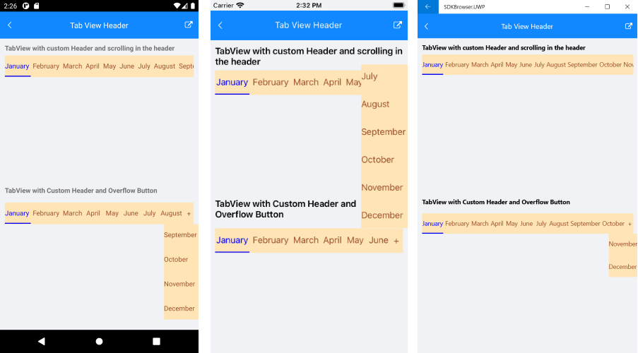
A sample Overflow Button Customization example can be found in the TabView/Features folder - Tab View Header of the SDK Samples Browser application.