TabViewItem
TabViewItem is the control used to populate RadTabView. It displays the header of the tab item and the corresponding content. TabView Item exposes the following properties:
- HeaderText(string): Defines a simple text for the TabView header.
- Header(Telerik.XamarinForms.Primitives.TabViewHeaderItem): Allows you to create a more complex layout for the TabView Header using the TabViewHeaderItem control.
- Content(Xamarin.Forms.View): Defines the content of the TabView Item
- IsSelected(bool): Defines the selected TabView item.
-
IsEnabled(bool): Defines whether the TabView Item is enabled/disabled. By default
IsEnabledisTrue. -
IsVisible(bool): Specifies whether the TabView Item is visible/hidden. IsVisible is supported only with the TabView
IsContentPreservedproperty set toFalse.
TabViewItem IsVisible is supported only in scenarios where "IsContentPreserved" property of the TabView is False. If you try to hide an item (set "IsVisible" to False) when "IsContentPreserved" is enabled, an InvalidOperationException will be raised.
Displaying TabViewItem
To display a TabViewItem you can add it in the Items collection of RadTabView.
Example
<telerikPrimitives:RadTabView x:Name="tabView" HeaderPosition="Bottom">
    <telerikPrimitives:RadTabView.Items>
        <telerikPrimitives:TabViewItem HeaderText="Tab1 " />
        <telerikPrimitives:TabViewItem HeaderText="Tab2 " />
        <telerikPrimitives:TabViewItem HeaderText="Tab3 " />
    </telerikPrimitives:RadTabView.Items>
</telerikPrimitives:RadTabView>
Defining Header
You can define a header for TabViewItem using one of the following properties:
- HeaderText: Defines a simple text for the TabView header.
- Header: Allows you to create a more complex layout for the TabView using the TabViewHeaderItem control.
Example with HeaderText and Header
<telerikPrimitives:RadTabView>
    <telerikPrimitives:RadTabView.Items>
        <telerikPrimitives:TabViewItem HeaderText="View">
            <telerikPrimitives:TabViewItem.Content>
                <Label Margin="10" Text="This is the content of the View tab" />
            </telerikPrimitives:TabViewItem.Content>
        </telerikPrimitives:TabViewItem>

        <telerikPrimitives:TabViewItem>
            <telerikPrimitives:TabViewItem.Header>
                <telerikPrimitives:TabViewHeaderItem>
                    <telerikPrimitives:TabViewHeaderItem.Content>
                        <StackLayout Orientation="Horizontal" HorizontalOptions="Center">
                            <telerikPrimitives:RadBorder BackgroundColor="#CA5100"
                                                         HeightRequest="10"
                                                         VerticalOptions="Center"
                                                         WidthRequest="10" />
                            <Label Text="Folder" VerticalOptions="Center" />
                        </StackLayout>
                    </telerikPrimitives:TabViewHeaderItem.Content>
                </telerikPrimitives:TabViewHeaderItem>
            </telerikPrimitives:TabViewItem.Header>
            <telerikPrimitives:TabViewItem.Content>
                <Label Margin="10" Text="This is the content of the Folder tab" />
            </telerikPrimitives:TabViewItem.Content>
        </telerikPrimitives:TabViewItem>

    </telerikPrimitives:RadTabView.Items>
</telerikPrimitives:RadTabView>
You can see both properties demonstrated in the Example section of this article.
Defining Content
You can define the content of a TabViewItem via its Content property. It is of type View, so you can use any UI element that implements the View class.
Example
<telerikPrimitives:RadTabView x:Name="tabView">
    <telerikPrimitives:RadTabView.Items>

        <telerikPrimitives:TabViewItem HeaderText="Home">
            <telerikPrimitives:TabViewItem.Content>
                <Label Margin="10" Text="This is the content of the Home tab" />
            </telerikPrimitives:TabViewItem.Content>
        </telerikPrimitives:TabViewItem>

        <telerikPrimitives:TabViewItem HeaderText="View">
            <telerikPrimitives:TabViewItem.Content>
                <Label Margin="10" Text="This is the content of the View tab" />
            </telerikPrimitives:TabViewItem.Content>
        </telerikPrimitives:TabViewItem>
    </telerikPrimitives:RadTabView.Items>
</telerikPrimitives:RadTabView>
The RadTabView control displays only the content of the selected item.
Selecting an Item
You can manually select TabViewItem via its IsSelected bool property. Selecting an item will deselect all the others from the Items collection. For more details on selection check the Key Features article.
Disabled Tabs
With Telerik UI for Xamarin version 2020.3.1106.1 TabView Item has a support for Disabled tabs. You can set the IsEnabled bool property of the TadViewItem to False if you want to prevent the header to be clicked. The header text will look disabled and you can not click on it.
<telerikPrimitives:RadTabView x:Name="tabView">
    <telerikPrimitives:RadTabView.Items>

        <telerikPrimitives:TabViewItem HeaderText="Home" IsEnabled="False">
            <telerikPrimitives:TabViewItem.Content>
                <Label Margin="10" Text="This is the content of the Home tab" />
            </telerikPrimitives:TabViewItem.Content>
        </telerikPrimitives:TabViewItem>

        <telerikPrimitives:TabViewItem HeaderText="View">
            <telerikPrimitives:TabViewItem.Content>
                <Label Margin="10" Text="This is the content of the View tab" />
            </telerikPrimitives:TabViewItem.Content>
        </telerikPrimitives:TabViewItem>
    </telerikPrimitives:RadTabView.Items>
</telerikPrimitives:RadTabView>
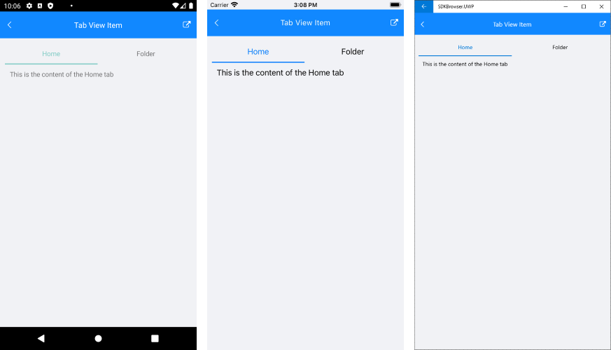
Hidden Tabs
With Telerik UI for Xamarin R3 2021 TabView introduces IsVisible property for the TabViewItem - with it you can easily show/hide certain TabItem without removing it from the TabView Items collection.
<telerikPrimitives:RadTabView x:Name="tabView">
    <telerikPrimitives:RadTabView.Items>

        <telerikPrimitives:TabViewItem HeaderText="Home">
            <telerikPrimitives:TabViewItem.Content>
                <Label Margin="10" Text="This is the content of the Home tab" />
            </telerikPrimitives:TabViewItem.Content>
        </telerikPrimitives:TabViewItem>

        <telerikPrimitives:TabViewItem HeaderText="View"
                                       IsVisible="False">
            <telerikPrimitives:TabViewItem.Content>
                <Label Margin="10" Text="This is the content of the View tab" />
            </telerikPrimitives:TabViewItem.Content>
        </telerikPrimitives:TabViewItem>

        <telerikPrimitives:TabViewItem HeaderText="Folder">
            <telerikPrimitives:TabViewItem.Content>
                <Label Margin="10" Text="This is the content of the Folder tab" />
            </telerikPrimitives:TabViewItem.Content>
        </telerikPrimitives:TabViewItem>

    </telerikPrimitives:RadTabView.Items>
</telerikPrimitives:RadTabView>
Check the result below on different platforms:
Example
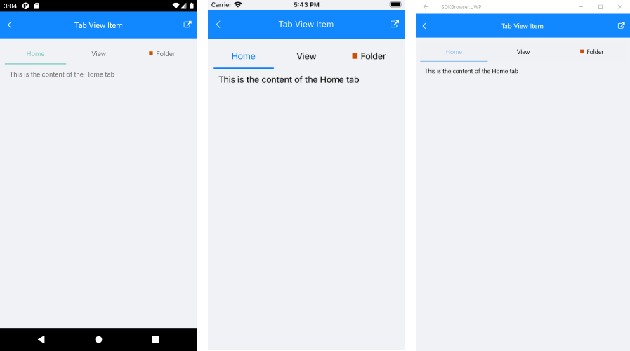
This example demonstrates how to define RadTabView with TabViewItems and set their header, content and also how to select an item via its IsSelected property.
<telerikPrimitives:RadTabView x:Name="tabView">
    <telerikPrimitives:RadTabView.Items>

        <telerikPrimitives:TabViewItem HeaderText="Home">
            <telerikPrimitives:TabViewItem.Content>
                <Label Margin="10" Text="This is the content of the Home tab" />
            </telerikPrimitives:TabViewItem.Content>
        </telerikPrimitives:TabViewItem>

        <telerikPrimitives:TabViewItem HeaderText="View">
            <telerikPrimitives:TabViewItem.Content>
                <Label Margin="10" Text="This is the content of the View tab" />
            </telerikPrimitives:TabViewItem.Content>
        </telerikPrimitives:TabViewItem>

        <telerikPrimitives:TabViewItem>
            <telerikPrimitives:TabViewItem.Header>
                <telerikPrimitives:TabViewHeaderItem>
                    <telerikPrimitives:TabViewHeaderItem.Content>
                        <StackLayout Orientation="Horizontal" HorizontalOptions="Center">
                            <telerikPrimitives:RadBorder BackgroundColor="#CA5100"
                                                         HeightRequest="10"
                                                         VerticalOptions="Center"
                                                         WidthRequest="10" />
                            <Label Text="Folder" VerticalOptions="Center" />
                        </StackLayout>
                    </telerikPrimitives:TabViewHeaderItem.Content>
                </telerikPrimitives:TabViewHeaderItem>
            </telerikPrimitives:TabViewItem.Header>
            <telerikPrimitives:TabViewItem.Content>
                <Label Margin="10" Text="This is the content of the Folder tab" />
            </telerikPrimitives:TabViewItem.Content>
        </telerikPrimitives:TabViewItem>

    </telerikPrimitives:RadTabView.Items>
</telerikPrimitives:RadTabView>
RadTabView tabView = new RadTabView();
Telerik.XamarinForms.Primitives.TabViewItem homeTab = new Telerik.XamarinForms.Primitives.TabViewItem()
{
    HeaderText = "Home",
    Content = new Label()
    {
        Text = "This is the content of the Home tab",
        Margin = new Thickness(10)
    },
};
Telerik.XamarinForms.Primitives.TabViewItem viewTab = new Telerik.XamarinForms.Primitives.TabViewItem()
{
    HeaderText = "View",
    Content = new Label()
    {
        Text = "This is the content of the View tab",
        Margin = new Thickness(10)
    },
};
StackLayout folderTabHeaderPanel = new StackLayout()
{
    Orientation = StackOrientation.Horizontal,
    Margin = new Thickness(5, 0, 0, 0),
};
folderTabHeaderPanel.Children.Add(new ContentView()
{
    BackgroundColor = (Color)(new ColorTypeConverter()).ConvertFromInvariantString("#CA5100"),
    WidthRequest = 10,
    HeightRequest = 10,
    VerticalOptions = LayoutOptions.Center,
});
folderTabHeaderPanel.Children.Add(new Label() { Text = "Folder" });
Telerik.XamarinForms.Primitives.TabViewItem folderTab = new Telerik.XamarinForms.Primitives.TabViewItem()
{
    Header = new TabViewHeaderItem() { Content = folderTabHeaderPanel },
    Content = new Label()
    {
        Text = "This is the content of the Folder tab",
        Margin = new Thickness(10)
    },
};

tabView.Items.Add(homeTab);
tabView.Items.Add(viewTab);
tabView.Items.Add(folderTab);
Here is the result: