Green Theme
The Green theme delivers a flat modern UI represented by two color variations – Light and Dark which are based on green accents.
Jump to the following topics to learn about the specifics of the theme's palette and features.
- Default Theme Colors
- Default Theme Brushes
- Changing Palette Colors
- Changing Theme Variation
- Changing Font Properties
- Changing Corner Radius
- Changing Opacity
Default Theme Colors
Below you can find the differences between the two color variations. Every brush has relevant HEX value in the corresponding color variation.
| Color name | Light | Dark (default) | ||
|---|---|---|---|---|
| Colors, which are same in the two palettes | ||||
| StrongColor | #FF646464 | #FF646464 | ||
| ValidationColor | #FFE60000 | #FFE60000 | ||
| FixedColor | #FFFFFFFF | #FFFFFFFF | ||
| ReadOnlyBackgroundColor | #00FFFFFF | #00FFFFFF | ||
| Colors, which are different in the two palettes | ||||
| AccentHighColor | #FF4FA520 | #FF2B7402 | ||
| AccentLowColor | #FF008406 | #FF86B90E | ||
| SemiAccentLowColor | #59008406 | #5986B90E | ||
| MouseOverColor | #FF8EBC00 | #FF669933 | ||
| MainColor | #FFF1F1F1 | #FF1B1B1F | ||
| PrimaryColor | #FFE8E8E8 | #FF2B2C2E | ||
| AlternativeColor | #FFE0E0E0 | #FF1D1E21 | ||
| MarkerColor | #FF000000 | #FFF1F1F1 | ||
| BasicColor | #FF999999 | #FF474747 | ||
| SelectedColor | #FF353535 | #FFFFFFFF | ||
| LowColor | #FF8D8D8D | #FF343434 | ||
| HighColor | #FFECECEC | #FF131313 | ||
| ComplementaryColor | #FFCACACA | #FF444446 |
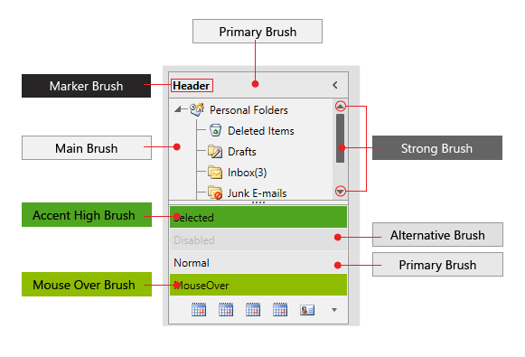
Default Theme Brushes
Below you can find more details about each brush and where it is usually applied.
Common Brushes
-
StrongBrush—Gray by default and it is mainly used for filling paths in elements when they are in Normal state. -
ValidatonBrush—Red by default and it is used for validation where such is applicable in our controls. -
FixedBrush—White by default and it is the main color for text or paths which are over elements with validation background.
Accent Brushes
-
AccentHighBrush—A green brush. -
AccentLowBrush—A slightly darker/lighter (depends on color variation) than the previous green brush. -
SemiAccentLowBrush—The same as AccentLowBrush but with 35% opacity. -
MouseOverBrush—Used as a background or border brush of controls or elements when they are in MouseOver state.
Foreground Brushes
-
MarkerBrush—The default brush used as foreground color. -
SelectedBrush—Used for paths’ fill in elements that are in MouseOver, Pressed or Selected state.
Background Brushes
-
MainBrush—Used as background of controls with direct input such as TextBox, PasswordBox, RadMaskedInput, Editable RadComboBox, RadAutoCompleteBox. Also, used as main background of elements that has different content with unpredictable background. -
PrimaryBrush—Used as a background of controls when in their Normal state, excluding controls with direct input. -
AlternativeBrush—Used as an alternative background – i.e. for popups or where we want to distinguish one element from another. -
HighBrush—Used as a background in RadMenu and RadTimeline. -
ComplementaryBrush—Used as a background in RadRadialMenu and RadScheduleView. -
ReadOnlyBackgroundBrush—Used as a background of controls in their ReadOnly state. Its default value is Transparent.
Border Brushes
-
BasicBrush—Used as a border brush of controls in their Normal state. -
LowBrush—Used as a border brush of controls in their ReadOnly state.
Theme brushes preview
Changing Palette Colors
The Green theme provides dynamic change of the palette colors responsible for the brushes used in the controls. Their defaults are stated above. This mechanism is used to modify the color variation of the theme.
The general naming convention is: GreenPalette.Palette.[name]Color is responsible for [name]Brush – e.g. GreenPalette.Palette.AccentHighColor sets the color for telerik:GreenResource ResourceKey=AccentHighBrush
Changing the colors can be achieved in code behind.
Setting palette colors
Changing Theme Variation
The Green theme comes with two built-in colro variations:
The ColorVariation enumeration that determines which color variation should be used
The
Darkcolor variation of the theme is designed with a dark background in mind. It is recommended to use such a background in your application when choosing it.
Light and Dark color variations demonstrated with RadCalendar
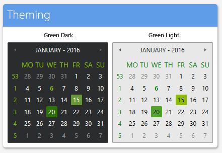
You can switch between the color variations by calling the LoadPreset method as shown below:
Changing the color variation of the theme
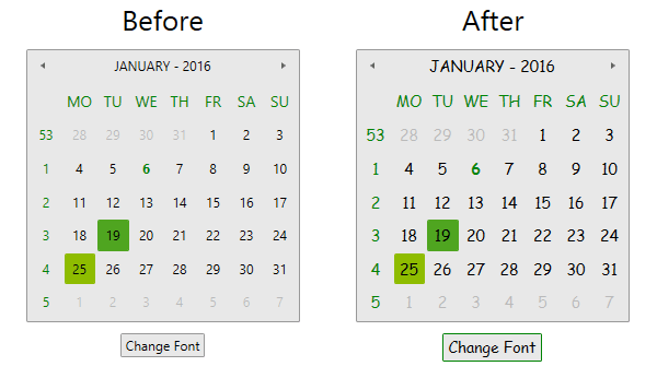
Changing Font Properties
When using the Green Theme you can dynamically change the FontSize and FontFamily properties of all components in the application.
The FontSize and FontFamily properties are public so you can easily modify the theme resources at one single point. The most commonly used font size in the theme is named FontSize and its default value is 12. Bigger font sizes are used for headers and footers while smaller ones are used inside complex controls such as RadRibbonView, RadGauge, RadGanttView, etc. As for the FontFamily resource - its default value is Segoe UI.
Please note that for complex scenarios we strongly recommend setting the FontSize property only initially before the application is initialized. Also, we recommend values between 11px and 19px for it.
A list with all the available FontSize and FontFamily options with their default values follows:
Default FontFamily and FontSize values
More details regarding the rarely used font sizes can be found below:
-
GreenPalette.Palette.FontSizeXSis used in:- TimeBar's SelectionRangeStyle in Telerik.Windows.Controls.DataVisualization
- Map’s Scale and MouseLocationIndicator in Telerik.Windows.Controls.DataVisualization
- AggregateResultsList, GridViewHeaderCell and GridViewGroupPanel in Telerik.Windows.Controls.GridView
-
GreenPalette.Palette.FontSizeSis used in:- ChartBaseStyle and TrackBallInfoControlStyle in Telerik.Windows.Controls.Chart.xaml
- HorizontalBulletGraphStyle and VerticalBullerGraphStyle in Telerik.Windows.Controls.DataVisualization
- TimeBar's ItemControlStyle in Telerik.Windows.Controls.DataVisualization
- RibbonView’s GroupChromeStyle in Telerik.Windows.Controls.RibbonView
- GanttView's EventContainerStyle in Telerik.Windows.Controls.GanntView
- ScheduleView TimeRulerItems' styles in Telerik.Windows.Controls.ScheduleView
- DiagramRulerStyle in Telerik.Windows.Controls.Diagrams.Extensions.xaml
-
GreenPalette.Palette.FontSizeLis used in:- GanttView's GanttDragResizeVisualCueTemplate in Telerik.Windows.Controls.GanntView
- ScheduleView TimeRulerGroupItems' and TimeRulerMonthViewGroupItem’s styles in Telerik.Windows.Controls.ScheduleView
-
GreenPalette.Palette.FontSizeXLis used in:- ScheduleView TimeRulerMonthViewItem’s styles in Telerik.Windows.Controls.ScheduleView
As the following example shows, you can change the default FontFamily from "Segoe UI" to "Comic Sans MS" and the FontSize from 12 to 14 on a click of a button:
The view of the example
Changing the FontSize and the FontFamily
Change in theme fonts
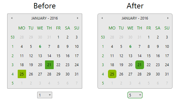
Changing Corner Radius
The Green theme also exposes an easy way to modify the corner radius of many elements in your application. You can use the following properties which are shown below with their default values:
Default CornerRadius values
The view of the example
Changing the CornerRadius
Changes in corner radius
Changing Opacity
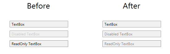
If you need to change the opacity of disabled elements, you can easily do it by using the DisabledOpacity property of the GreenPalette as follows:
The view of the opacity
Changing the DisabledOpacity
Changes in the disabled elements opacity
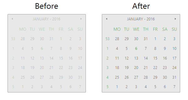
The same is applicable for the ReadOnly state of controls by using the exposed ReadOnlyOpacity property of GreenPalette. The default values are 0.2 for the DisabledOpacity and 1 for the ReadOnlyOpacity property.
The view of the example
Changing the opacity
Changes in the readonly elements opacity
Merging Modified Palette Resources With StyleManager Theming Approach
When modifying fonts, colors, or other resources from the GreenPalette and StyleManager is used as theming mechanism, the theme's ResourceDictionary needs to be merged in App.xaml file to apply the changes.