New to Telerik UI for WPF? Download free 30-day trial

Styling the Predefined Dialogs

This article explains how you could customize the look and feel of the predefined dialog windows.

Modifying the Default Style

To style the predefined dialogs of the RadWindow static class, you have to call them via the overload that takes a DialogParameters object as an argument. Learn more about the predefined dialogs in the Predefined Dialogs article.

In this article's example we will use RadAlert, but the approach is the same for RadConfirm and RadPrompt.

First, obtain the default style that targets RadAlert. See how to do this in the Editing Control Templates topic. The extracted RadAlertStyle will be similar to the following:

Example 1: Default RadAlertStyle

<Style x:Key="RadAlertStyle" TargetType="telerik:RadAlert"> 
    <Setter Property="IsTabStop" Value="False"/> 
    <Setter Property="MinWidth" Value="275"/> 
    <Setter Property="MaxWidth" Value="500"/> 
    <Setter Property="SnapsToDevicePixels" Value="True"/> 
    <Setter Property="Template"> 
        <Setter.Value> 
            <ControlTemplate TargetType="telerik:RadAlert"> 
                <!--...--> 
            </ControlTemplate> 
        </Setter.Value> 
    </Setter> 
</Style> 

If you are not using Implicit Styles to style the controls, you will need to copy all the resources referenced (with the StaticResources keyword) in the RadAlertStyle to your project as well (such as AlertIconTemplate).

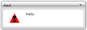
Now you can make modifications in the template such as removing the OK button, changing the Alert icon, etc.

And finally, pass the customized RadAlertStyle to the predefined dialog via the DialogParameters object and its ContentStyle property.

Example 2: Applying customized Style to RadAlert

DialogParameters parameters = new DialogParameters(); 
parameters.ContentStyle = this.Resources["RadAlertStyle"] as Style; 
parameters.Content = "Hello"; 
RadWindow.Alert(parameters); 
Dim parameters As New DialogParameters() 
parameters.ContentStyle = TryCast(Me.Resources("RadAlertStyle"), Style) 
parameters.Content = "Hello" 
RadWindow.Alert(parameters) 

Figure 1: RadAlert with custom Style

WPF RadWindow RadAlert with custom Style

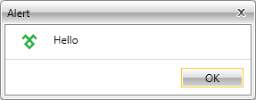
Applying IconTemplate

With the Q1 2016 release of UI for WPF the IconTemplate property was introduced. By using it you are now able to easily change the icon of the predefined windows.

Basically, a valid DataTemplate needs to be created and that Template should be passed to the predefined windows via the DialogParameters and its IconTemplate property.

Example 3: Defining the DataTemplate

<DataTemplate x:Key="IconTemplate"> 
    <Image Source="telerik.png" Stretch="Fill" Width="22" Height="22"/> 
</DataTemplate> 

Example 4: Applying the DataTemplate to the IconTemplate property

RadWindow.Alert(new DialogParameters() 
{ 
    Content = "Hello", 
    IconTemplate = this.Resources["IconTemplate"] as DataTemplate 
}); 
RadWindow.Alert(New DialogParameters() With 
{ 
    .Content = "Hello", 
    .IconTemplate = TryCast(Me.Resources("IconTemplate"), DataTemplate 
)}) 

Figure 2: RadAlert with set IconTemplate

WPF RadWindow RadAlert with set IconTemplate

Modify WindowStyle

You can also modify the appearance of the window which hosts the dialog content. For the purpose, set the WindowStyle property of the DialogParameters object.

Example 5: Default RadAlertStyle

<Style x:Key="RadAlertWindowStyle" TargetType="telerik:RadWindow"> 
    <Setter Property="CornerRadius" Value="10"/> 
</Style> 

Example 6: Applying the DataTemplate to the IconTemplate property

RadWindow.Alert(new DialogParameters() 
{ 
    Content = "Hello", 
    parameters.WindowStyle = App.Current.Resources["RadAlertWindowStyle"] as Style; 
}); 
RadWindow.Alert(New DialogParameters() With 
{ 
    .Content = "Hello", 
    .WindowStyle = TryCast(App.Current.Resources("RadAlertWindowStyle"), Style) 
)}) 

See Also

In this article