Getting Started with WPF TreeListView
This article will guide you through the process of creating a sample application with RadTreeListView.
RadTreeListView vs RadGridView
You should use the RadTreeListView control to display hierarchical data in a tabular format. In order to achieve this, the control combines the functionality of RadGridView control with the ability to display data in a tree view manner. This is implemented by directly inheriting RadGridView and implementing the tree view behavior.
RadTreeListView displays the data in the same way as RadGridView. The difference is that each row plays the role of a tree node, which can be expanded or collapsed.
Please note that RadTreeListView and the Hierarchical RadGridView are two different things. The first displays the data in a tree view manner in one and the same table. The second one displays the hierarchical data in nested RadGridViews.
Use RadTreeListView only when you need to display homogeneous data. For heterogeneous data use the Hierarchical RadGridView. Heterogeneous data means a source with different type of objects in it.
You can also check out the RadGridView's Getting Started section.
Adding Telerik Assemblies Using NuGet
To use RadTreeListView when working with NuGet packages, install the Telerik.Windows.Controls.GridView.for.Wpf.Xaml package. The package name may vary slightly based on the Telerik dlls set - Xaml or NoXaml
Read more about NuGet installation in the Installing UI for WPF from NuGet Package article.
With the 2025 Q1 release, the Telerik UI for WPF has a new licensing mechanism. You can learn more about it here.
Adding Assembly References Manually
If you are not using NuGet packages, you can add a reference to the following assemblies:
- Telerik.Licensing.Runtime
- Telerik.Windows.Controls
- Telerik.Windows.Controls.GridView
- Telerik.Windows.Data
- Telerik.Windows.Controls.Input
Add RadTreeListView to the Project
After you make sure you have added the needed assembly references, you can either add the control manually by writing the XAML code (Example 2) or you can drag it from the Visual Studio Toolbox and drop it over the XAML view.
In order to use RadTreeListView in XAML, you have to declare the following namespace:
Example 1: Declaring Telerik Namespace
xmlns:telerik="http://schemas.telerik.com/2008/xaml/presentation"
Example 2: Adding RadTreeListView in XAML
<telerik:RadTreeListView x:Name="radTreeListView">
</telerik:RadTreeListView>
Populating with Data
Populating RadTreeListView with sample data will require a business model and a view model that exposes a collection that the control can be bound to. This section will cover the process of defining them.
The example will use a collection that represents the contents of a warehouse. It will contain WarehouseItem objects. Each WarehouseItem will have a Name, Count and a collection of WarehouseItem objects. Here is the class definition.
Example 3: Defining a Sample Business Model
public class WarehouseItem: INotifyPropertyChanged
{
    private string name;
    private int count;
    private ObservableCollection<WarehouseItem> items;

    public WarehouseItem(string name, int count)
    {
        this.Name = name;
        this.Count = count;
        this.Items = new ObservableCollection<WarehouseItem>();
    }
    public string Name
    {
        get
        {
            return this.name;
        }
        set
        {
            if (value != this.name)
            {
                this.name = value;
                this.OnPropertyChanged("Name");
            }
        }
    }
    public ObservableCollection<WarehouseItem> Items
    {
        get
        {
            return this.items;
        }
        set
        {
            if (value != this.items)
            {
                this.items = value;
                this.OnPropertyChanged("Items");
            }
        }
    }
    public int Count
    {
        get
        {
            return this.count;
        }
        set
        {
            if (value != this.count)
            {
                this.count = value;
                this.OnPropertyChanged("Count");
            }
        }
    }

    protected virtual void OnPropertyChanged(PropertyChangedEventArgs args)
    {
        PropertyChangedEventHandler handler = this.PropertyChanged;
        if (handler != null)
        {
            handler(this, args);
        }
    }

    private void OnPropertyChanged(string propertyName)
    {
        this.OnPropertyChanged(new PropertyChangedEventArgs(propertyName));
    }

    public event PropertyChangedEventHandler PropertyChanged;
}
    Public Class WarehouseItem
    Implements INotifyPropertyChanged

    Private _name As String
    Private _count As Integer
    Private _items As ObservableCollection(Of WarehouseItem)

    Public Sub New(ByVal name As String, ByVal count As Integer)
        Me.Name = name
        Me.Count = count
        Me.Items = New ObservableCollection(Of WarehouseItem)()
    End Sub
    Public Property Name() As String
        Get
            Return Me._name
        End Get
        Set(ByVal value As String)
            If value <> Me._name Then
                Me._name = value
                Me.OnPropertyChanged("Name")
            End If
        End Set
    End Property
    Public Property Items() As ObservableCollection(Of WarehouseItem)
        Get
            Return Me._items
        End Get
        Set(ByVal value As ObservableCollection(Of WarehouseItem))
            If value IsNot Me._items Then
                Me._items = value
                Me.OnPropertyChanged("Items")
            End If
        End Set
    End Property
    Public Property Count() As Integer
        Get
            Return Me._count
        End Get
        Set(ByVal value As Integer)
            If value <> Me._count Then
                Me._count = value
                Me.OnPropertyChanged("Count")
            End If
        End Set
    End Property

    Protected Overridable Sub OnPropertyChanged(ByVal args As PropertyChangedEventArgs)
        Dim handler As PropertyChangedEventHandler = Me.PropertyChangedEvent
        If handler IsNot Nothing Then
            handler(Me, args)
        End If
    End Sub

    Private Sub OnPropertyChanged(ByVal propertyName As String)
        Me.OnPropertyChanged(New PropertyChangedEventArgs(propertyName))
    End Sub

    Public Event PropertyChanged As PropertyChangedEventHandler Implements INotifyPropertyChanged.PropertyChanged
End Class
Here is an example class that dynamically creates the sample data.
Example 4: Create Sample Data
public class WarehouseService
{
    public static ObservableCollection<WarehouseItem> GetWarehouseData()
    {
        ObservableCollection<WarehouseItem> data = new ObservableCollection<WarehouseItem>();
        WarehouseItem drinks = new WarehouseItem( "Drinks", 35 );
        drinks.Items.Add( new WarehouseItem( "Water", 10 ) );
        WarehouseItem tea = new WarehouseItem( "Tea", 20 );
        tea.Items.Add( new WarehouseItem( "Black", 10 ) );
        tea.Items.Add( new WarehouseItem( "Green", 10 ) );
        drinks.Items.Add( tea );
        drinks.Items.Add( new WarehouseItem( "Coffee", 5 ) );
        data.Add( drinks );
        WarehouseItem vegetables = new WarehouseItem( "Vegeatbles", 75 );
        vegetables.Items.Add( new WarehouseItem( "Tomato", 40 ) );
        vegetables.Items.Add( new WarehouseItem( "Carrot", 25 ) );
        vegetables.Items.Add( new WarehouseItem( "Onion", 10 ) );
        data.Add( vegetables );
        WarehouseItem fruits = new WarehouseItem( "Fruits", 55 );
        fruits.Items.Add( new WarehouseItem( "Cherry", 30 ) );
        fruits.Items.Add( new WarehouseItem( "Apple", 20 ) );
        fruits.Items.Add( new WarehouseItem( "Melon", 5 ) );
        data.Add( fruits );
        return data;
    }
}
Public Class WarehouseService
 Public Shared Function GetWarehouseData() As ObservableCollection(Of WarehouseItem)
  Dim data As New ObservableCollection(Of WarehouseItem)()
  Dim drinks As New WarehouseItem("Drinks", 35)
  drinks.Items.Add(New WarehouseItem("Water", 10))
  Dim tea As New WarehouseItem("Tea", 20)
  tea.Items.Add(New WarehouseItem("Black", 10))
  tea.Items.Add(New WarehouseItem("Green", 10))
  drinks.Items.Add(tea)
  drinks.Items.Add(New WarehouseItem("Coffee", 5))
  data.Add(drinks)
  Dim vegetables As New WarehouseItem("Vegeatbles", 75)
  vegetables.Items.Add(New WarehouseItem("Tomato", 40))
  vegetables.Items.Add(New WarehouseItem("Carrot", 25))
  vegetables.Items.Add(New WarehouseItem("Onion", 10))
  data.Add(vegetables)
  Dim fruits As New WarehouseItem("Fruits", 55)
  fruits.Items.Add(New WarehouseItem("Cherry", 30))
  fruits.Items.Add(New WarehouseItem("Apple", 20))
  fruits.Items.Add(New WarehouseItem("Melon", 5))
  data.Add(fruits)
  Return data
 End Function
End Class
Finally, define a view model containing the created sample data.
Example 5: Define a Sample View Model
public class WarehouseViewModel: ViewModelBase
{
    private ObservableCollection<WarehouseItem> warehouseItems;

    public ObservableCollection<WarehouseItem> WarehouseItems
    {
        get
        {
            if (this.warehouseItems == null)
            {
                this.warehouseItems = WarehouseService.GetWarehouseData();
            }

            return this.warehouseItems;
        }
    }
}
Public Class WarehouseViewModel
    Inherits ViewModelBase

    Private _warehouseItems As ObservableCollection(Of WarehouseItem)

    Public ReadOnly Property WarehouseItems() As ObservableCollection(Of WarehouseItem)
        Get
            If Me._warehouseItems Is Nothing Then
                Me._warehouseItems = WarehouseService.GetWarehouseData()
            End If

            Return Me._warehouseItems
        End Get
    End Property
End Class
In order to display your data, you need to bind the ItemsSource property of RadTreeListView.
Example 6: Bind RadTreeListView
<Window.Resources>
    <my:WarehouseViewModel x:Key="MyViewModel"/>
</Window.Resources>
<telerik:RadTreeListView DataContext="{StaticResource MyViewModel}"
                         x:Name="radTreeListView"
                         ItemsSource="{Binding WarehouseItems}"/>
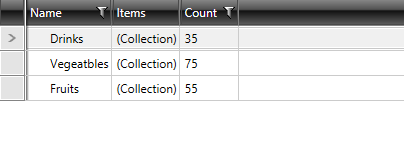
At this point, only the first level of the hierarchical data will get displayed and RadTreeListView will look just like a RadGridView.
Figure 1: RadTreeListView bound to collection of WarehouseItems
In order to display the other levels of the hierarchy, you have to define a TreeListViewTableDefinition and set its ItemsSource property to the respective member of the business object. Then you need to set the table definition to the ChildTableDefinition property of RadTreeListView.
In the context of RadTreeListView control, you shouldn't use the GridViewTabelDefinition class, but instead use the TreeListViewTableDefinition class because it exposes an ItemSource property that should be bound to the property that represents the next level of hierarchy. This property should have the same name at each level of the hierarchy.
Example 7: Define a ChildTableDefinition for RadTreeListView
<telerik:RadTreeListView x:Name="radTreeListView"
                            ItemsSource="{Binding WarehouseItems}">
    <telerik:RadTreeListView.ChildTableDefinitions>
        <telerik:TreeListViewTableDefinition ItemsSource="{Binding Items}" />
    </telerik:RadTreeListView.ChildTableDefinitions>
</telerik:RadTreeListView>
Columns
By default, RadTreeListView will auto-generate the columns for its data by creating a column for each property. In order to prevent this, you must set the AutogenerateColumns property to False and manually add the desired columns to the Columns collection of the control.
Example 8: Manually Define the Columns of RadTreeListView
<telerik:RadTreeListView x:Name="radTreeListView"
                            AutoGenerateColumns="False"
                ItemsSource="{Binding WarehouseItems}">
    <telerik:RadTreeListView.ChildTableDefinitions>
        <telerik:TreeListViewTableDefinition ItemsSource="{Binding Items}" />
    </telerik:RadTreeListView.ChildTableDefinitions>
    <telerik:RadTreeListView.Columns>
        <telerik:GridViewDataColumn DataMemberBinding="{Binding Name}"
                                    Header="Name" />
        <telerik:GridViewDataColumn DataMemberBinding="{Binding Count}"
                                    Header="Count" />
    </telerik:RadTreeListView.Columns>
</telerik:RadTreeListView>
RadTreeListView can use the same column types used with RadGridView. To learn more about the different types of columns, read here.
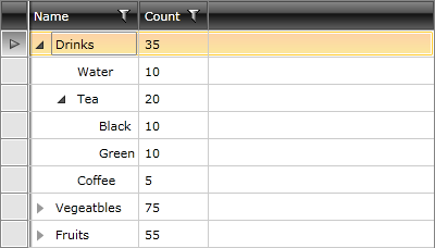
To change the column, which holds the tree view UI, use the HierarchyColumnIndex property.
Figure 2 shows a snapshot of the result.
Figure 2: RadTreeListView with manually defined columns
Setting a Theme
The controls from our suite support different themes. You can see how to apply a theme different than the default one in the Setting a Theme help article.
Changing the theme using implicit styles will affect all controls that have styles defined in the merged resource dictionaries. This is applicable only for the controls in the scope in which the resources are merged.
To change the theme, you can follow the steps below:
Choose between the themes and add reference to the corresponding theme assembly (ex: Telerik.Windows.Themes.Windows8.dll). You can see the different themes applied in the Theming examples from our WPF Controls Examples application.
-
Merge the ResourceDictionaries with the namespace required for the controls that you are using from the theme assembly. For RadTreeListView, you will need to merge the following resources:
- Telerik.Windows.Controls
- Telerik.Windows.Controls.Input
- Telerik.Windows.Controls.GridView
Example 9 demonstrates how to merge the ResourceDictionaries so that they are applied globally for the entire application.
Example 9: Merge the ResourceDictionaries
    <Application.Resources>
        <ResourceDictionary>
            <ResourceDictionary.MergedDictionaries>
                <ResourceDictionary Source="/Telerik.Windows.Themes.Windows8;component/Themes/System.Windows.xaml"/>
                <ResourceDictionary Source="/Telerik.Windows.Themes.Windows8;component/Themes/Telerik.Windows.Controls.xaml"/>
                <ResourceDictionary Source="/Telerik.Windows.Themes.Windows8;component/Themes/Telerik.Windows.Controls.Input.xaml"/>
                <ResourceDictionary Source="/Telerik.Windows.Themes.Windows8;component/Themes/Telerik.Windows.Controls.GridView.xaml"/>
            </ResourceDictionary.MergedDictionaries>
        </ResourceDictionary>
    </Application.Resources>
Figure 3 shows RadTreeListView with the Windows8 theme applied.
Figure 3: RadTreeListView with the Windows8 theme
Telerik UI for WPF Learning Resources
- Telerik UI for WPF TreeListView Component
- Getting Started with Telerik UI for WPF Components
- Telerik UI for WPF Installation
- Telerik UI for WPF and WinForms Integration
- Telerik UI for WPF Visual Studio Templates
- Setting a Theme with Telerik UI for WPF
- Telerik UI for WPF Virtual Classroom (Training Courses for Registered Users)
- Telerik UI for WPF License Agreement