Multiple Thumbs
As of R3 2020, the RadSlider allows you to define multiple thumbs with which to control its values and ranges.
This feature can be enabled by adding instances of the SliderThumb and RangeSliderThumb classes to its new Thumbs collection.
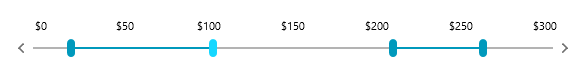
Example 1: Defining multiple thumbs
<telerik:RadSlider Minimum="0" Maximum="300">
    <telerik:RadSlider.Thumbs>
        <telerik:RangeSliderThumb RangeStart="0" RangeEnd="100" />
        <telerik:SliderThumb Value="150" />
        <telerik:RangeSliderThumb RangeStart="200" RangeEnd="250" />
    </telerik:RadSlider.Thumbs>
</telerik:RadSlider>
Figure 1: RadSlider with multiple thumbs

Both the SliderThumb and RangeSliderThumb classes provide the InteractionMode and ThumbStyle properties as they inherit from the common SliderThumbBase class, but in turn they also expose specific members described in the next two sections.
SliderThumb
The SliderThumb represents a single thumb which can be dragged by the user and exposes a single Value property of type double.
Figure 2: The SliderThumb

RangeSliderThumb
The RangeSliderThumb, on the other hand, represents a control with two draggable thumbs (of type SliderThumb) as well as an extra thumb (of type Thumb) in between to drag the whole range.
Figure 3: The RangeSliderThumb

It exposes the following properties:
- RangeStart: The smallest value of a specified range.
- RangeEnd: The largest value of a specified range.
- MinimumRangeSpan: The minimum value distance between SelectionStart and SelectionEnd.
- MaximumRangeSpan: The maximum value distance between SelectionStart and SelectionEnd.
- SelectedRange: A property of type SelectionRange<double> which can be used to set the Start and End of the range.
- MiddleThumbStyle: The style for the middle thumb of the RangeSliderThumb element. The style needs to target the Thumb type.
- AlternateThumbStyle: The style for the right thumb of the RangeSliderThumb element. The style needs to target the SliderThumb type.
In addition, the RangeSliderThumb provides the SelectedRangeChanged event which is fired each time a certain range changes.
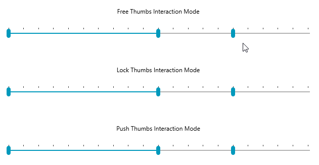
InteractionMode
You can control the action of the individual thumbs when they come in contact with another thumb by setting their InteractionMode property. It accepts the following values of the ThumbInteractionMode enumeration:
- Free: When the active thumb interacts with the thumb in free mode, there is no special interaction between both thumbs.
- Lock: When the active thumb interacts with the locked thumb it is not possible to pass through this thumb.
- Push: When the active thumb interacts with the thumb in push mode, its position will be changed to the position of the active thumb.
Figure 4: The effect of the different interaction modes
ActiveThumb
To aid the usage of multiple thumbs, the RadSlider now also exposes an ActiveThumb property which corresponds to the last thumb the user interacted with.
If the ActiveThumb property is set to null, interaction with the increase and decrease handles will be disabled.
ThumbStyle
Through the ThumbStyle property of the SliderThumbs, you can apply a specific style only to a certain thumb.
In the case of the RangeSliderThumb, this style is only applied to the left-most thumb and if you need to change the appearance of the other two thumbs, you need to also use the MiddleThumbStyle and AlternateThumbStyle to style the middle and right thumbs, respectively.
Example 2: Styling the thumbs individually
<Grid>
    <Grid.Resources>
        <!-- If you're not using the NoXaml binaries, you need to remove the BasedOn attributes of the styles -->
        <Style x:Key="RedThumbStyle" TargetType="Thumb" BasedOn="{StaticResource ThumbStyle}">
            <Setter Property="Background" Value="Red" />
        </Style>
        <Style x:Key="GreenStyle" TargetType="Thumb" BasedOn="{StaticResource SelectionMiddleThumbStyle}">
            <Setter Property="Background" Value="Green" />
        </Style>
        <Style x:Key="BlueThumbStyle" TargetType="Thumb" BasedOn="{StaticResource ThumbStyle}">
            <Setter Property="Background" Value="Blue" />
        </Style>
    </Grid.Resources>
    <telerik:RadSlider Minimum="0" Maximum="100">
        <telerik:RadSlider.Thumbs>
            <telerik:SliderThumb Value="30" ThumbStyle="{StaticResource RedThumbStyle}" />
            <telerik:RangeSliderThumb ThumbStyle="{StaticResource RedThumbStyle}" AlternateThumbStyle="{StaticResource BlueThumbStyle}" MiddleThumbStyle="{StaticResource GreenStyle}" RangeStart="50" RangeEnd="80" />
        </telerik:RadSlider.Thumbs>
    </telerik:RadSlider>
</Grid>
Please note that when using the StyleManager theming approach you need to also define the Height for the middle thumb. This has been demonstrated in the following knowledge base article.
Alternatively, you can set the ThumbStyle, SelectionMiddleThumbStyle and AlternateThumbStyle properties on the RadSlider control itself and they will be passed onto all thumbs from the Thumbs collection.
Example 3: Styling the thumbs through the properties of the RadSlider
<!-- ... -->
<telerik:RadSlider ThumbStyle="{StaticResource RedThumbStyle}" SelectionMiddleThumbStyle="{StaticResource GreenStyle}" AlternateThumbStyle="{StaticResource BlueThumbStyle}" Minimum="0" Maximum="100">
<!-- ... -->
Figure 5: Styling the thumbs

You can see more examples of creating styles for the RadSlider control in the Styling and Appearance article.