Getting Started with WPF NotifyIcon
This tutorial will walk you through the creation of a sample application that contains a RadNotifyIcon control.
Adding Telerik Assemblies Using NuGet
To use RadNotifyIcon when working with NuGet packages, install the Telerik.Windows.Controls.Navigation.for.Wpf.Xaml package. The package name may vary slightly based on the Telerik dlls set - Xaml or NoXaml
Read more about NuGet installation in the Installing UI for WPF from NuGet Package article.
With the 2025 Q1 release, the Telerik UI for WPF has a new licensing mechanism. You can learn more about it here.
Adding Assembly References Manually
If you are not using NuGet packages, you can add a reference to the following assemblies:
- Telerik.Licensing.Runtime
- Telerik.Windows.Controls
- Telerik.Windows.Controls.Navigation
You can find the required assemblies for each control from the suite in the Controls Dependencies help article.
Defining RadNotifyIcon
Example 1 demonstrates how you can define a RadNotifyIcon in xaml. You have to point the RadNotifyIcon to an ".ico" file that will be shown in the taskbar notification area. You can either set the TrayIconSource property which accepts an ImageSource/string pointing to the file, or the TrayIcon property, which accepts a System.Drawing.Icon object.
Example 1: Defining RadNotifyIcon
<telerik:RadNotifyIcon x:Name="icon" TrayIconSource="YourIconPath.ico" GuidItem="00000001-0002-0003-0004-000000000005" />
You should replace the placeholder GuidItem with your own Guid. Make sure to create two separate Guids for building in Debug and Release mode and use the same ones for a given application. This will allow Windows to recognize the icon each time you show it in the tray.
Each time you use a new GuidItem, Windows will register a new icon. To learn how to clear the icon cache, you can check out the following thread: How to remove old notification icons from the Windows 10 system tray.
Showing and Hiding the Icon
By default the icon will be displayed in the tray area once the application is started. If you want to manually show the icon, you can initially set its ShowTrayIcon to False. Example 3 shows two options for showing and hiding the icon in code.
Example 2: Hiding the icon by default
<telerik:RadNotifyIcon x:Name="icon" ShowTrayIcon="False" />
Example 3: Show/Hide the icon in code
// Options for showing the icon
this.icon.ShowTrayIcon = true;
this.icon.AddIcon();


// Options for hiding the icon
this.icon.ShowTrayIcon = false;
this.icon.RemoveIcon();
' Options for showing the icon
Me.icon.ShowTrayIcon = True
Me.icon.AddIcon()


' Options for hiding the icon
Me.icon.ShowTrayIcon = False
Me.icon.RemoveIcon()
Refreshing the Icon
The RadNotifyIcon allows for refreshing the icon through the UpdateIcon method.
Example 4: Updating the icon
this.icon.UpdateIcon();
Me.icon.UpdateIcon()
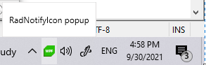
Interacting with the Icon
The RadNotifyIcon supports displaying a popup, tooltip, context menu and balloon notifications. You can learn more about each feature in its respective article:
GetUserNotificationState
The RadNotifyIcon exposes the GetUserNotificationState static method, which allows you to check the state of the computer for the current user to determine whether sending a notification is appropriate.
Example 5: Using the GetUserNotificationState method
var state = RadNotifyIcon.GetUserNotificationState();

if(state == UserNotificationState.AcceptsNotifications)
{
    // send notification
}
Dim state = RadNotifyIcon.GetUserNotificationState()

If state Is UserNotificationState.AcceptsNotifications Then
    ' send notification
End If
Setting a Theme
The controls from our suite support different themes. You can see how to apply a theme different than the default one in the Setting a Theme help article.
Changing the theme using implicit styles will affect all controls that have styles defined in the merged resource dictionaries. This is applicable only for the controls in the scope in which the resources are merged.
To change the theme, you can follow the steps below:
Choose between the themes and add reference to the corresponding theme assembly (ex: Telerik.Windows.Themes.Windows8.dll). You can see the different themes applied in the Theming examples from our WPF Controls Examples application.
-
Merge the ResourceDictionaries with the namespace required for the controls that you are using from the theme assembly. For the RadNotifyIcon, you will need to merge the following resources:
- Telerik.Windows.Controls
- Telerik.Windows.Controls.Navigation
Example 6 demonstrates how to merge the ResourceDictionaries so that they are applied globally for the entire application.
Example 6: Merge the ResourceDictionaries
<Application.Resources>
    <ResourceDictionary>
        <ResourceDictionary.MergedDictionaries>
            <ResourceDictionary Source="/Telerik.Windows.Themes.Windows8;component/Themes/System.Windows.xaml"/>
            <ResourceDictionary Source="/Telerik.Windows.Themes.Windows8;component/Themes/Telerik.Windows.Controls.xaml"/>
            <ResourceDictionary Source="/Telerik.Windows.Themes.Windows8;component/Themes/Telerik.Windows.Controls.Navigation.xaml"/>
        </ResourceDictionary.MergedDictionaries>
    </ResourceDictionary>
</Application.Resources>
Alternatively, you can use the theme of the control via the StyleManager.
Figure 3 shows a RadNotifyIcon with the Windows8 theme applied.
Figure 3: RadNotifyIcon with the Windows8 theme
Telerik UI for WPF Learning Resources
- Telerik UI for WPF NotifyIcon Component
- Getting Started with Telerik UI for WPF Components
- Telerik UI for WPF Installation
- Telerik UI for WPF and WinForms Integration
- Telerik UI for WPF Visual Studio Templates
- Setting a Theme with Telerik UI for WPF
- Telerik UI for WPF Virtual Classroom (Training Courses for Registered Users)
- Telerik UI for WPF License Agreement