Tooltip
You can configure the tooltip that is displayed when the user hovers over the icon with the TooltipContent property. By default a styled custom tooltip is shown. If you want to show the native tooltip, set the UseNativeTooltip property to True.
Native ToolTip
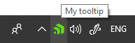
To display a native tooltip, set the UseNativeTooltip property as demonstrated in Example 1. When this property is True the ToString() value of the TooltipContent will be shown in the tooltip.
Example 1: Setting TooltipContent
<telerik:RadNotifyIcon
        x:Name="icon"
        TooltipContent="My tooltip"
        UseNativeTooltip="True">
</telerik:RadNotifyIcon>
Figure 1: RadNotifyIcon with tooltip
In order for theming to be applied, you can ommit the setting of the UseNativeTooltip property.
TooltipContent and TooltipContentTemplate
The RadNotifyIcon provides a default TooltipContentTemplate that will be styled according to your theme. You can also customize it as per your requirements. The DataContext inside the TooltipContentTemplate property will be whatever is set to the TooltipContent.
Example 2: Setting TooltipContent and TooltipContentTemplate
<telerik:RadNotifyIcon
    x:Name="icon"
    TooltipContent="My styled tooltip">
    <telerik:RadNotifyIcon.TooltipContentTemplate>
        <DataTemplate>
            <Border Background="Bisque">
                <TextBlock Text="{Binding}" Padding="10"/>
            </Border>
        </DataTemplate>
    </telerik:RadNotifyIcon.TooltipContentTemplate>
</telerik:RadNotifyIcon>
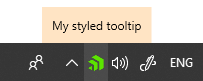
Figure 2: RadNotifyIcon with customized tooltip
IsTooltipOpen
The IsTooltipOpen property allows you to check whether a styled tooltip is currently open.
Example 3: Using the IsTooltipOpen property
var isOpen = this.icon.IsTooltipOpen;
Dim isOpen = Me.icon.IsTooltipOpen