LayoutControlExpanderGroup
LayoutControlExpanderGroup is one of the few layout groups supported by the RadLayoutControl. LayoutControlExpanderGroup behaves as the LayoutControlGroup but its children are displayed in an expander control. Clicking on the group’s header or the expand arrow will expand or collapse its children.
You can read the Layout Panel article to get better understanding on how the layout groups are arranging their children.
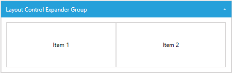
Example 1: Setting up LayoutControlExpanderGroup
Figure 1: LayoutControlExpanderGroup
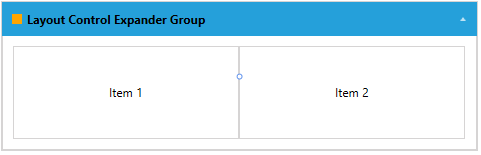
The header of the expander group can be set through its Header property. The property is of type Object which allows you to place any visual (or not) element in it.
Example 2: Setting up the header of LayoutControlExpanderGroup
Figure 2: LayoutControlExpanderGroup with UIElements in its header
The group’s content state (collapsed/expanded) can be manually controlled via the IsExpanded property.
Example 3: Setting the state of LayoutControlExpanderGroup
Figure 3: Collapsed LayoutControlExpanderGroup
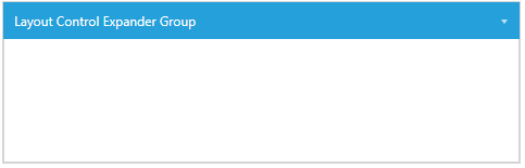
You can notice that the size of the group demonstrated in Figure 3 and Example 3 doesn't collapse, but only its children are hidden (collapsed). This is because the group's VerticalAlignment is set to Stretch by default. In this example, if you want to collapse also the size of the group itself you can set the VerticalAlignment to Top.
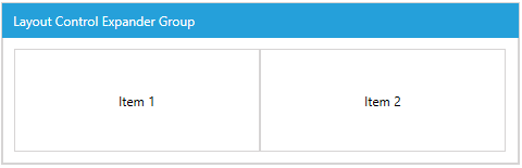
The IsExpandable property of LayoutControlExpanderGroup controls whether the expanding arrow should be displayed and the collapse/expand action can be executed by clicking on the header.
Example 4: Setting the IsExpandable property of LayoutControlExpanderGroup
Figure 4: LayoutControlExpanderGroup with disabled collapse/expand interactions
When the IsExpandable property is set to False the content of the group can still be collapsed and expanded via the IsExpanded property.
When no explicit dimensions are set the size of the group depends on its position in the layout and also its alignment. When a group is collapsed it is not necessary that its size collapses too. This depends on its size and alignment.