Getting Started with WPF LayoutControl
This tutorial will walk you through the creation of a sample application that contains RadLayoutControl.
- Adding Telerik Assemblies Using NuGet
- Adding Assembly References Manually
- Defining a RadLayoutControl
- Adding Items in the Control
- Layout Groups
- Enable Edit Mode
- Code Example
The figures in the RadLayoutControl help documentation are showing the control with the Windows8 theme applied. You can see how to set a theme in the Setting a Theme help article.
Adding Telerik Assemblies Using NuGet
To use RadLayoutControl when working with NuGet packages, install the Telerik.Windows.Controls.Navigation.for.Wpf.Xaml package. The package name may vary slightly based on the Telerik dlls set - Xaml or NoXaml
Read more about NuGet installation in the Installing UI for WPF from NuGet Package article.
With the 2025 Q1 release, the Telerik UI for WPF has a new licensing mechanism. You can learn more about it here.
Adding Assembly References Manually
If you are not using NuGet packages, you can add a reference to the following assemblies:
- Telerik.Licensing.Runtime
- Telerik.Windows.Controls
- Telerik.Windows.Controls.Navigation
You can find a list with the required assemblies for each control from the UI for WPF suite in the Controls Dependencies help article.
Defining a RadLayoutControl
You can add RadLayoutControl manually in XAML as demonstrated in Example 1.
Example 1: Adding RadLayoutControl in XAML
<telerik:RadLayoutControl />
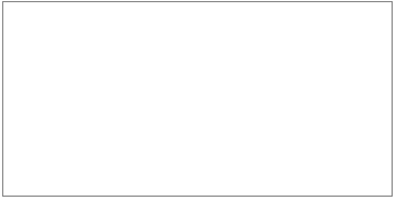
RadLayoutControl doesn't display any content when it is not populated with items or layout groups, so at this point only the border of the control should be displayed on the screen.
Figure 1: Empty RadLayoutControl
Adding Items in the Control
You can add items through the Items collection of RadLayoutControl. The layout component works with LayoutControlGroup controls and UIElements. In other words you can populate it with all visual elements provided by the framework. Example 2 demonstrates this.
Example 2: Adding items in the RadLayoutControl.
<telerik:RadLayoutControl>
    <Button Content="Button"/>
    <Border Background="Bisque"/>
    <telerik:LayoutControlGroup>
        <TextBlock Text="TextBlock" Background="LightGray" TextAlignment="Center"/>
    </telerik:LayoutControlGroup>
</telerik:RadLayoutControl>
Figure 2: RadLayoutControl with few elements added
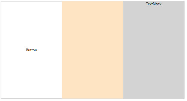
By default the layout control and its groups are ordering their items with horizontal orientation. You can see how to change this in the Orientation help article.
You can nest LayoutControlGroups into one another which allows you to separate the layout into different groups that can be arranged along with their items.
Example 3: Nesting LayoutControlGroups
<telerik:RadLayoutControl>
    <Button Content="Button"/>
    <Border Background="Bisque"/>
    <telerik:LayoutControlGroup Orientation="Vertical">
        <TextBlock Text="TextBlock" Background="LightGray" TextAlignment="Center" VerticalAlignment="Center"/>
        <telerik:LayoutControlGroup Orientation="Vertical" VerticalAlignment="Center" Margin="2">
            <StackPanel Orientation="Horizontal">
                <TextBlock Text="Text field:" Margin="5 0 5 0" />
                <TextBox MinWidth="100"/>
            </StackPanel>
            <StackPanel Orientation="Horizontal">
                <TextBlock Text="Text field:" Margin="5 0 5 0" />
                <TextBox MinWidth="100"/>
            </StackPanel>
        </telerik:LayoutControlGroup>
    </telerik:LayoutControlGroup>
</telerik:RadLayoutControl>
Figure 3: RadLayoutControl with nested groups
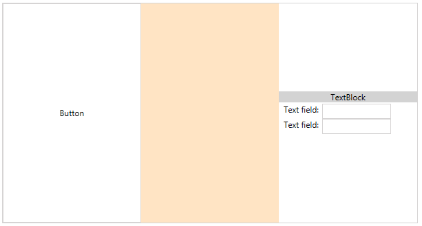
RadLayoutControl doesn't support data binding and setting its ItemsSource property will throw an exception (NotSupportedException).
Layout Groups
There are few layout group controls which can be used with RadLayoutControl. Each group has different appearance. You can read more about this in the Layout Groups section in the documentation. Additionally, the Code Example section of this help article demonstrates the different layout groups.
ScrollViewer Root Element
The RadLayoutControl and its groups wrap their content in a ScrollViewer. The ScrollViewer control measures its children with infinity. This behavior disables the virtualization of all controls placed inside. You can easily disable the ScrollViewer functionality and delegate the scrolling to the child framework element inside. To do that you can set the ScrollViewer.VerticalScrollBarVisibility / ScrollViewer.HorizontalScrollBarVisibility attached properties to the RadLayoutControl and to the groups you want this property applied.
Enable Edit Mode
The control allows you to rearrange its children at runtime. To enable this the IsInEditMode property of the control should be set to True.
Example 4: Enabling the edit mode of the control
<telerik:RadLayoutControl IsInEditMode="True" />
Figure 4: The layout setup from Example 3 with one of the groups selected.
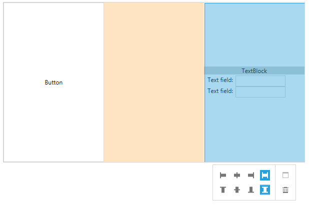
Read more about the edit mode in the Edit the Layout article.
Code Example
This section demonstrates a basic layout set up with nested groups and different group types.
Example 5: Complete code example
<telerik:RadLayoutControl IsInEditMode="True">
    <telerik:LayoutControlGroup Orientation="Vertical">
        <telerik:LayoutControlExpanderGroup Margin="2" Header="Layout Control Expander Group">
            <telerik:LayoutControlGroup Orientation="Vertical">
                <telerik:LayoutControlGroup>
                    <RadioButton Content="RadioButton 1" Padding="5" VerticalAlignment="Center" Margin="2" />
                    <RadioButton Content="RadioButton 2" IsChecked="True" Padding="5" VerticalAlignment="Center" Margin="2" />
                    <RadioButton Content="RadioButton 3" Padding="5" VerticalAlignment="Center" Margin="2" />
                </telerik:LayoutControlGroup>

                <Grid>
                    <Grid.ColumnDefinitions>
                        <ColumnDefinition Width="Auto" />
                        <ColumnDefinition />
                    </Grid.ColumnDefinitions>
                    <TextBlock Text="TextBlock:" Foreground="Black" VerticalAlignment="Center" Margin="5 0 5 0"/>
                    <TextBox Grid.Column="1" Foreground="Black" VerticalAlignment="Center" Margin="5 0 5 0"/>
                </Grid>
            </telerik:LayoutControlGroup>

            <ListBox  Padding="8" Margin="2" >
                <ListBoxItem Content="ListBoxItem 1" />
                <ListBoxItem Content="ListBoxItem 2" />
                <ListBoxItem Content="ListBoxItem 3" />
                <ListBoxItem Content="ListBoxItem 4" />
                <ListBoxItem Content="ListBoxItem 5" />
                <ListBoxItem Content="ListBoxItem 6" />
            </ListBox>
        </telerik:LayoutControlExpanderGroup>

        <telerik:LayoutControlTabGroup Margin="2">
            <telerik:LayoutControlTabGroupItem Header="Tab 1">
                <telerik:LayoutControlGroup>
                    <TextBlock Text="TextBlock" Padding="5" Margin="2" Foreground="Black" Background="LightGray" TextAlignment="Center" VerticalAlignment="Stretch" />
                    <TextBlock Text="TextBlock" Padding="5" Margin="2" Foreground="Black" Background="LightGray" TextAlignment="Center" VerticalAlignment="Stretch" />
                </telerik:LayoutControlGroup>
            </telerik:LayoutControlTabGroupItem>
            <telerik:LayoutControlTabGroupItem Header="Tab 2" />
        </telerik:LayoutControlTabGroup>
    </telerik:LayoutControlGroup>

    <telerik:LayoutControlGroup Orientation="Vertical" HorizontalAlignment="Right">
        <Button Content="Button 1" Padding="10 20 10 20" Margin="2" VerticalAlignment="Top" />
        <Button Content="Button 2" Padding="10 20 10 20" Margin="2" VerticalAlignment="Bottom" />
    </telerik:LayoutControlGroup>

    <ToggleButton Content="ToggleButton" Padding="5 0 5 0" HorizontalAlignment="Right" Margin="2" />
</telerik:RadLayoutControl>
Figure 5: RadLayoutPanel example
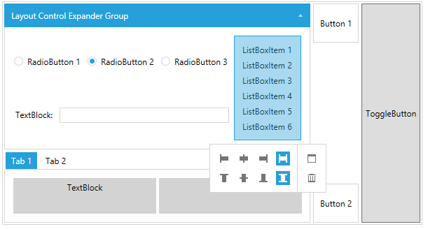
You can switch between normal and edit mode of the control by setting its IsInEditMode property.
Setting a Theme
The controls from our suite support different themes. You can see how to apply a theme different than the default one in the Setting a Theme help article.
Changing the theme using implicit styles will affect all controls that have styles defined in the merged resource dictionaries. This is applicable only for the controls in the scope in which the resources are merged.
To change the theme, you can follow the steps below:
Choose between the themes and add reference to the corresponding theme assembly (ex: Telerik.Windows.Themes.Windows8.dll). You can see the different themes applied in the Theming examples from our WPF Controls Examples application.
-
Merge the ResourceDictionaries with the namespace required for the controls that you are using from the theme assembly. For the RadLayoutControl, you will need to merge the following resources:
- Telerik.Windows.Controls
- Telerik.Windows.Controls.Navigation
Example 6 demonstrates how to merge the ResourceDictionaries so that they are applied globally for the entire application.
Example 6: Merge the ResourceDictionaries
<Application.Resources>
    <ResourceDictionary>
        <ResourceDictionary.MergedDictionaries>
            <ResourceDictionary Source="/Telerik.Windows.Themes.Windows8;component/Themes/System.Windows.xaml"/>
            <ResourceDictionary Source="/Telerik.Windows.Themes.Windows8;component/Themes/Telerik.Windows.Controls.xaml"/>
            <ResourceDictionary Source="/Telerik.Windows.Themes.Windows8;component/Themes/Telerik.Windows.Controls.Navigation.xaml"/>
        </ResourceDictionary.MergedDictionaries>
    </ResourceDictionary>
</Application.Resources>
Alternatively, you can use the theme of the control via the StyleManager.
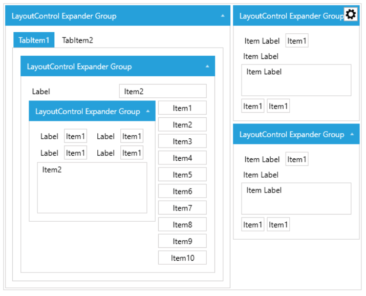
Figure 7 shows a RadLayoutControl with the Windows8 theme applied.
Figure 7: RadLayoutControl with the Windows8 theme
Telerik UI for WPF Learning Resources
- Telerik UI for WPF LayoutControl Component
- Getting Started with Telerik UI for WPF Components
- Telerik UI for WPF Installation
- Telerik UI for WPF and WinForms Integration
- Telerik UI for WPF Visual Studio Templates
- Setting a Theme with Telerik UI for WPF
- Telerik UI for WPF Virtual Classroom (Training Courses for Registered Users)
- Telerik UI for WPF License Agreement